Rethinking a
30-Year-Old Brand
Creative Direction
Strategy
Design
Competitor Magazine has been in print for 30 years and was very much in need of a complete overhaul when they approached us. Running and endurance sports are enjoyed by more than 50 million Americans, but the magazine’s outdated look and feel had become a barrier to its potential for growth of both readership and ad revenue. A hard reset on the entire package was required to shake up the industry and re-engage readers.
Rethinking a
28-Year-Old Brand
Creative Direction
Strategy
Design
Competitor Magazine has been in print for nearly 30 years and was very much in need of a complete overhaul. Running and endurance sports are enjoyed by more than 50 million Americans but the magazine’s outdated look and feel had become a barrier to its massive potential for growth of both readership and ad revenue. A hard reset on the entire package was required to both shake up the industry and re-engage readers.
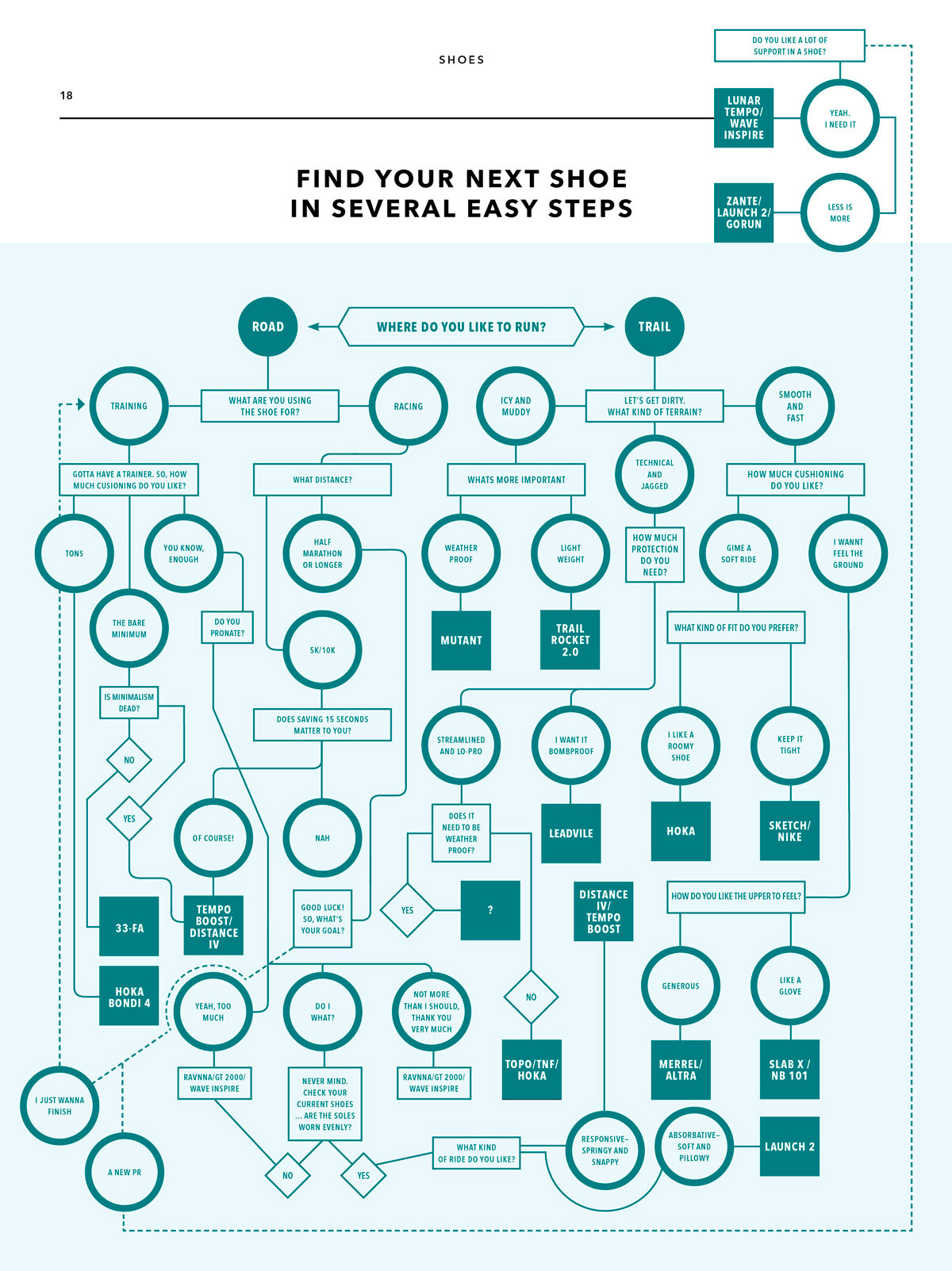
Challenge
With content covering running, triathlon, mountain biking, cycling, and more, the publication suffered from an overloaded and unclear identity. It had also become cluttered with a multitude of dated design decisions and confusing information architecture. The core challenge was to undo decades of design negligence.
Goal
The aim was to transcend typical target demographics and re-focus on authentic athlete experience to engage readers of all ages. It was imperative to increase visual impact with design that would elevate and compliment the clear, inclusive editorial tone.
Solution
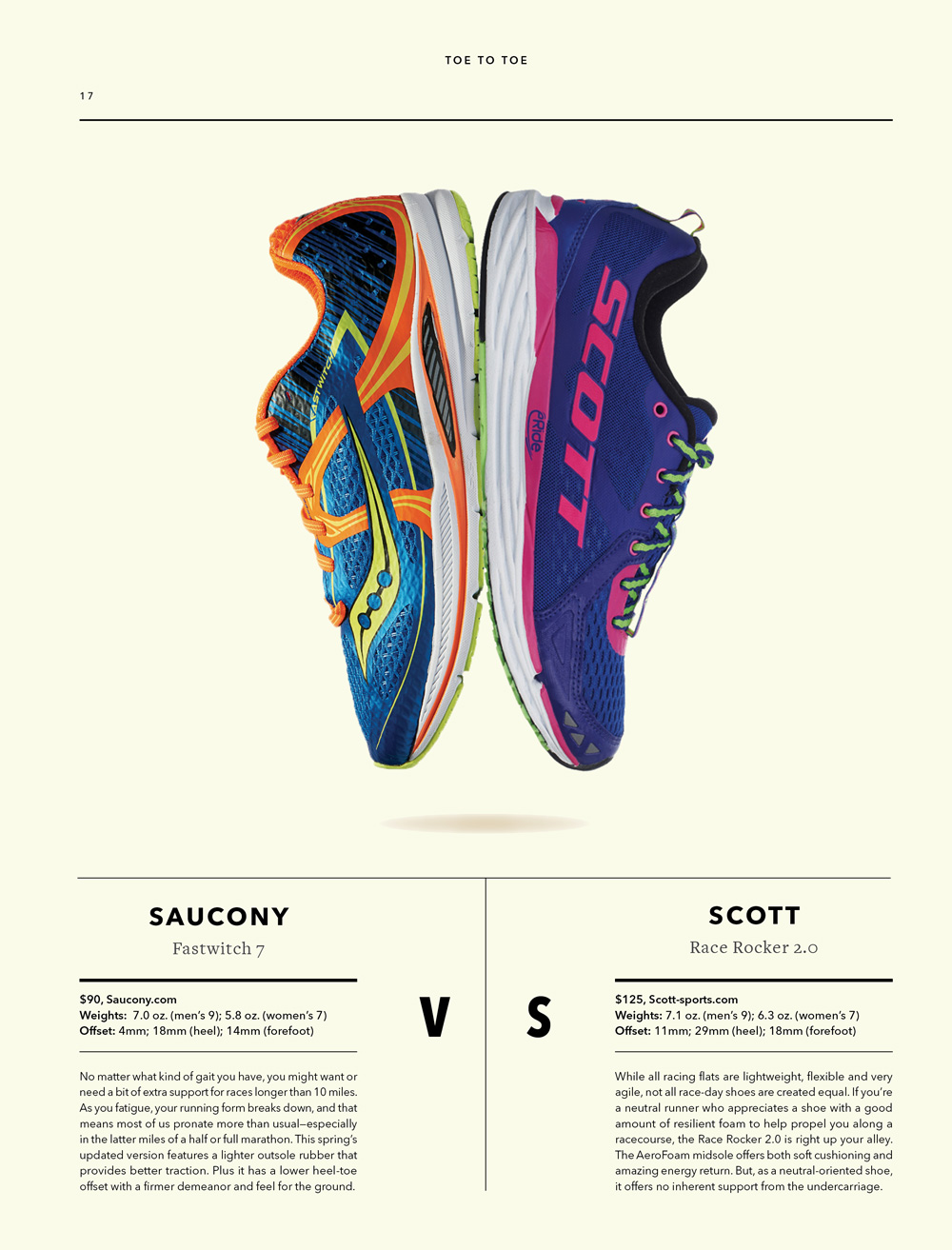
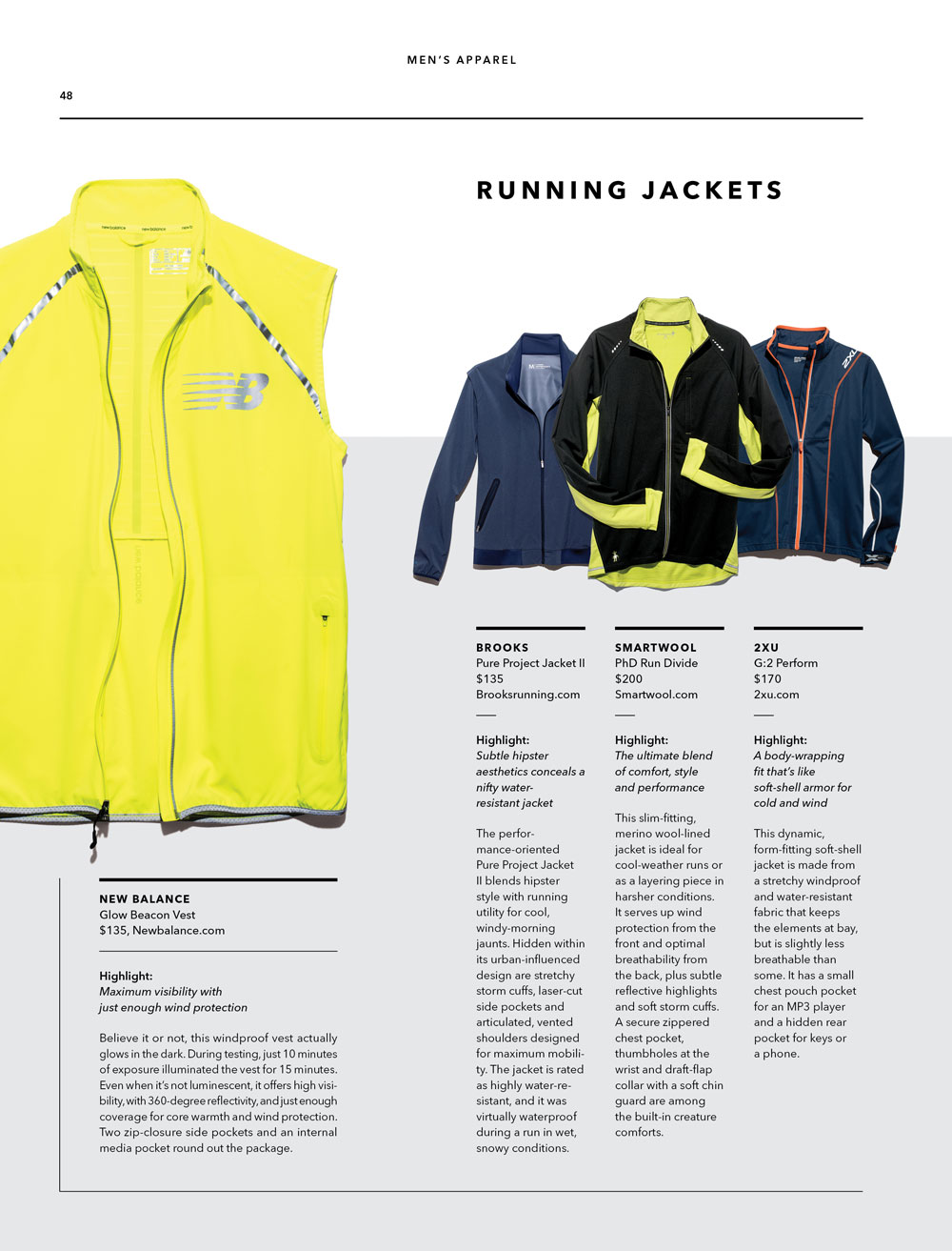
Taking a functional / modular approach to the design, we began by stripping away unnecessary elements. We then created a visual architecture supported by a versatile toolkit to give the in-house designers a flexible framework for constructing dynamic compositions without having to continually rework layouts.
Updated
Old
Nameplate Inspiration
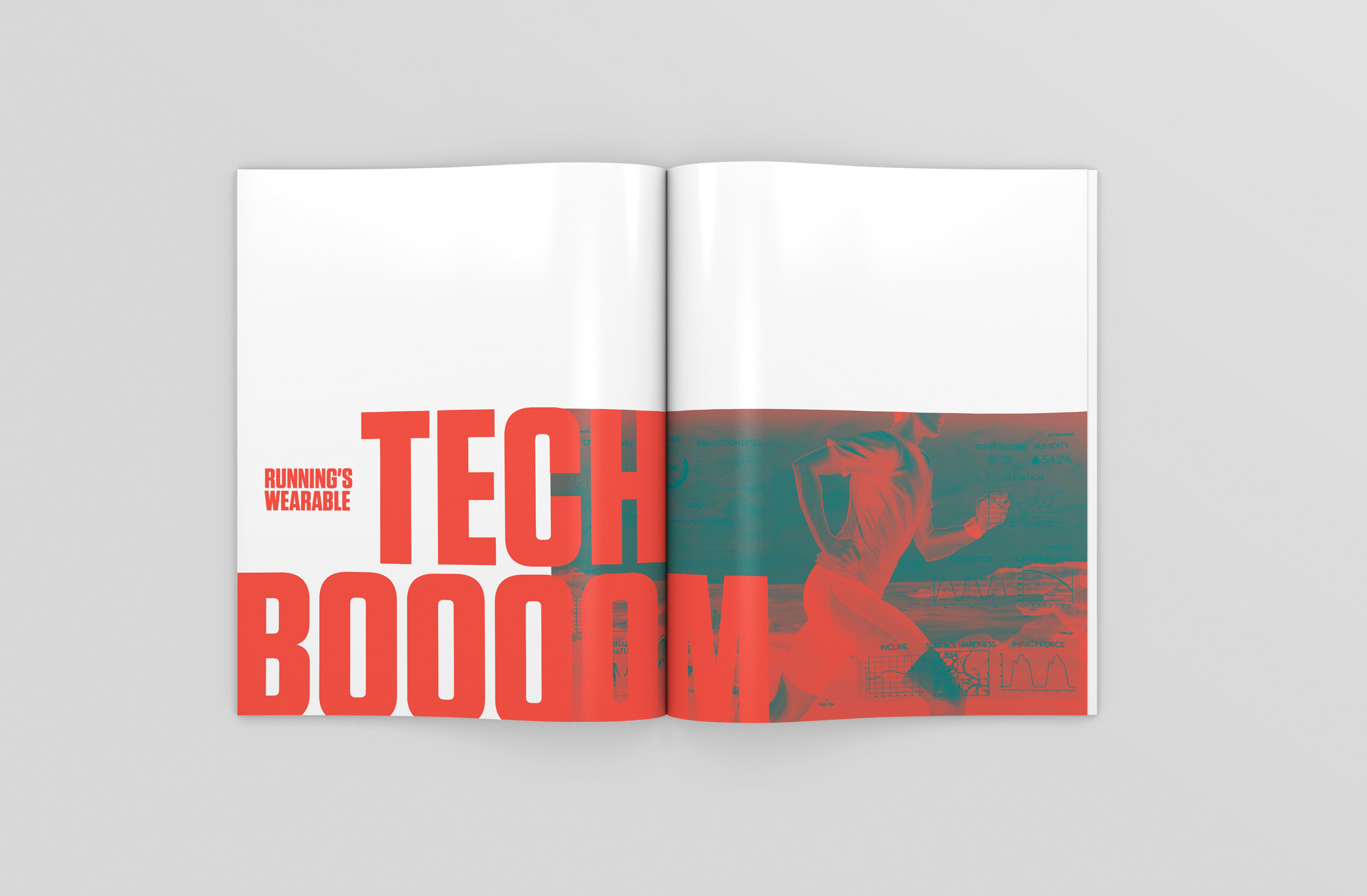
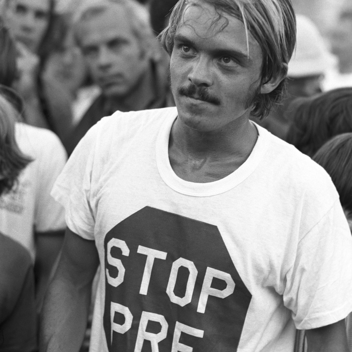
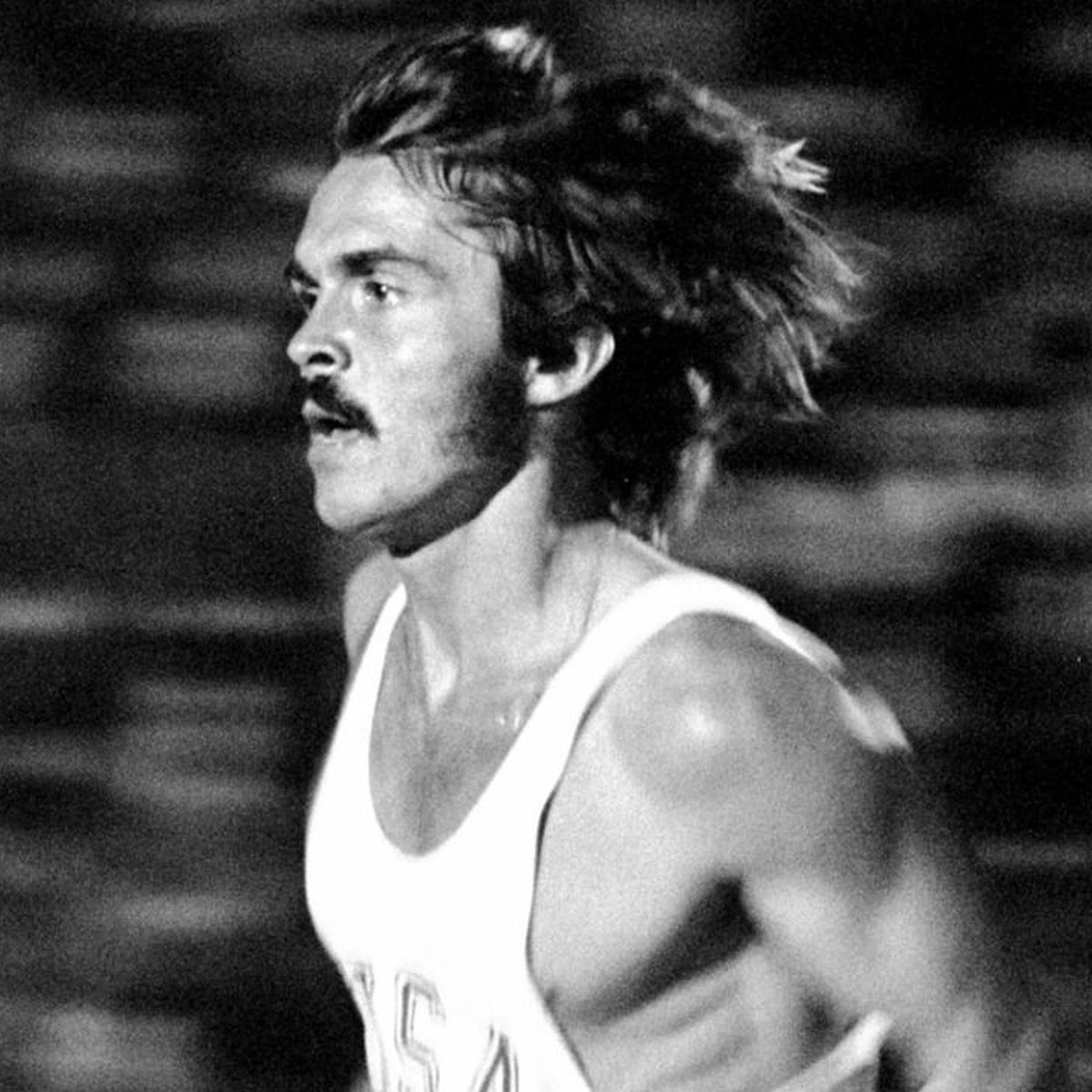
The magazine’s ambiguous title lacks the directness needed for people to instantly understand what’s inside. But what’s very clear is the passion that fuels the magazine’s editors and readers—they love running and racing. For inspiration, we looked to one of running’s most iconic figures, Steve Prefontaine—the first running rock star and the man credited with single-handedly kicking off America’s running boom in the 1970s. To create a modern and athletic logo, we replaced bland lowercase letterforms with the slender yet solid form of a runner, incorporating dynamic forward motion in the solitary letter “i”.
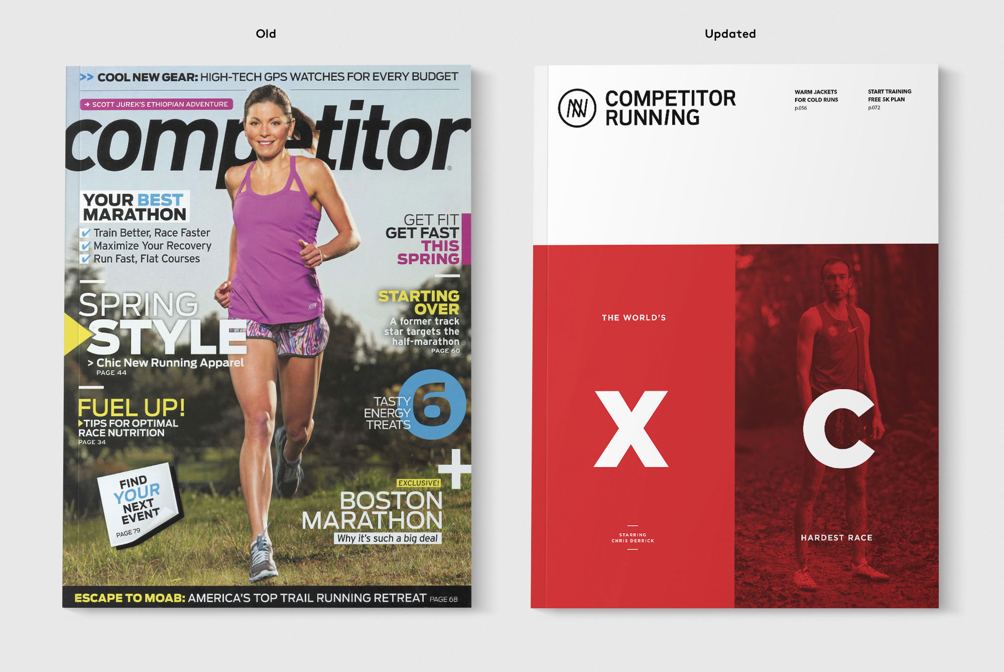
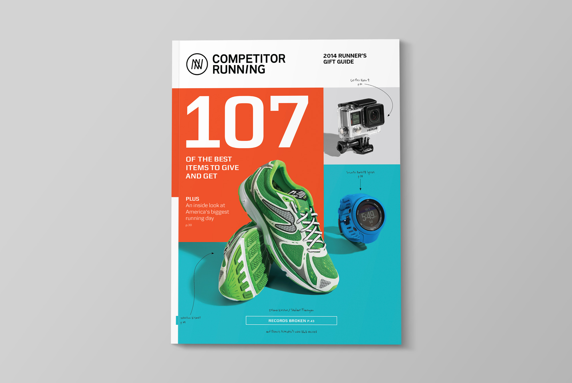
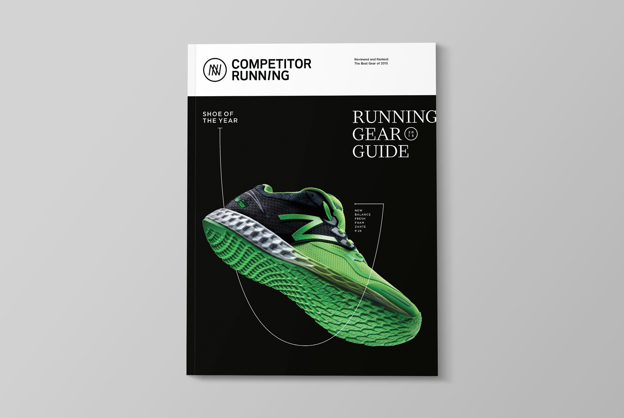
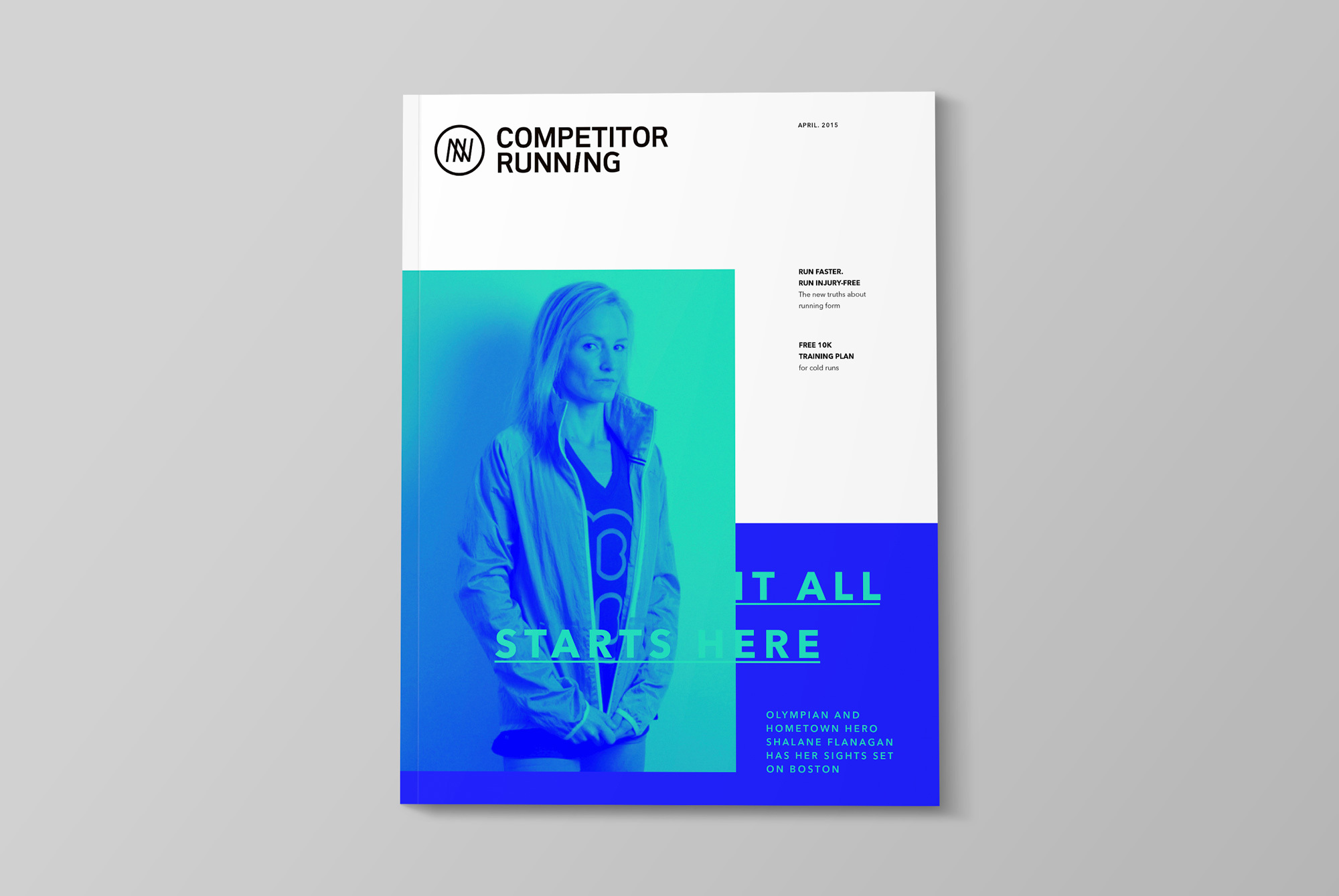
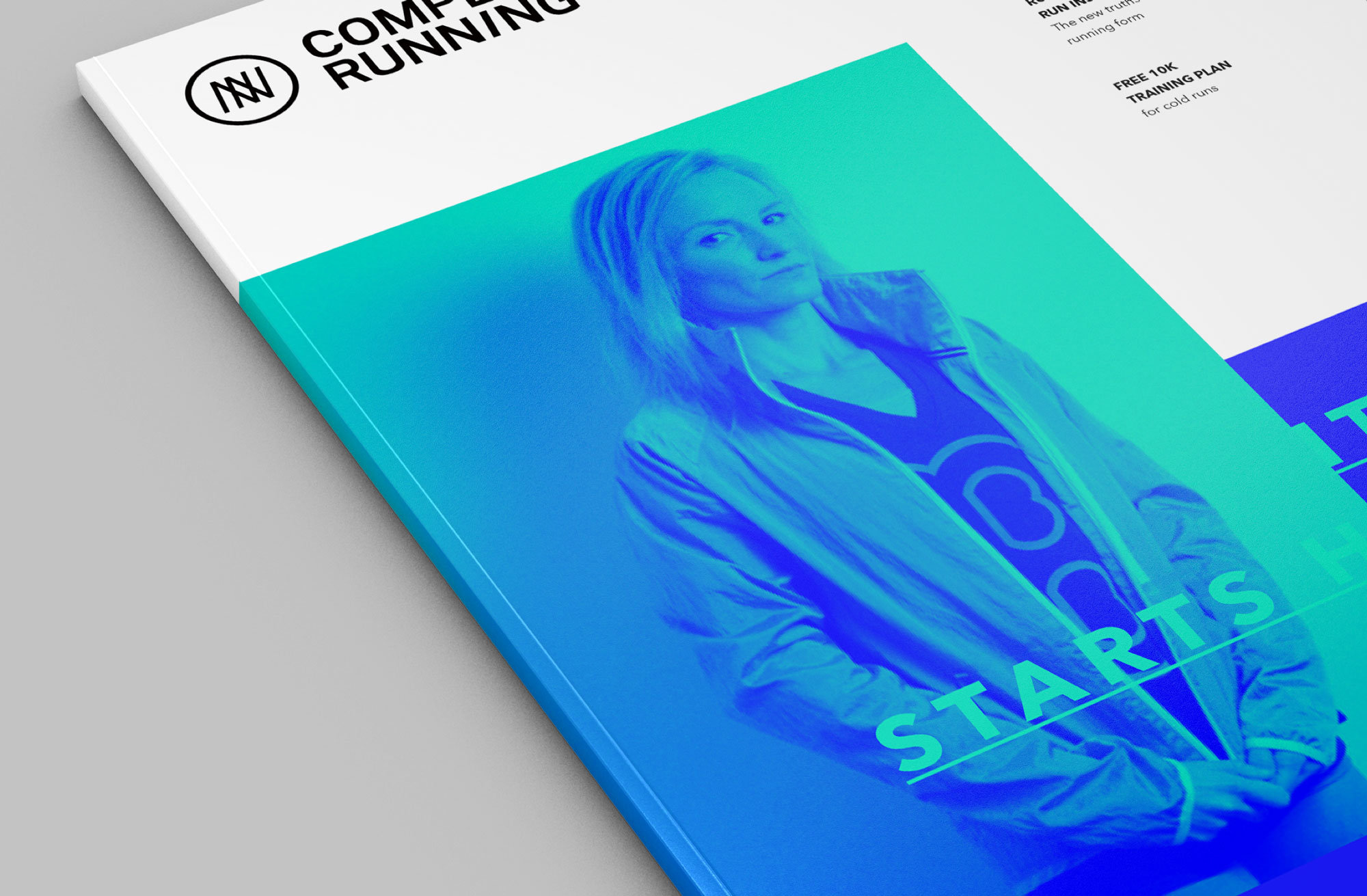
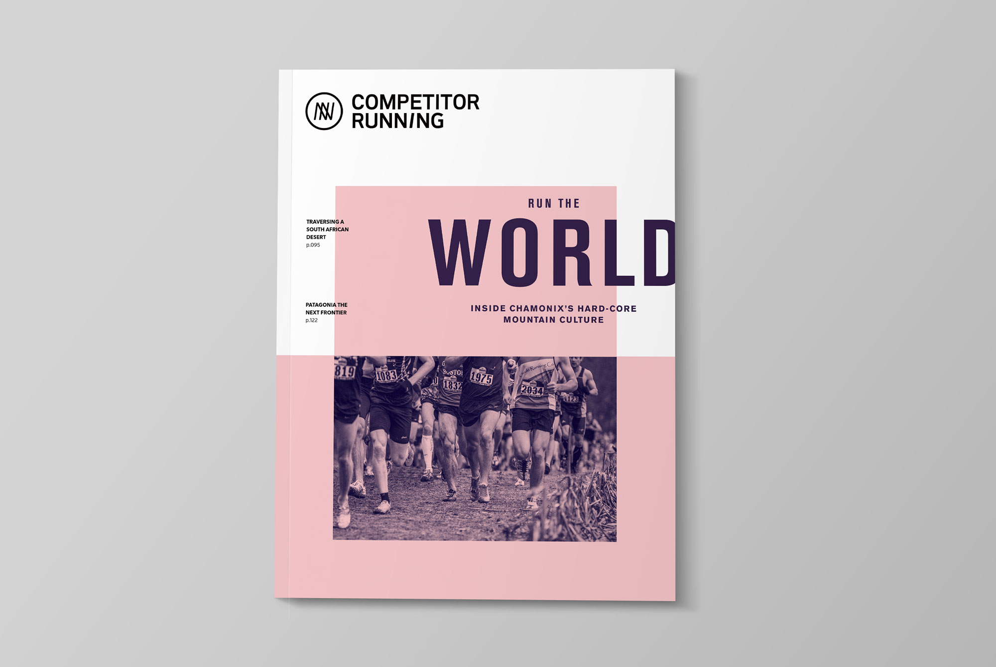
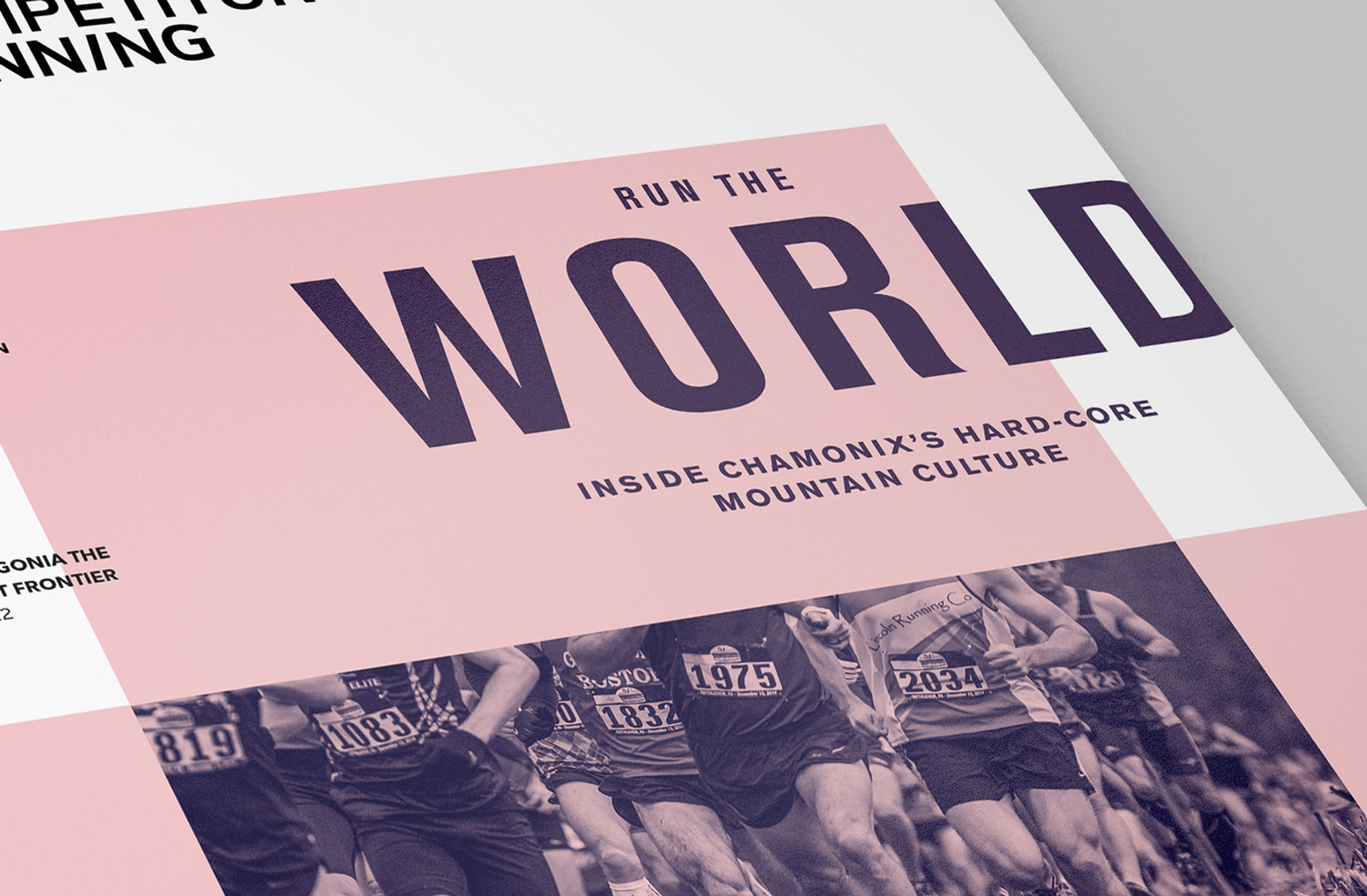
Cover Strategy
The cover strategy required drastic revision. Overuse of text and blurbs crowded the page, overwhelming readers with disorder. Because the title is not sold on newsstands, we had the freedom to strip the cover down to a simple and more direct design, replacing stock photography with narrative and concept-based images. Focusing on a single idea for the cover enabled us to create a poster-like aesthetic using large flats of color and toned imagery, all balanced by a strong sense of whitespace.
Content Format
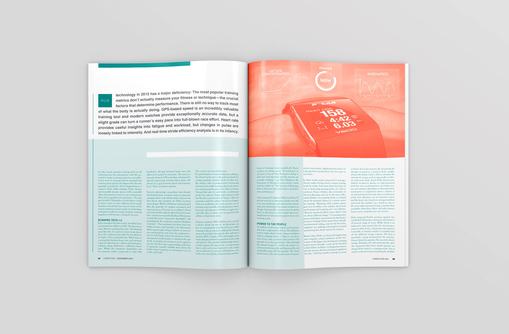
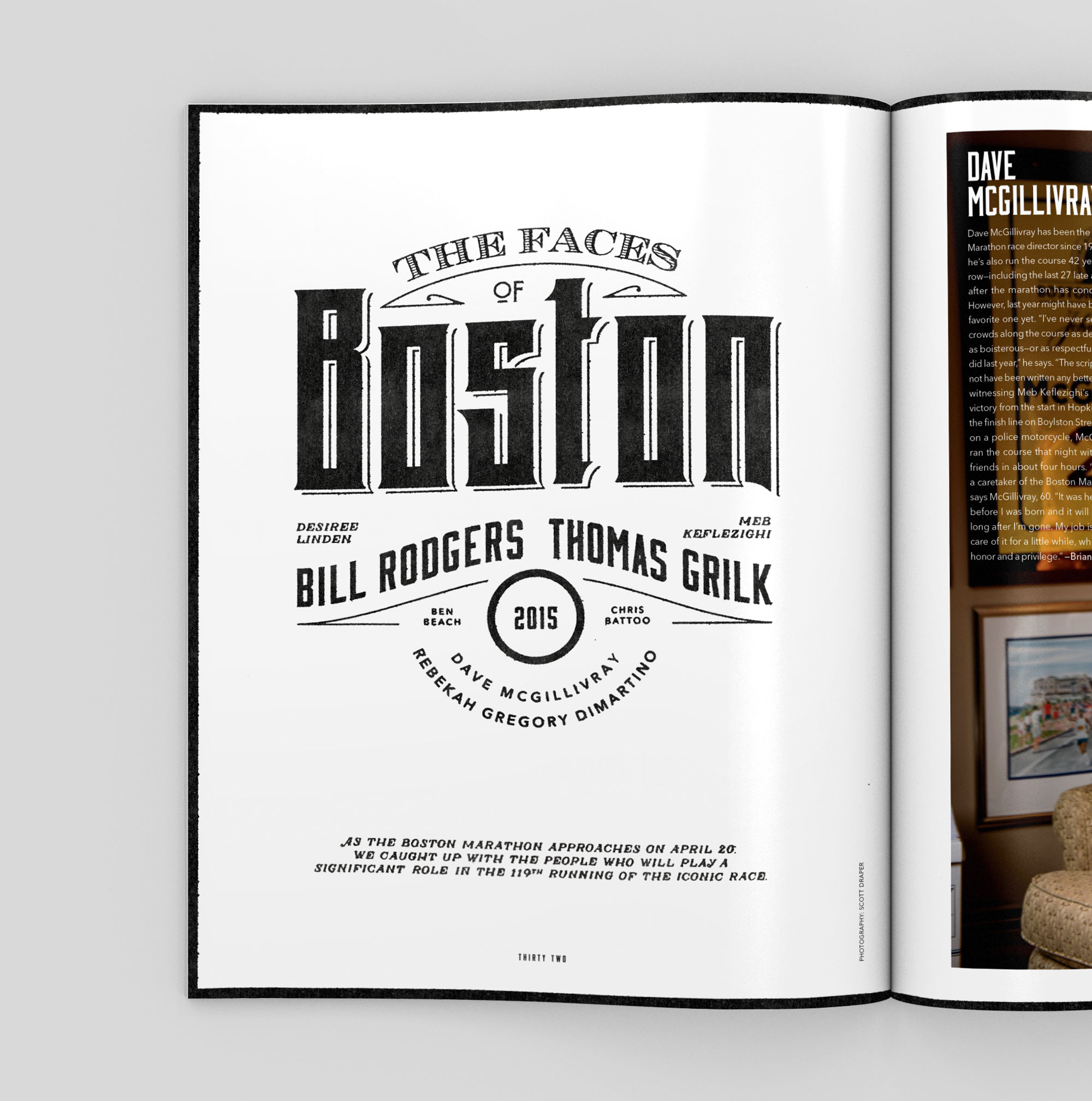
The existing design was deconstructed and completely reorganized to establish an obvious and orderly framework of content and design hierarchy. With an improved reader experience as our goal, we focused on structural details that would best support the communication of key information in more digestible and memorable ways.