Rebrand
Rocky Mountain Chocolate
Rocky Mountain Chocolate
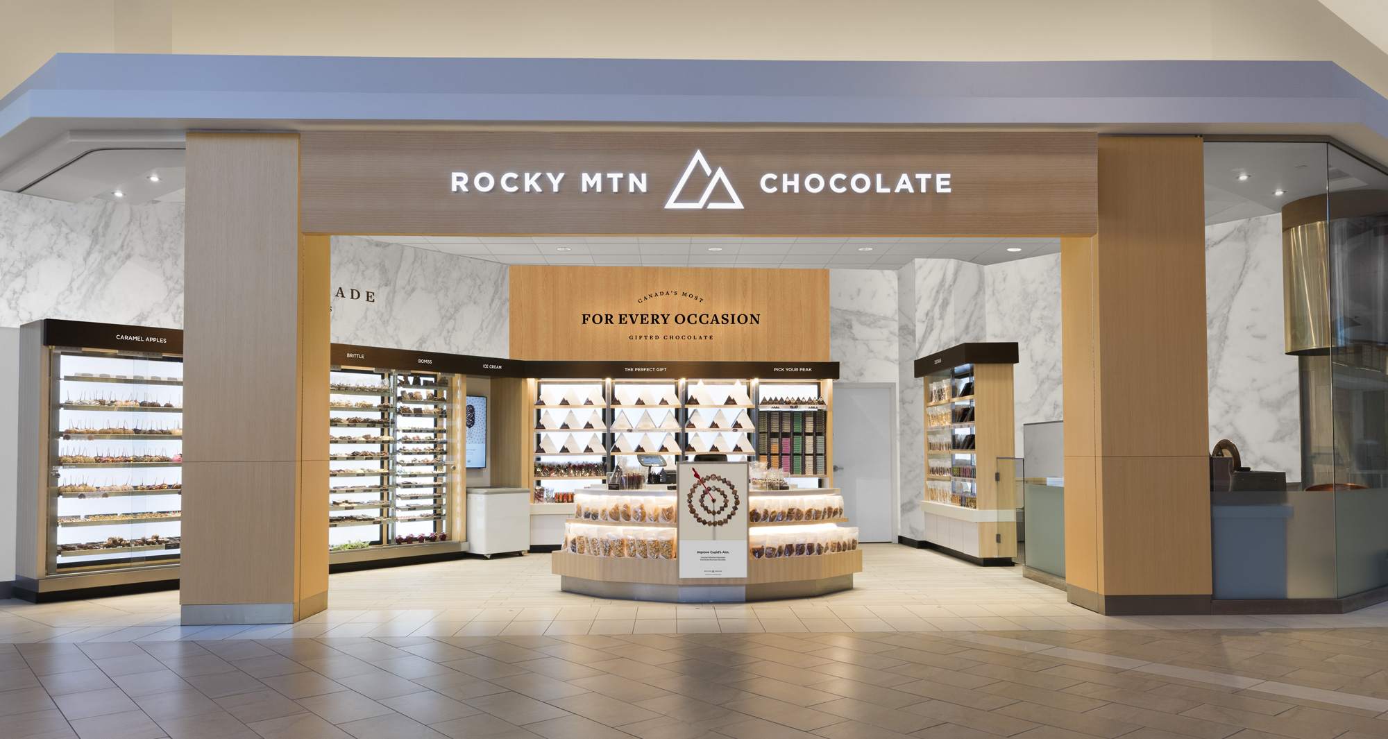
Renowned for made-in-store caramel apples, fresh fudge, and handmade chocolates, Rocky Mountain Chocolate Factory is sought after at 70 stores nationwide, including locations at premier destinations like Whistler, Banff, and Robson Street in Vancouver. While Rocky’s products remained a beloved part of customers’ memories, their logo was dated and didn’t speak to their core essence as gift givers. They needed a distinct identity: one that repositioned them as the number one chocolate store for both self-indulgent moments and gift giving.
Renowned for made-in-store caramel apples, fresh fudge, and handmade chocolates, Rocky Mountain Chocolate Factory is sought after at 70 stores nationwide, including locations at premier destinations like Whistler, Banff, and Robson Street in Vancouver. While Rocky’s products remained a beloved part of customers’ memories, their logo was dated and didn’t speak to their core essence as gift givers. They needed a distinct identity: one that repositioned them as the number one chocolate store for both self-indulgent moments and gift giving.
Renowned for made-in-store caramel apples, fresh fudge, and handmade chocolates, Rocky Mountain Chocolate Factory is sought after at 70 stores nationwide, including locations at premier destinations like Whistler, Banff, and Robson Street in Vancouver. While Rocky’s products remained a beloved part of customers’ memories, their logo was dated and didn’t speak to their core essence as gift givers. They needed a distinct identity: one that repositioned them as the number one chocolate store for both self-indulgent moments and gift giving.
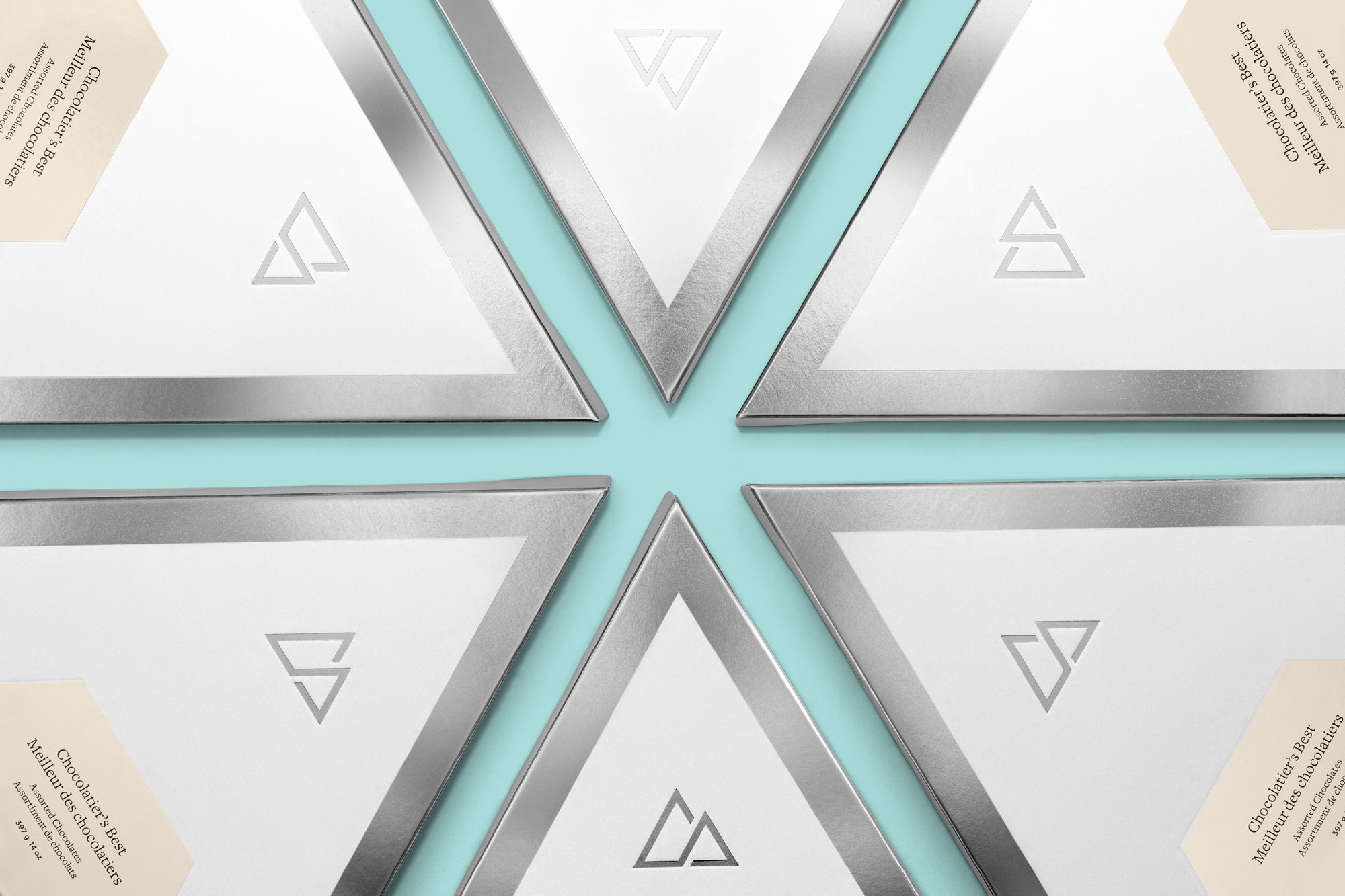
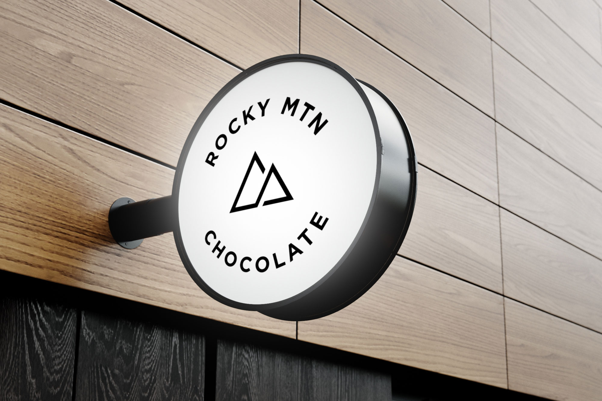
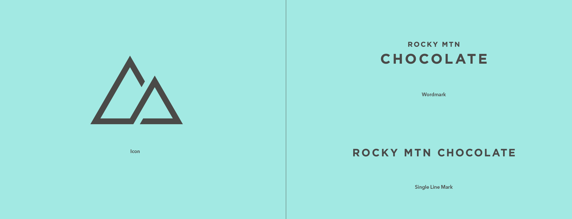
Rocky approached us to bridge the gap between their self-indulgent roots and their desire to become the top-of-mind chocolate store for gift giving. The new icon, consisting of two equilateral triangles, embodies the concepts of self-indulgence and selflessness as it unites two Peak Boxes—one for you, one for them—with a single stroke. The Peak Box, inspired by their namesake, is Rocky’s premier chocolate collection and most-gifted product offering. It’s triangle shape creates clear differentiation from the traditional boxes of their competitors and celebrates their rich history.
Rocky approached us to bridge the gap between their self-indulgent roots and their desire to become the top-of-mind chocolate store for gift giving. The new icon, consisting of two equilateral triangles, embodies the concepts of self-indulgence and selflessness as it unites two Peak Boxes—one for you, one for them—with a single stroke. The Peak Box, inspired by their namesake, is Rocky’s premier chocolate collection and most-gifted product offering. It’s triangle shape creates clear differentiation from the traditional boxes of their competitors and celebrates their rich history.
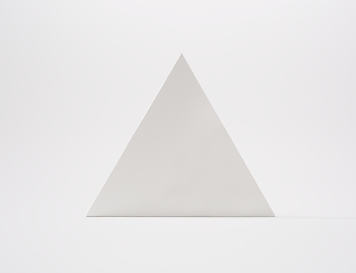
For over 20 years, the uniquely-shaped Peak Box has been Rocky’s premier chocolate collection and most-gifted product offering.
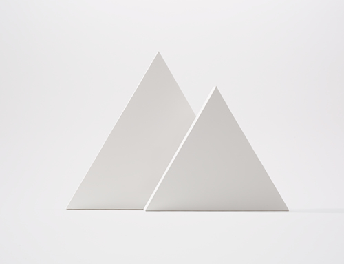
Gift giving is at the core of Rocky’s brand DNA, with a focus on getting yourself a treat as well as one to share.

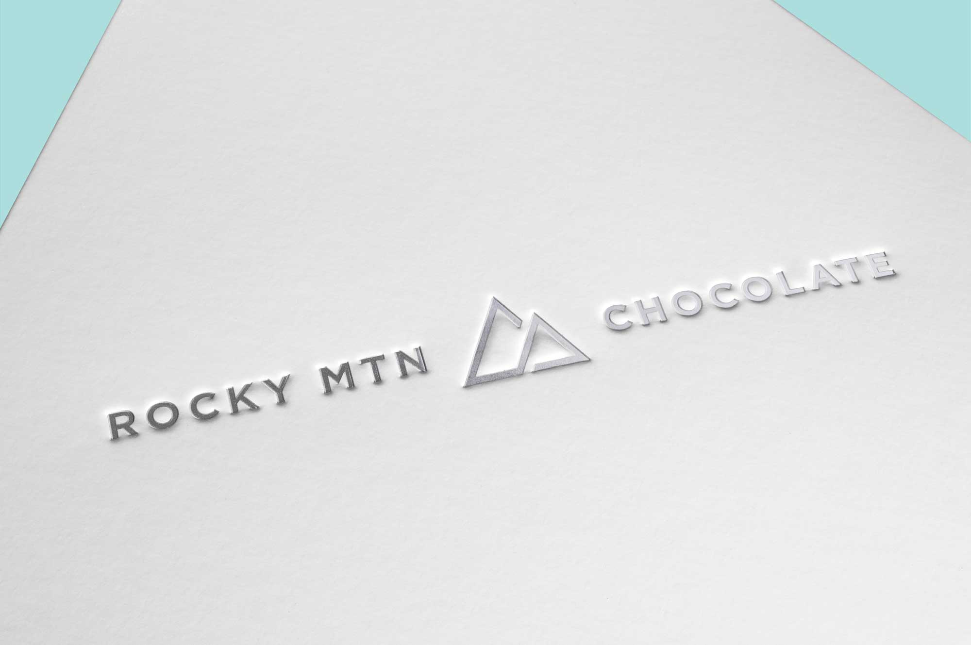
When the two Peak Box silhouettes are united with a single stroke, a visual representation of both gift giving and a mountain range is formed.

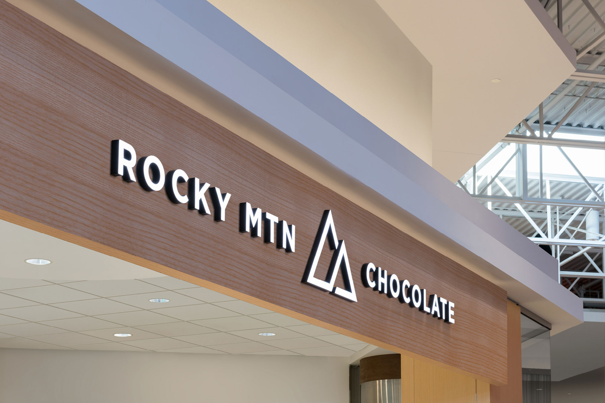
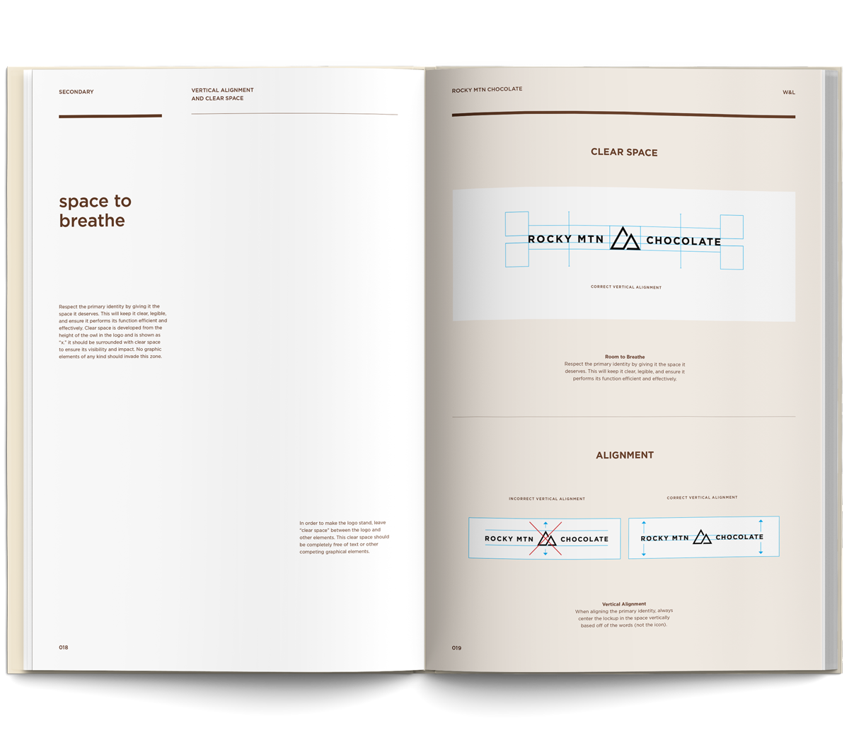
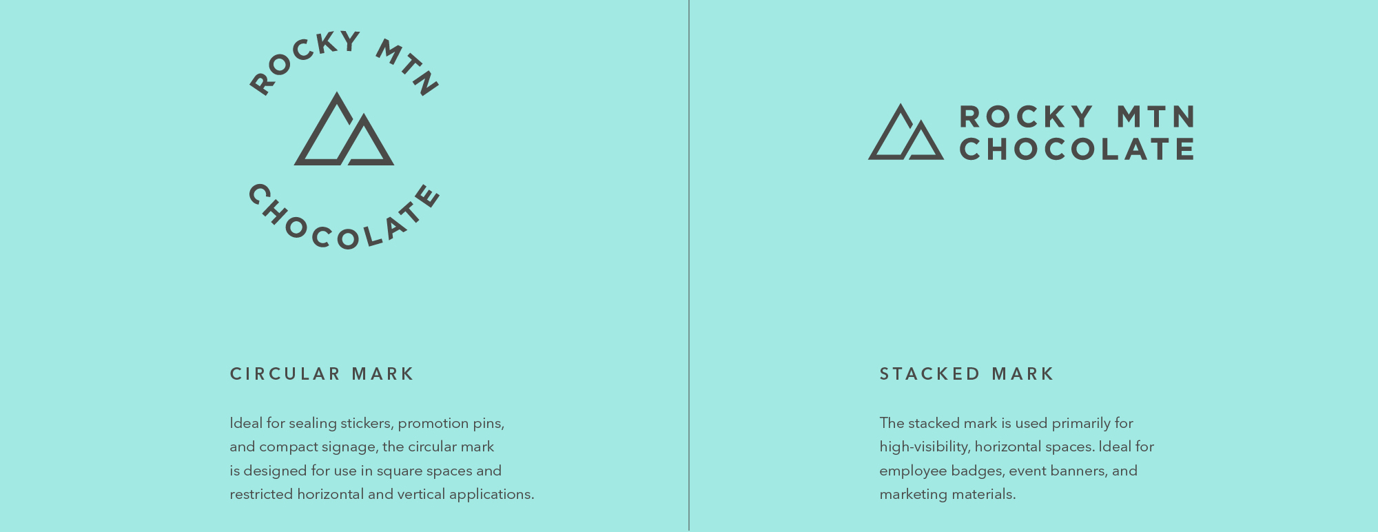
With 70 stores nationwide and an expansive packaging line, Rocky’s identity system requires significant flexibility in application while maintaining consistent and cohesive usage. We designed a flexible identity system that utilizes a primary mark, two secondary marks, and three isolated marks to accommodate all formats and executions, ranging from traditional retail signage to digital icons, packaging and embroidered brand peripherals like chef coats. Following the completion of the rebrand, a brand book documenting the identity guidelines was created to efficiently ensure proper usage.


Nearly all civilizations have assigned deep meaning to the equilateral triangle. While the common thread between many of them is an attempt to explain the supernatural, most boil down to three key elements: perfection, strength, and hyper-connectivity. As a reference to these elements, the icon geometry is derived from an isometric grid—a visual representation of the spirit and quality of bonds forged over the giving of chocolate. This grid system and spatial awareness is integrated throughout Rocky’s packaging, peripherals, and even merchandising strategy.
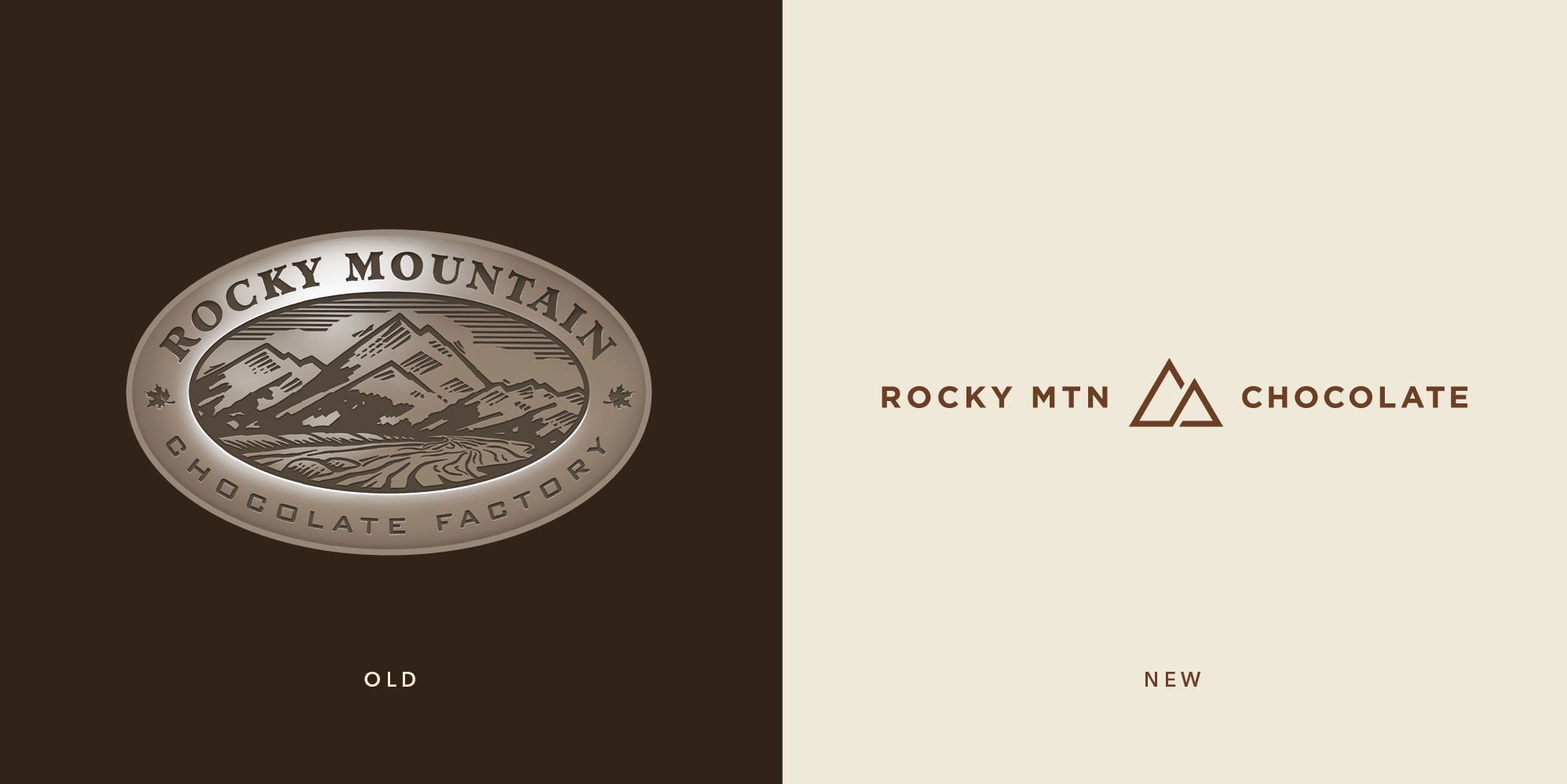
Rocky’s previous logo was more of an illustration than a functional mark. To ensure clarity, the ornate landscape was replaced with a more modern aesthetic. We honed in on the mountains and their relation to Rocky’s premier chocolate collection—the Peak Box. Mountain became Mtn—its public signage abbreviation—speaking to adventure and making the marks more scalable and balanced. Factory was then dropped to emphasize the handmade quality of their product—Rocky crafts chocolates, they are not manufactured.
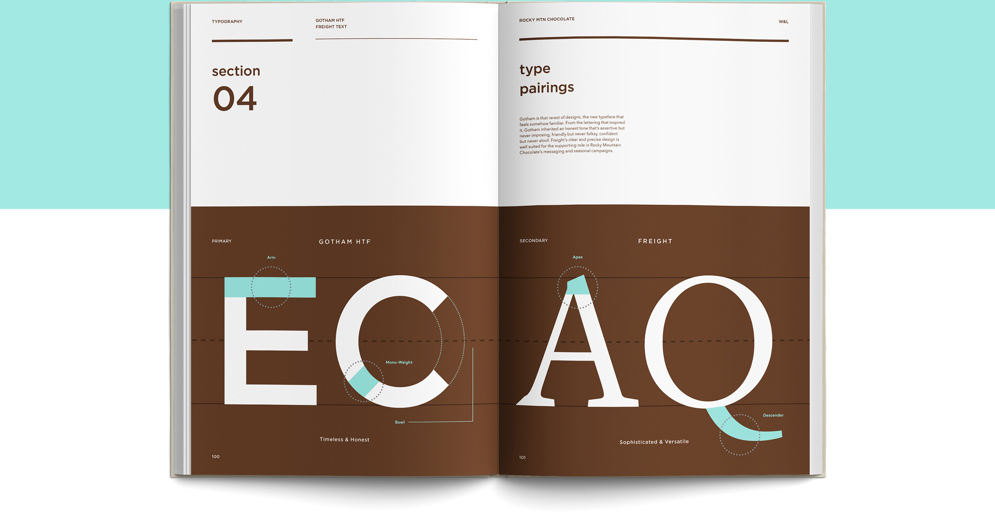

Emphasizing modernity and the hands-on authenticity of chocolate making, we paired Gotham with Freight Text Book. As the primary typeface, Gotham medium—a geometric sans serif—has a distinctly timeless and honest feel. Freight—a versatile serif—adds a touch of sophistication and diversity as a subtle nod to the complex flavors that Rocky creates using traditional recipes.
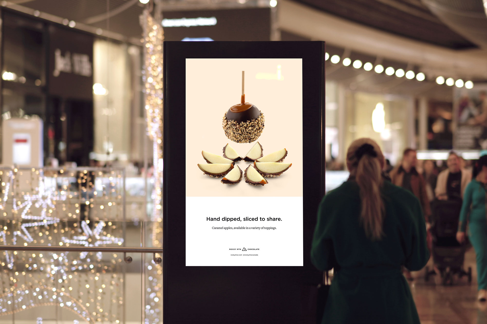
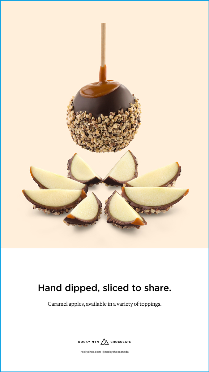


We wanted our signage to stand out amongst the visual noise created by Rocky’s extensive product offering. We focused on conceptual and mouthwatering hero creative—often integrating product, but not always—to draw the eye (and appetite) in. For effective communication, the copywriting was set with plenty of breathing room. Split into a headline and subhead, the copywriting romances the product offering in a witty fashion before hitting you with a direct call-to-action.
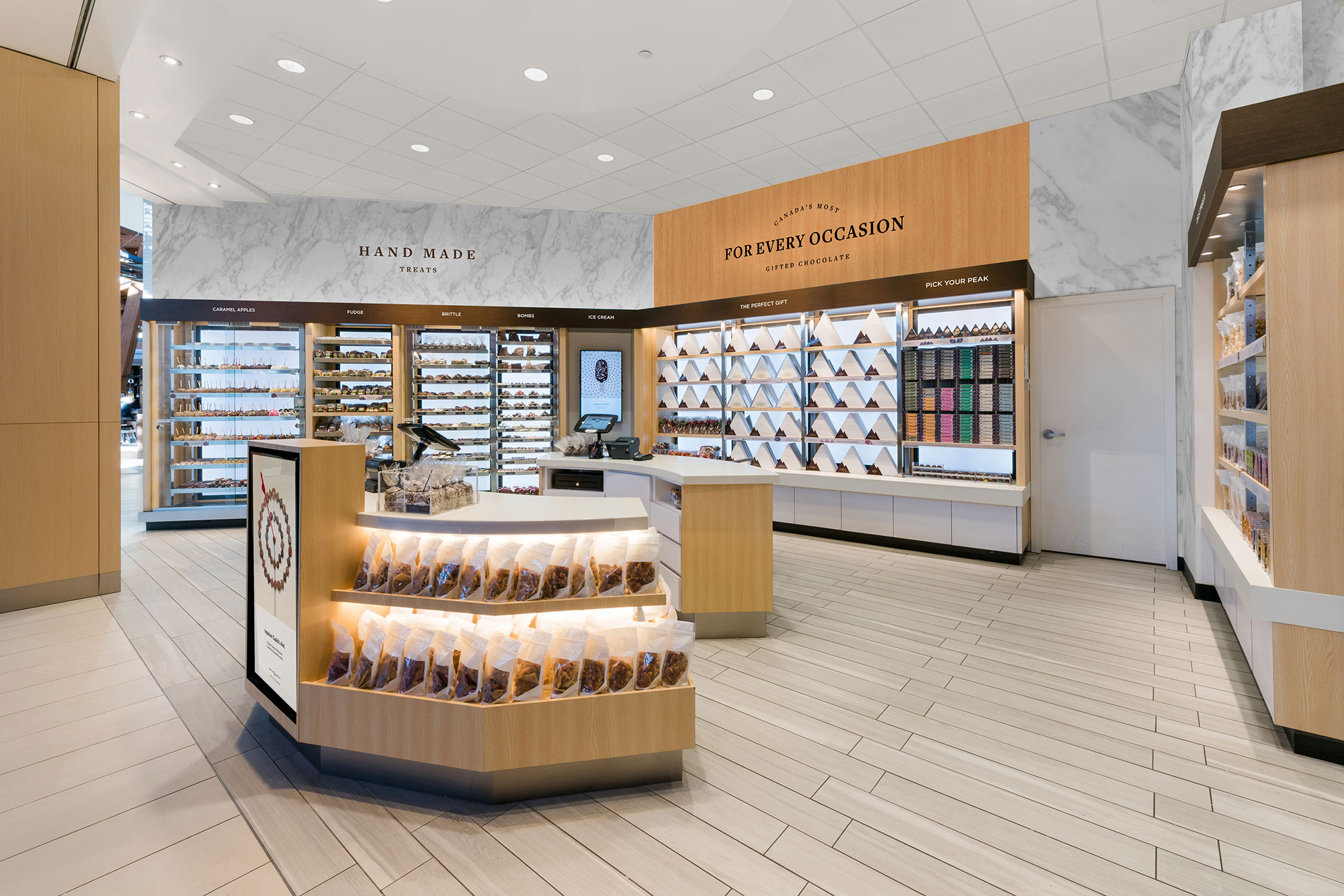
Occupies the largest in-store visual real estate as it clads most shelving and panels.
Used throughout the chocolatier’s area in-store as well as small accents throughout the shelving units.

Caps in-store shelving by contrasting the lighter cedar tone.
Traditionally used for fudge-making tables, it extends throughout the store as prominent texture.
Occupies the largest in-store visual real estate as it clads most shelving and panels.
Used throughout the chocolatier’s area in-store as well as small accents throughout the shelving units.

Caps in-store shelving by contrasting the lighter cedar tone.
Traditionally used for fudge-making tables, it extends throughout the store as prominent texture.
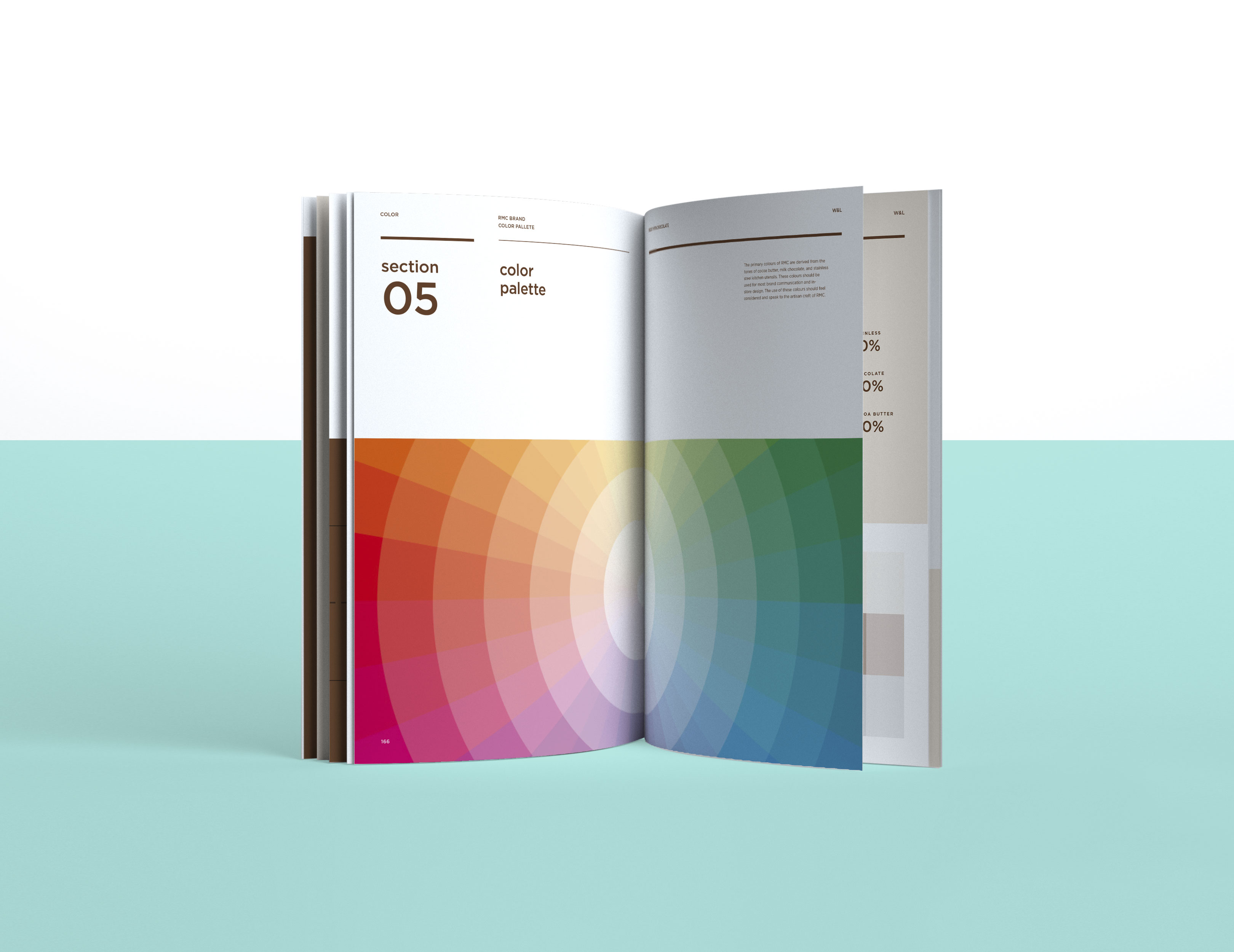
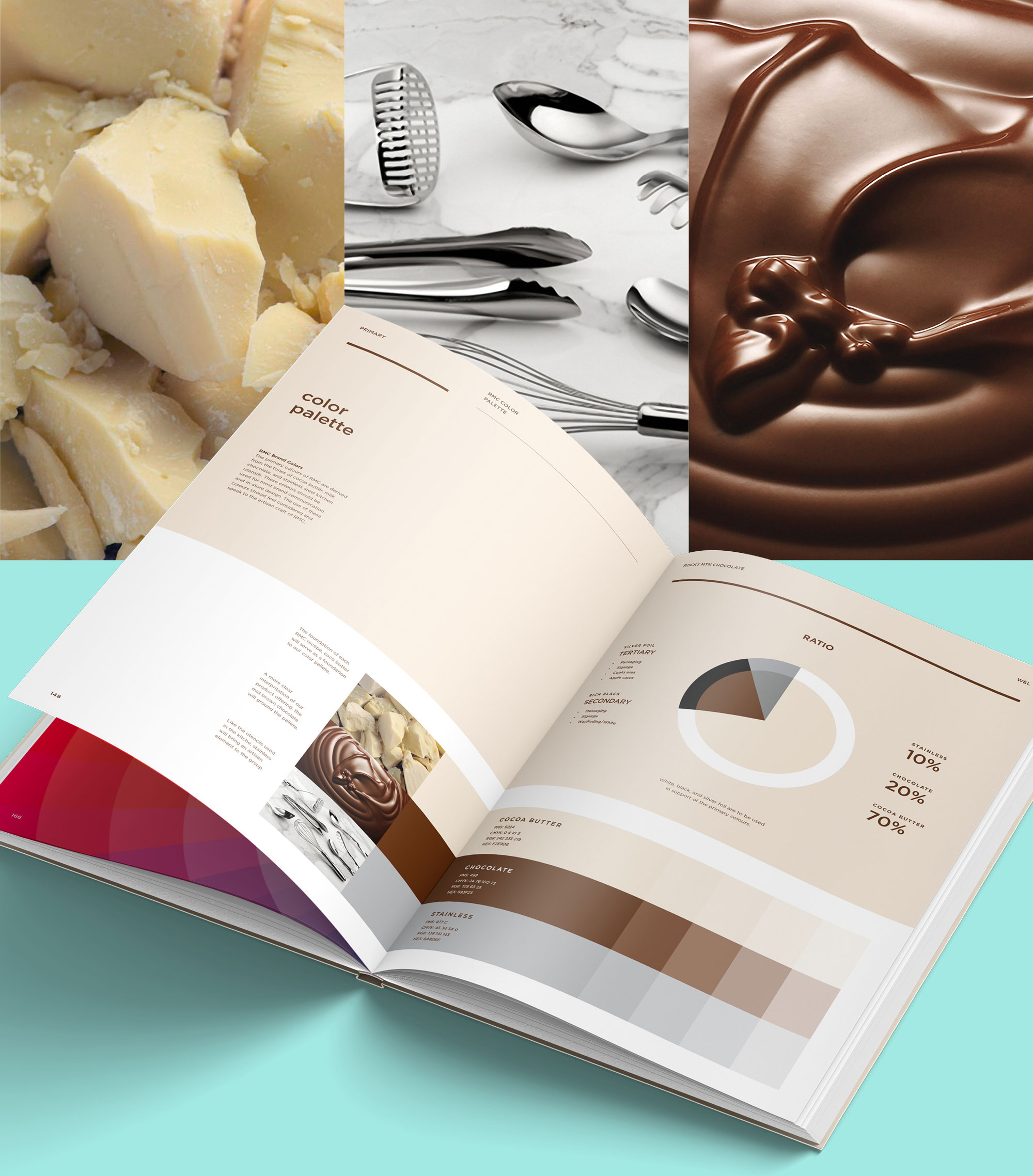
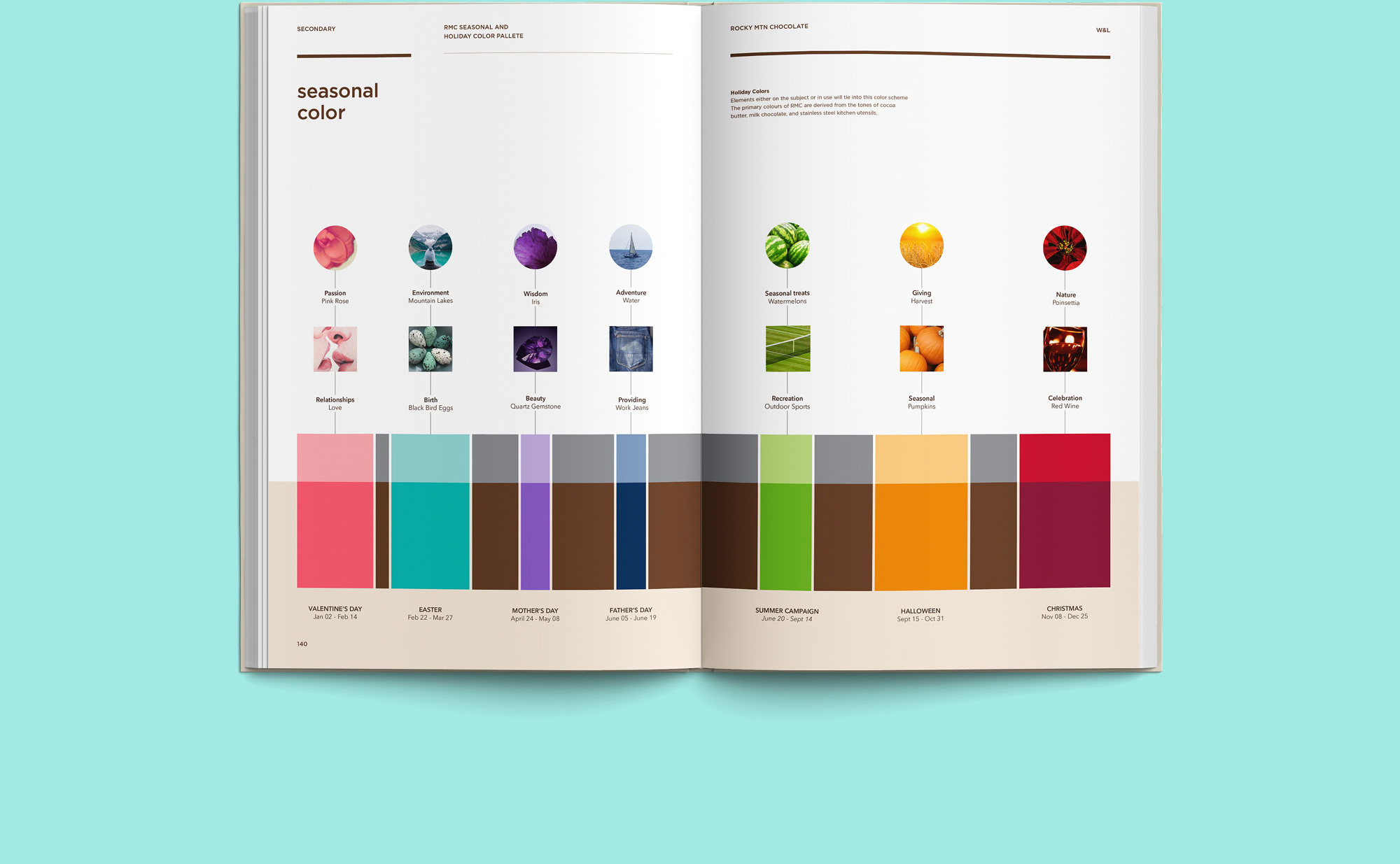
Derived from tones of cocoa butter, chocolate, and the stainless steel of high-end kitchen utensils, Rocky’s color palette visually represents the chocolate-making process. Pop colors are integrated throughout the year to champion the spirit of the respective holiday, as that’s core to Rocky’s gift-giving business. Additionally, white, black, and silver foil are used to support the primary palette and pop colors.
01
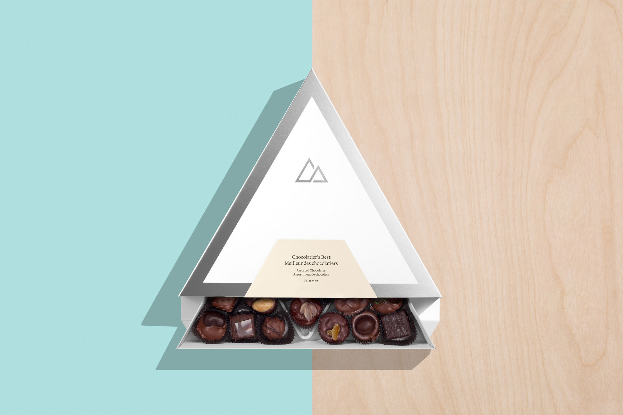
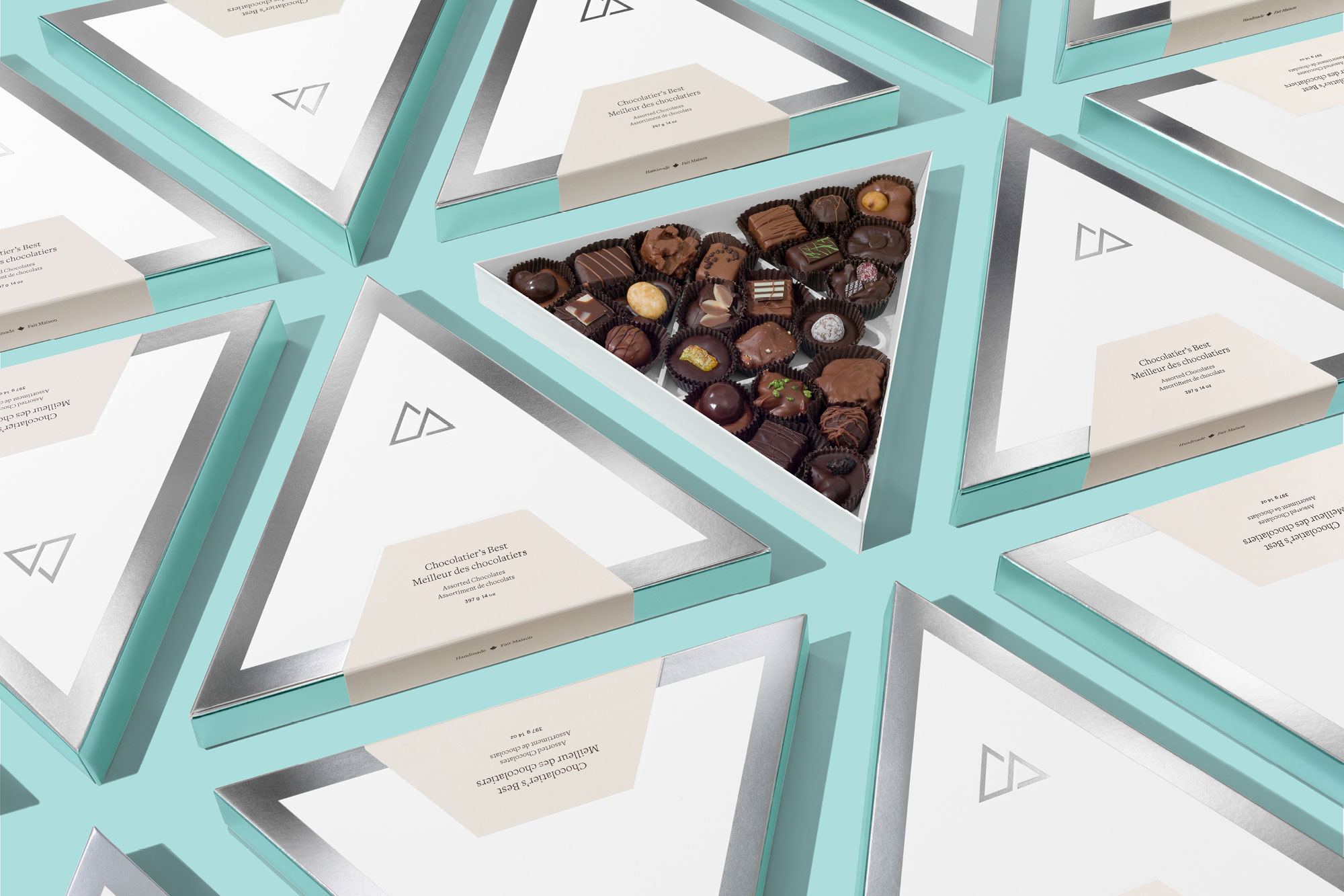
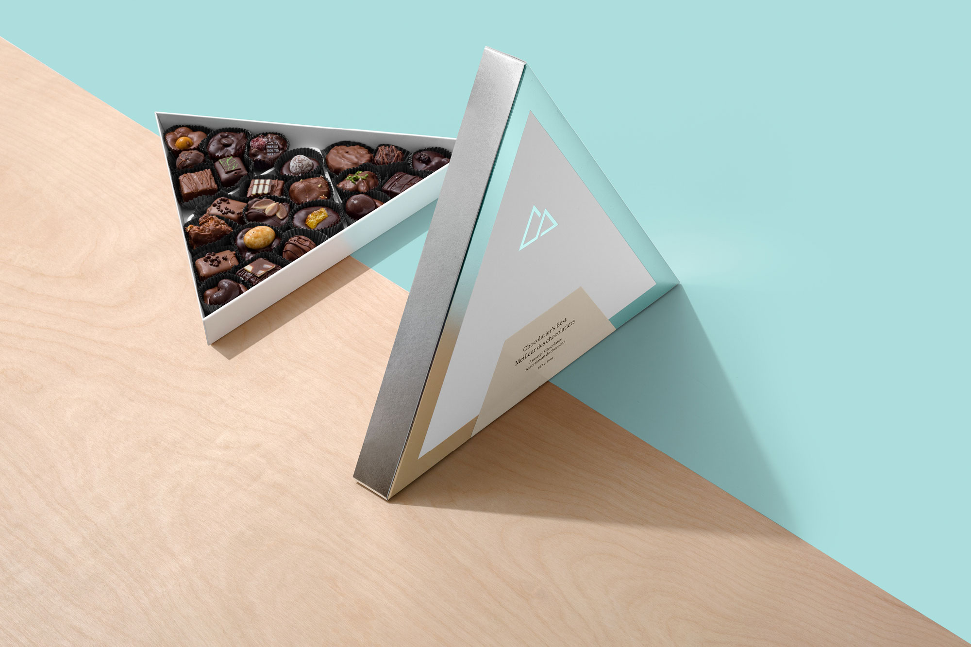
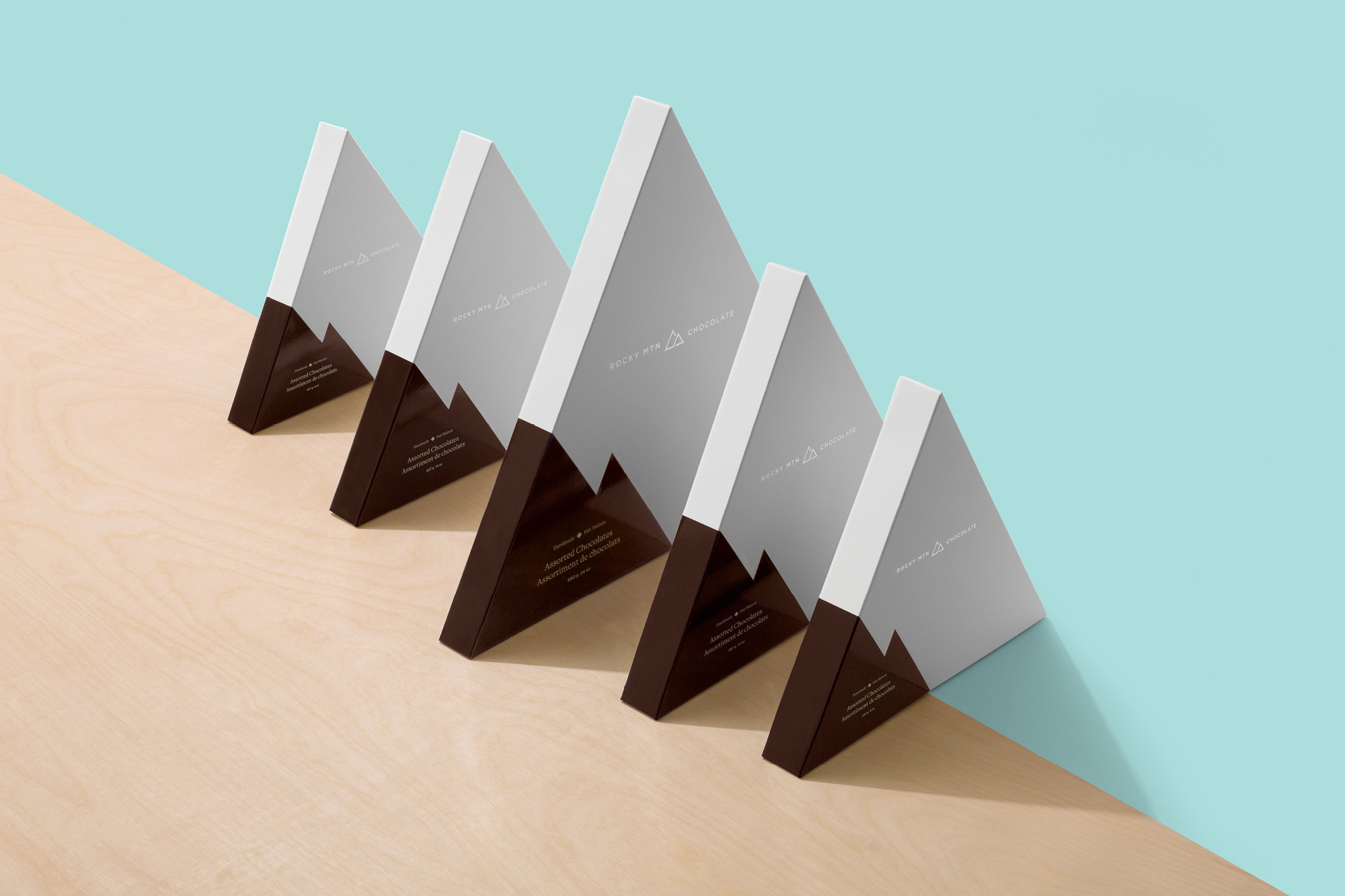
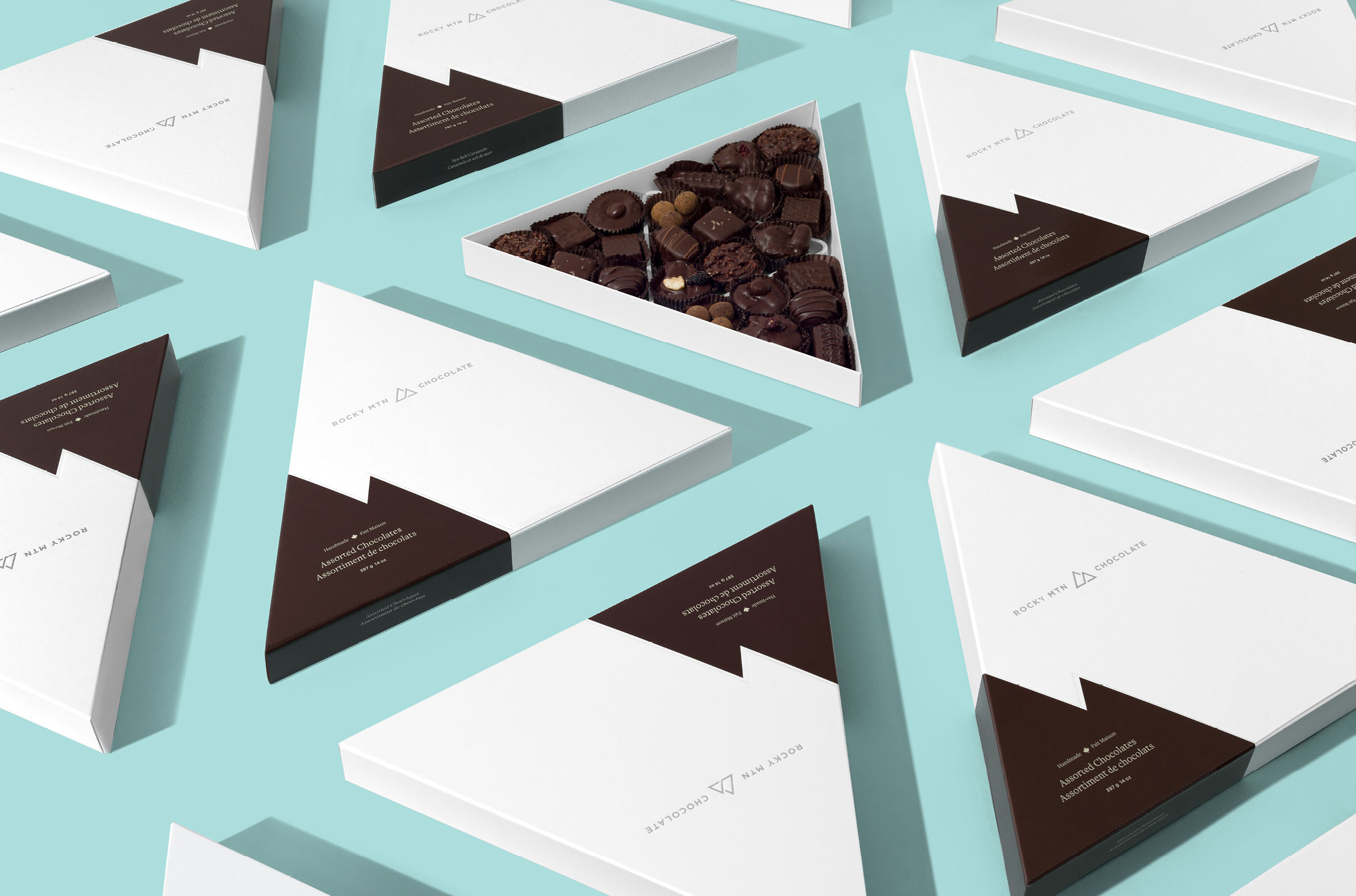
As their marquee chocolate collection, Rocky’s Signature Peak Boxes needed an updated approach that aligned with their renewed emphasis on gift giving. We focused on elevating the customer journey; designing a Peak Box that matched their modern elegance. The new look has a minimal aesthetic and abstractly features a snow-covered mountain peak, grounding it in the brand’s history. Premium production techniques such as soft-touch varnish, silver foil debossing, and gloss varnishes make the unboxing experience memorable—their tactile nature acts as a precursor to the pleasure of indulging in the chocolate.
01
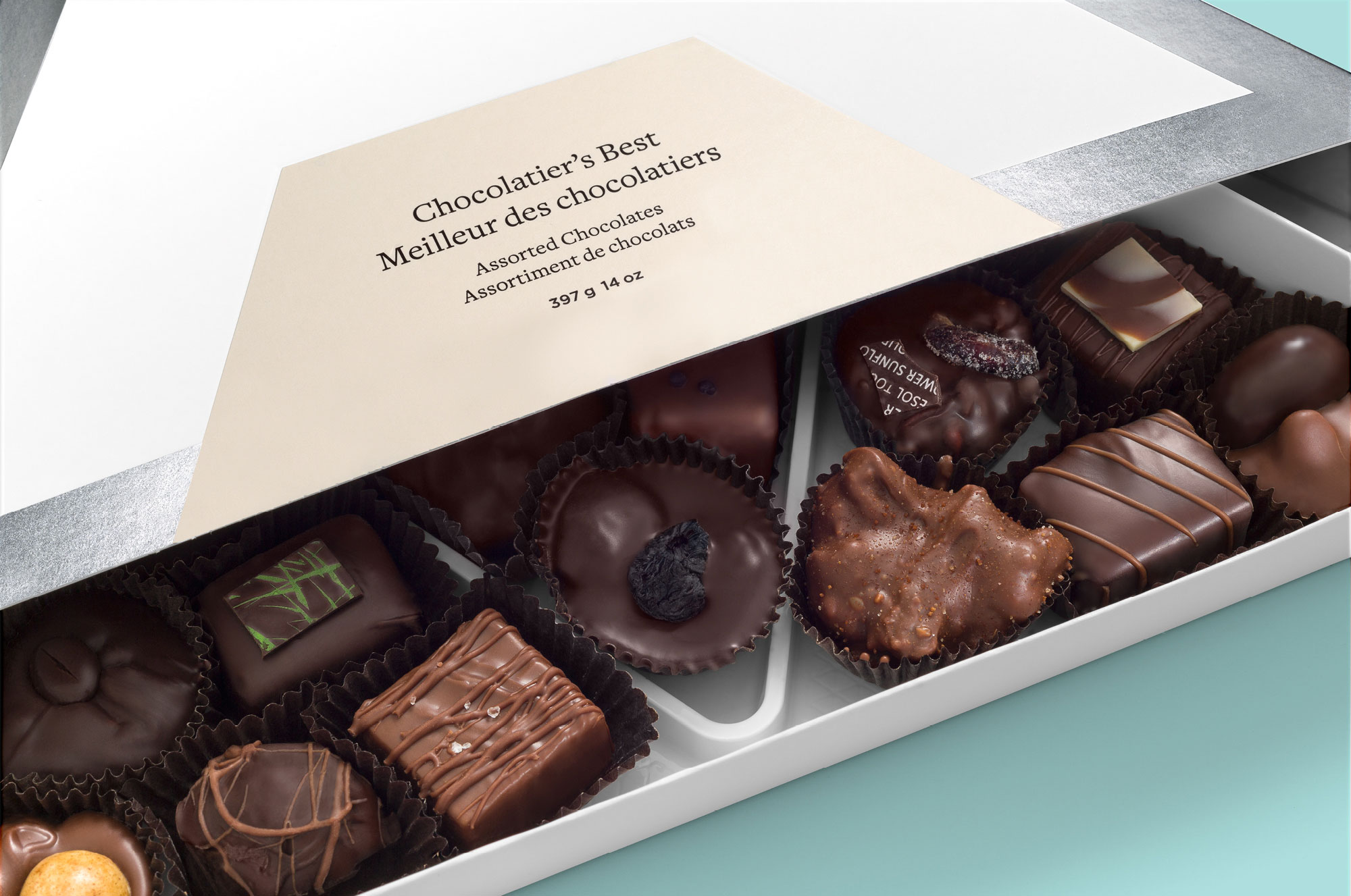
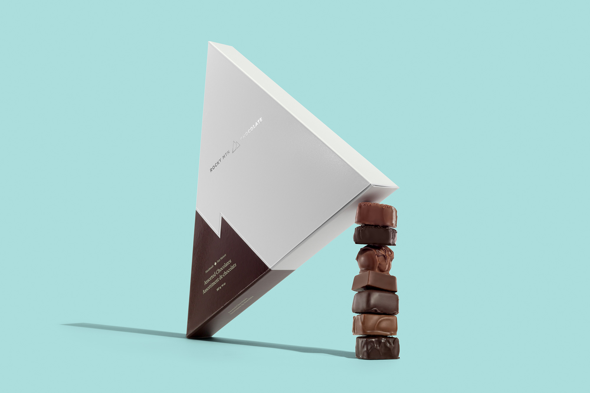
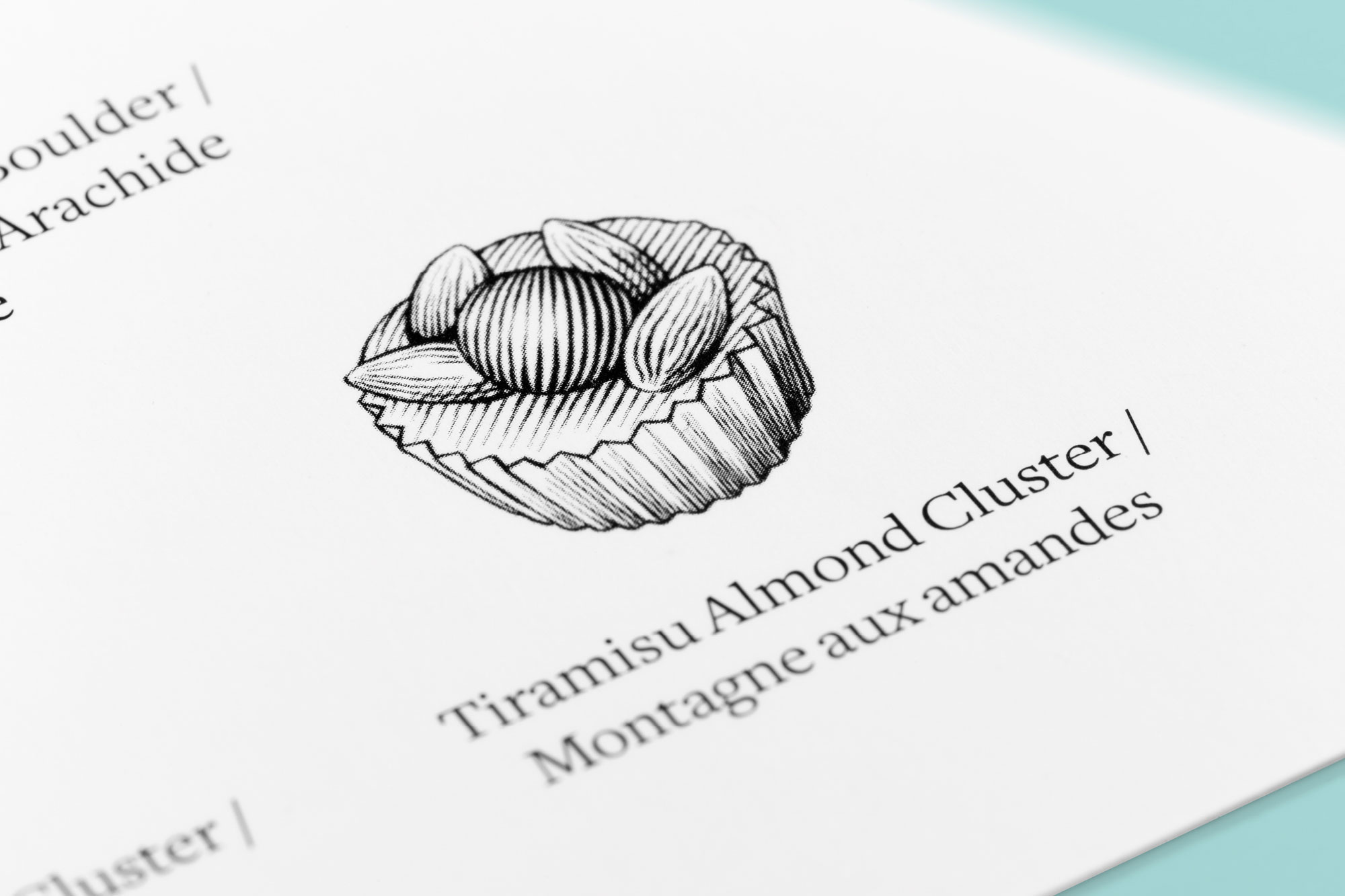
As their marquee chocolate collection, Rocky’s Signature Peak Boxes needed a new approach that aligned with their renewed emphasis on gift giving. We focused on elevating the customer journey; designing a Peak Box that matched their modern elegance. The new look has a minimal aesthetic and abstractly features a snow-covered mountain peak, grounding it in the brand’s history. Premium production techniques such as soft-touch varnish, silver foil debossing, and a gloss varnish label make the unboxing experience memorable—their tactile nature acts as a precursor to the pleasure of indulging in the chocolate that awaits within. Product information is displayed clearly—in both French and English—as the typeface conveys the brand’s sophisticated yet traditional spirit.



02
Working directly with the master chocolatiers at Rocky is always a pleasure. One might liken it to an all-access pass to Willy Wonka’s personal kitchen. When Rocky tasked us with developing small-batch chocolate bars with big impact, we knew the flavors and packaging needed to boldly differentiate from the competition to establish them as innovators within the category. For each collection that we curate, an intense tasting process ensues (naturally), making the experience one of our favorites.
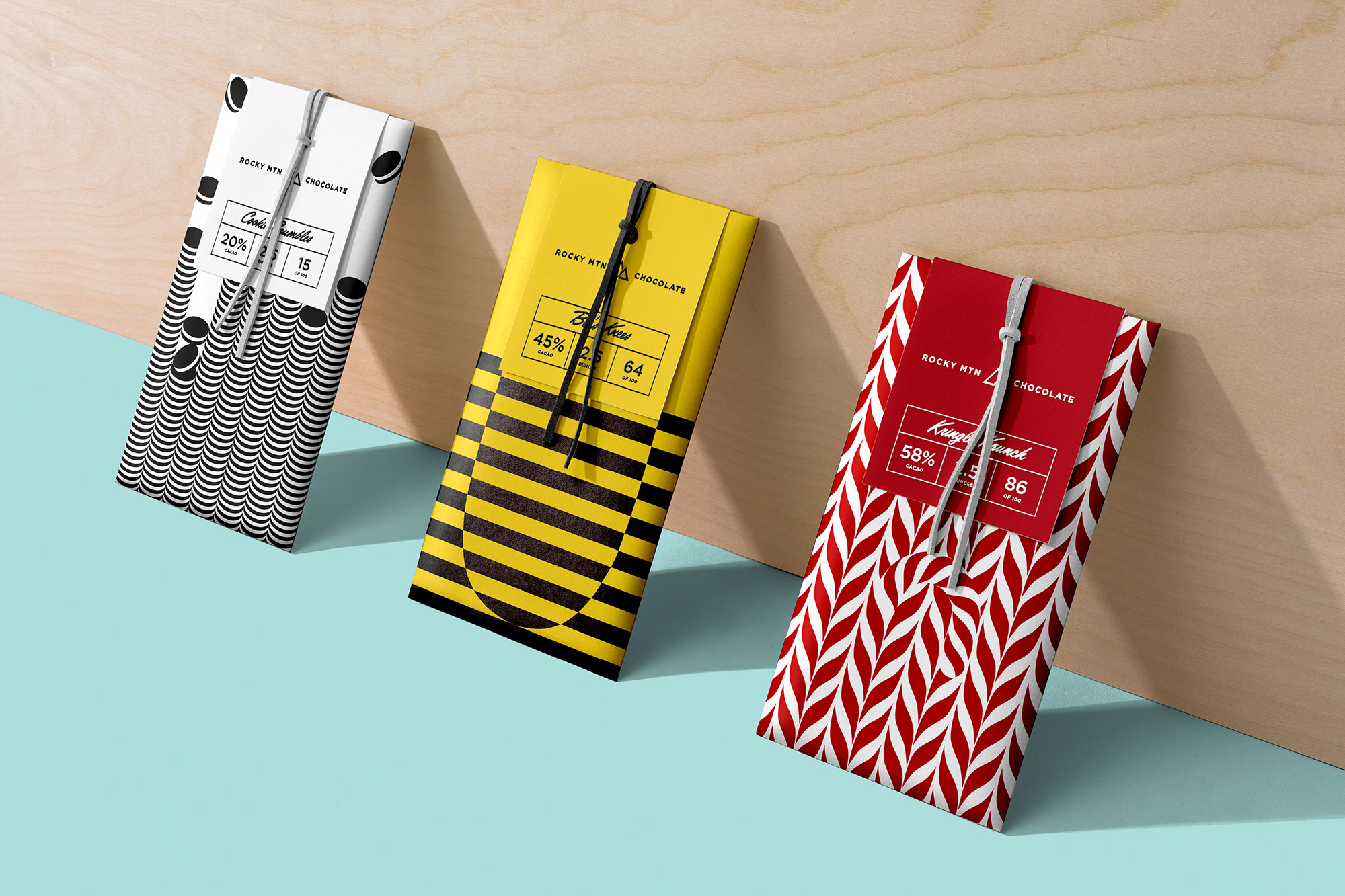
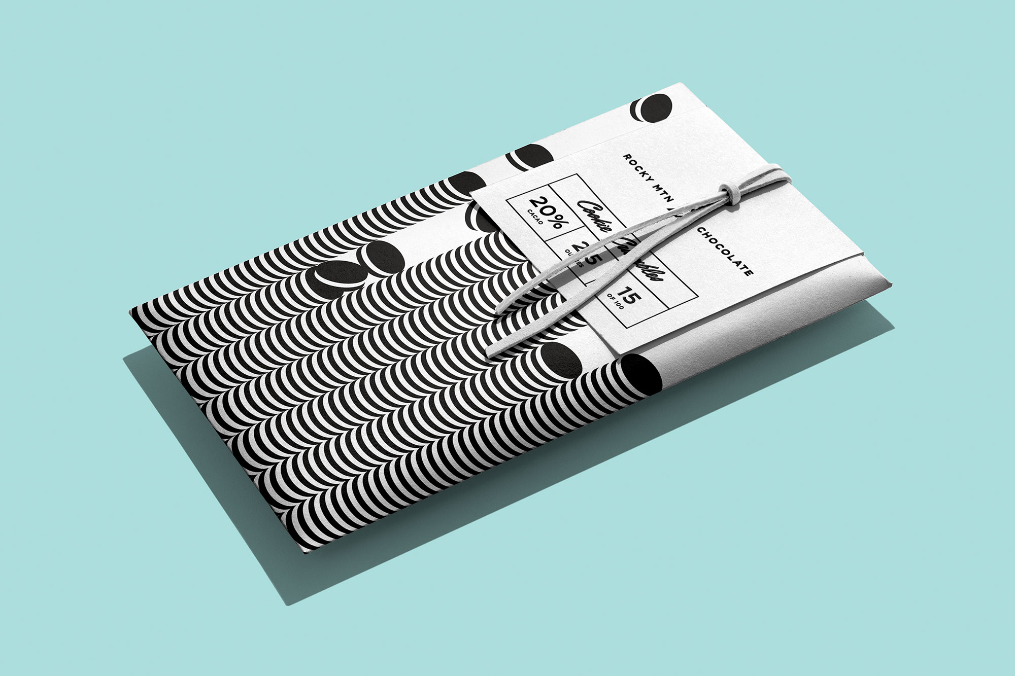
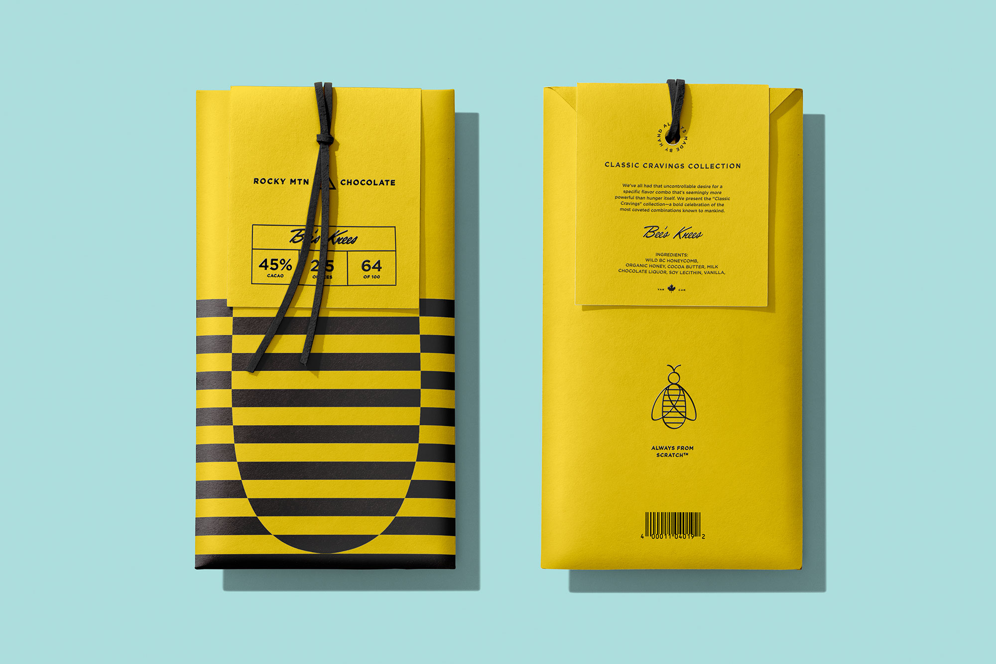
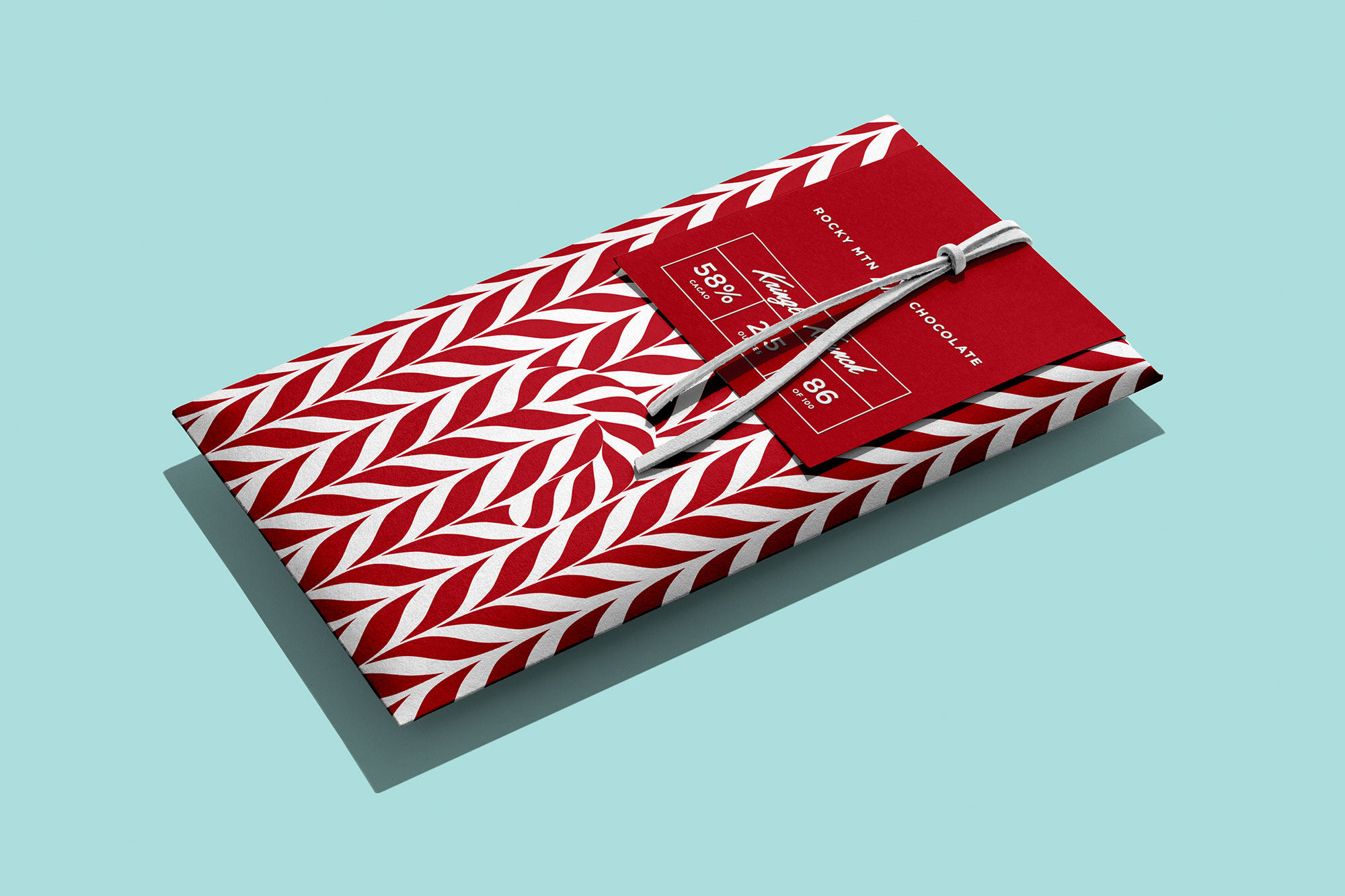
We’ve all had that uncontrollable desire for a specific flavor combo that’s seemingly more powerful than hunger itself. We present the “Classic Cravings” collection—a bold celebration of the most coveted combinations known to mankind. Starting with the ever-popular “Cookie Crumbles” bar, we paired delectable cookie chunks with smooth milk chocolate made from fresh crème. The “Bee’s Knees” bar uses organic honeycomb that’s hand-picked from local bee keepers and the “Kringle Krunch” infuses crushed Middle Eastern peppermint with dark chocolate to quench even the strongest of cravings.
We’ve all had that uncontrollable desire for a specific flavor combo that’s seemingly more powerful than hunger itself. We present the “Classic Cravings” collection—a bold celebration of the most coveted combinations known to mankind. Starting with the ever-popular “Cookie Crumbles” bar, we paired delectable cookie chunks with smooth milk chocolate made from fresh crème. The “Bee’s Knees” bar uses organic honeycomb that’s hand-picked from local bee keepers and the “Kringle Krunch” infuses crushed Middle Eastern peppermint with dark chocolate to quench even the strongest of cravings.
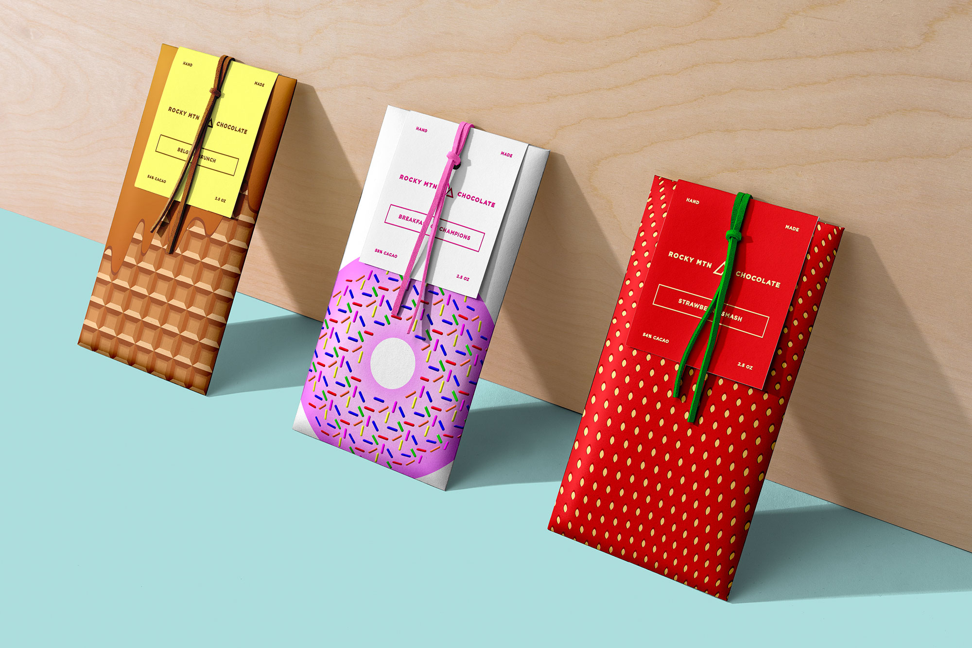
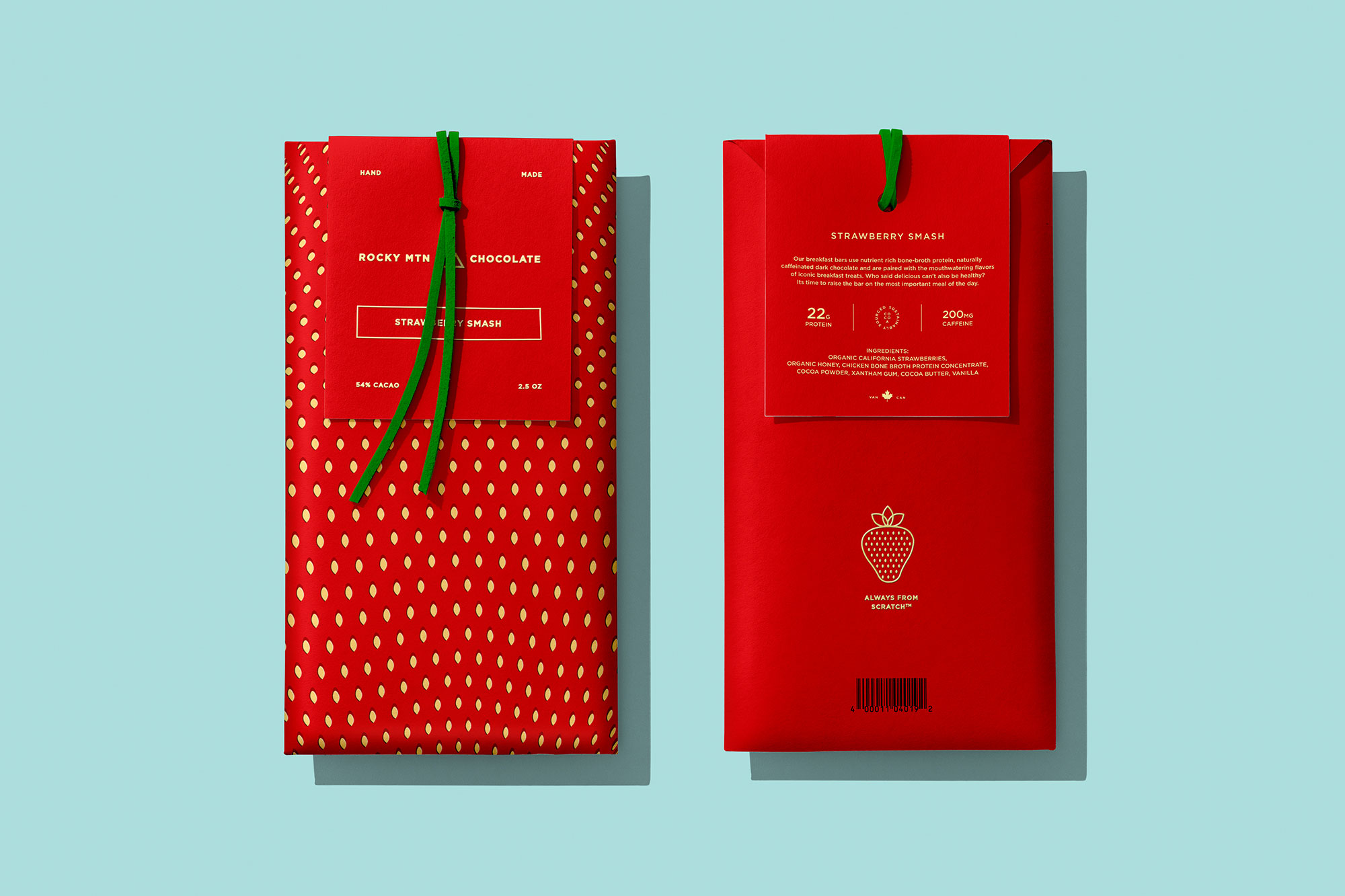
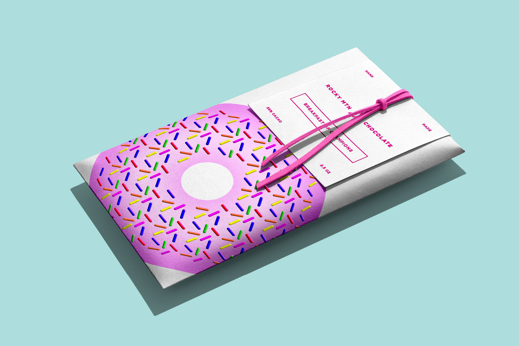
We created a line of meal-replacement bars inspired by the most important meal of the day: breakfast. These bars use nutrient rich bone-broth protein, naturally caffeinated dark chocolate, and are paired with the mouthwatering flavors of iconic breakfast treats. The savory “Belgium Brunch” bar uses a griddle-made waffle base coated with fresh Canadian maple syrup, while the “Breakfast of Champions” celebrates the indulgence of fresh 4:00am donuts with a healthy spin using vegan and sugar-free sprinkles. For the “Strawberry Smash”, we sourced organic California strawberries to pair with caffeinated dark chocolate—the perfect start to any morning.
We created a line of meal-replacement bars inspired by the most important meal of the day: breakfast. These bars use nutrient rich bone-broth protein, naturally caffeinated dark chocolate, and are paired with the mouthwatering flavors of iconic breakfast treats. The savory “Belgium Brunch” bar uses a griddle-made waffle base coated with fresh Canadian maple syrup, while the “Breakfast of Champions” celebrates the indulgence of fresh 4:00am donuts with a healthy spin using vegan and sugar-free sprinkles. For the “Strawberry Smash”, we sourced organic California strawberries to pair with caffeinated dark chocolate—the perfect start to any morning.

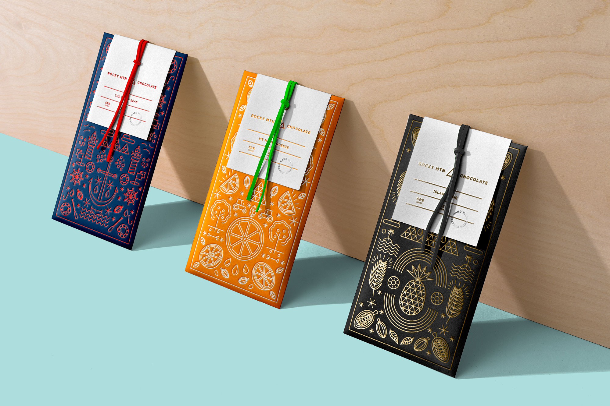
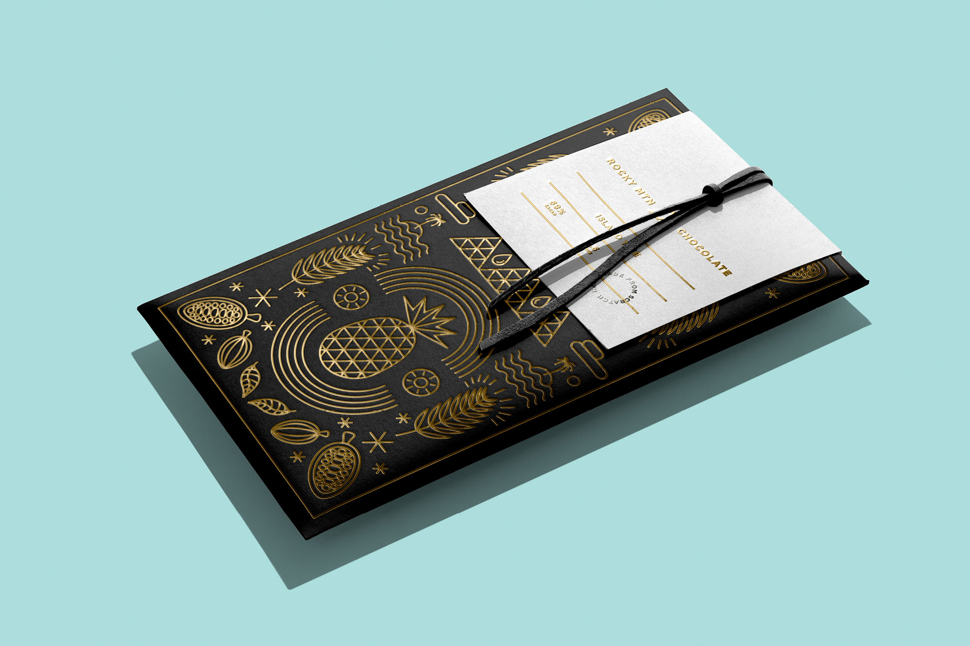
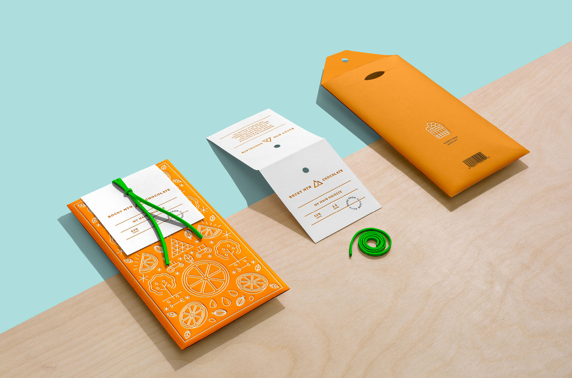
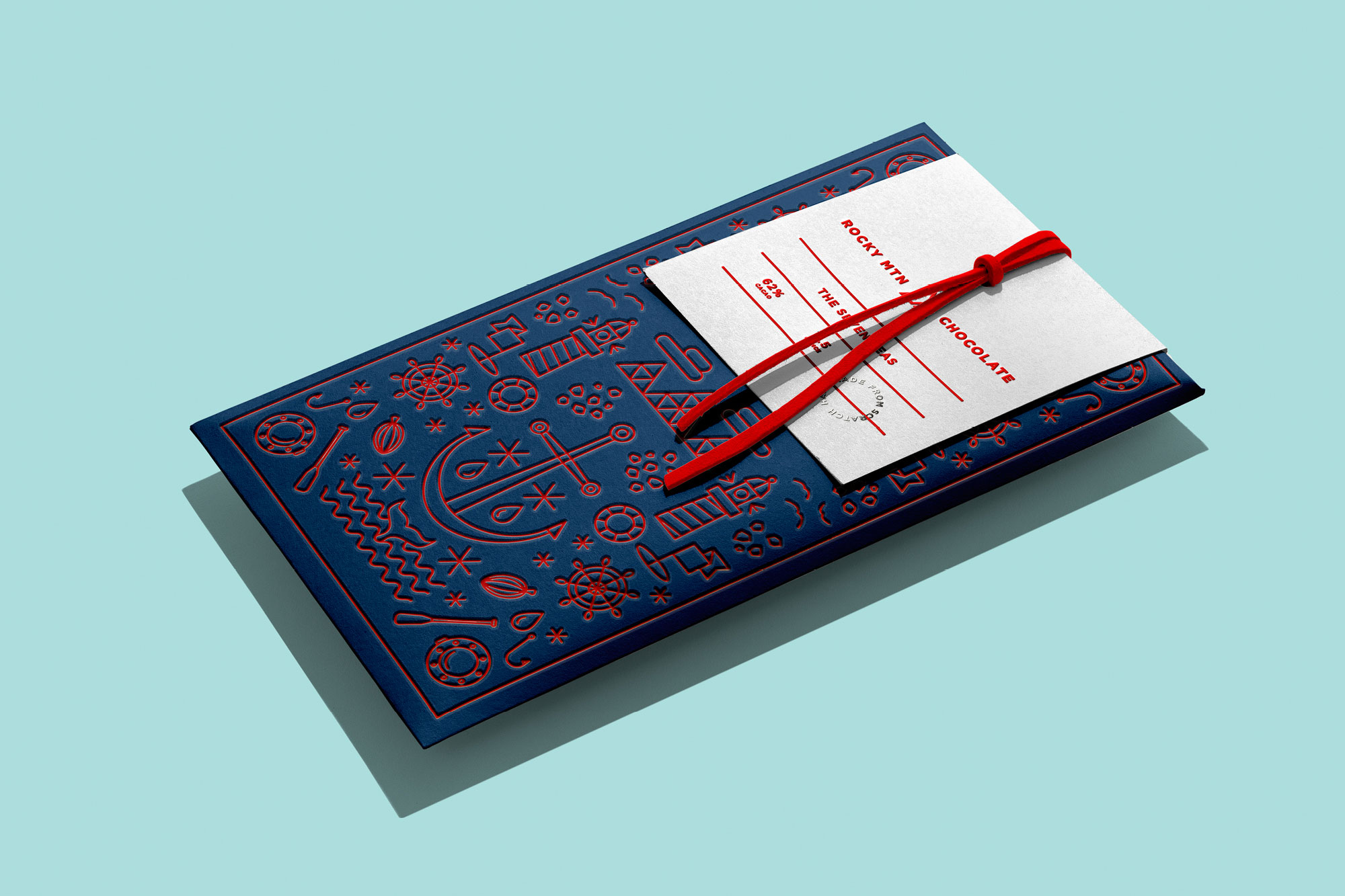
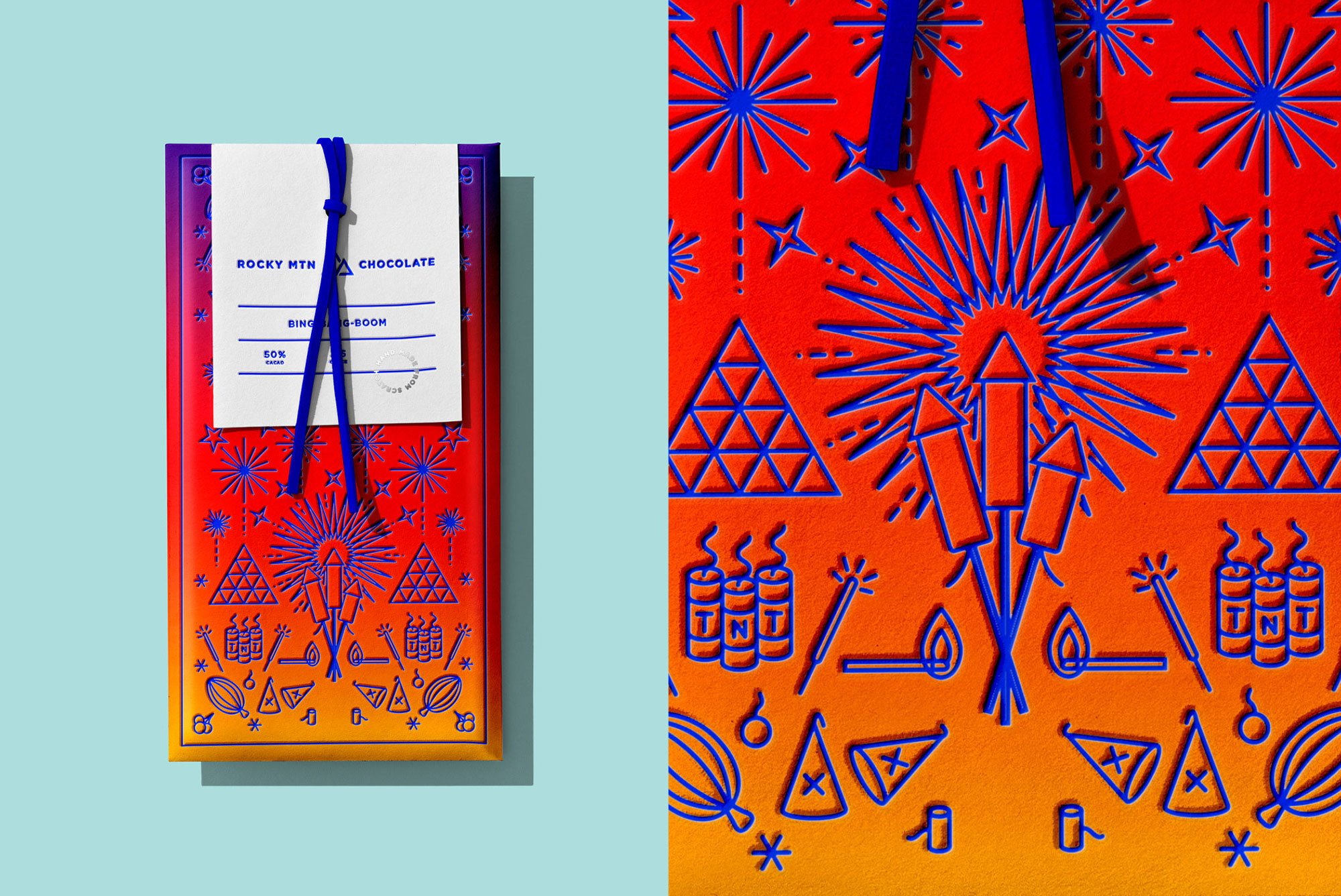
Similar to grapes cultivated for wine, cacao beans distinctly reflect the flavor profiles of the environment in which they were harvested. For the “Lineage” line, we celebrated the origins of each ingredient to highlight the bean-to-bar process. This line explores both classic flavor profiles like the savory “Seven Seas,” which pairs coastal-grown Chilean cacao with the complex flavors of Mediterranean Sea salt, and new flavors like the Florida orange-infused “Main Squeeze,” Hawaiian pineapple-infused “Island Time,” and the pop-rocks-infused “Bing-Bang-Boom.”
Similar to grapes cultivated for wine, cacao beans distinctly reflect the flavor profiles of the environment in which they were harvested. For the “Lineage” line, we celebrated the origins of each ingredient to highlight the bean-to-bar process. This line explores both classic flavor profiles like the savory “Seven Seas,” which pairs coastal-grown Chilean cacao with the complex flavors of Mediterranean Sea salt, and new flavors like the Florida orange-infused “Main Squeeze,” Hawaiian pineapple-infused “Island Time,” and the pop-rocks-infused “Bing-Bang-Boom.”
03
For Rocky Mountain Chocolate’s premium chocolate collection, the packaging needed to be as contemporary as the delicacies inside. Featuring single-origin cacao and rare ingredients like Himalayan salt and pistachio marzipan, this assortment represents the pinnacle of the brand. The icon is set in debossed silver foil surrounded by a sea of white soft touch, sparking intrigue and exclusivity. The silver foil wrapping the edges frames the package, while the label’s cream color celebrates the delicious ingredient at the core of their brand: cocoa butter.
