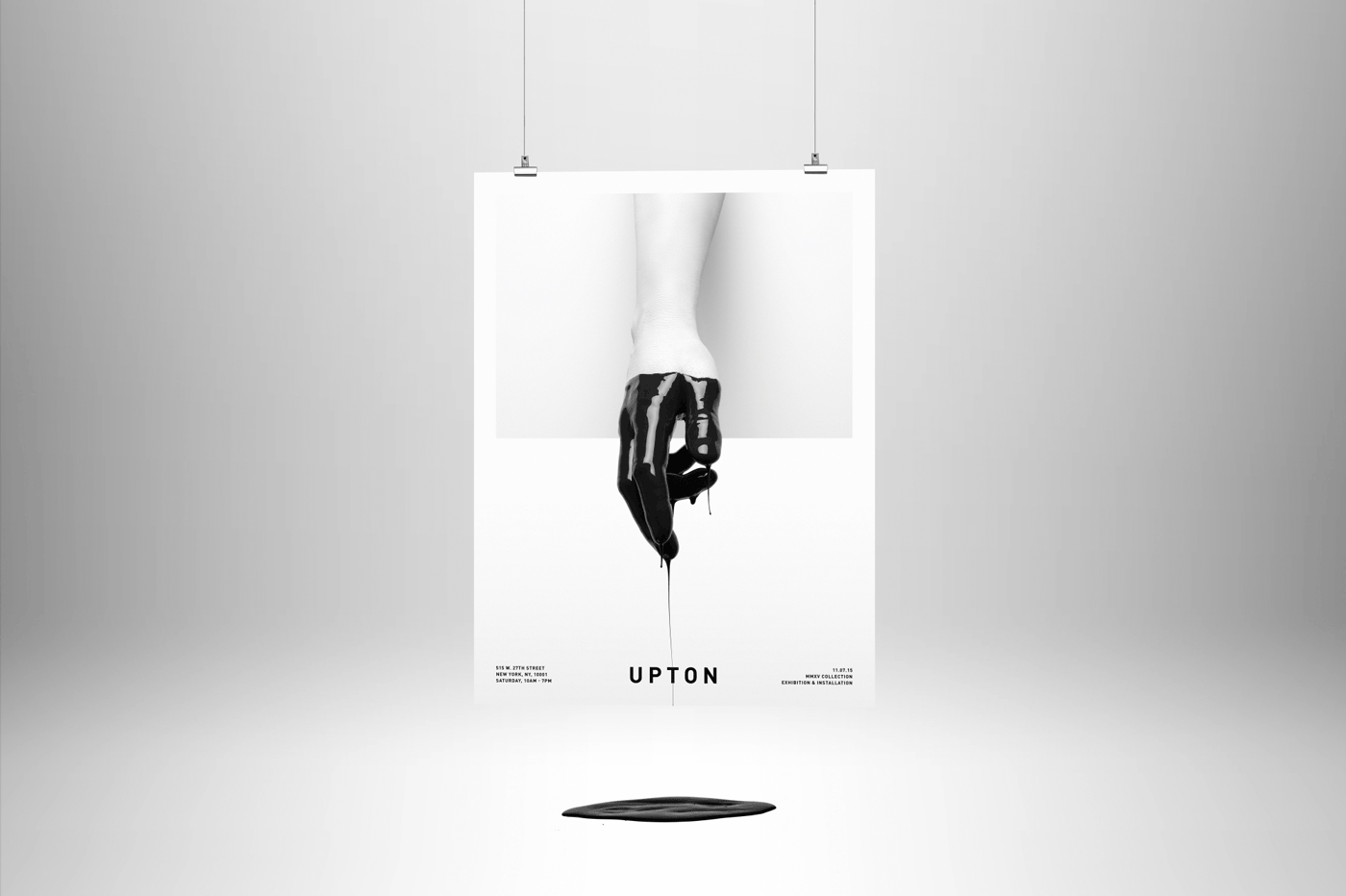
Branding
Upton Belts
Upton Belts
In 2014, a fashion-minded group of entrepreneurs asked us to build a brand from the ground up after determining that white space existed within the belt market. After our own analysis, we realized that not only was the group correct, but that an online-exclusive brand would ensure an American-made, premium product with an edge on pricing. We also determined that fit would be critical to our competitive advantage.
The e-commerce model presented significant challenges for a custom-made product—primarily a lack of direct customer interaction. To make a lasting impression we needed to bridge the gap between the brand’s digital home and its real-world presence through our key consumer touchpoints: packaging and print collateral.
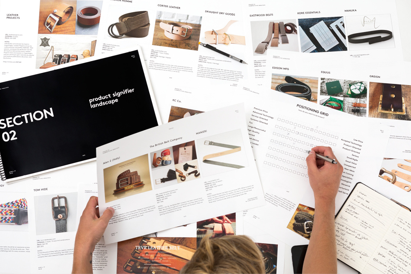
To understand the client’s objectives, and to guide our discovery phase, we first went over the client’s research and interviewed all key stakeholders. We then defined the market by carefully compiling a list of over 100 different brands, categorizing them based on key characteristics.
Based on research and discussion with the client, we selected 16 competitors to evaluate based on brand experience from a consumer’s viewpoint. This process guided an in-depth qualitative and quantitative study of each competitor. We then used perceptual mapping to visualize the competitive landscape, identify opportunities, and develop strategies for successful marketplace entry.
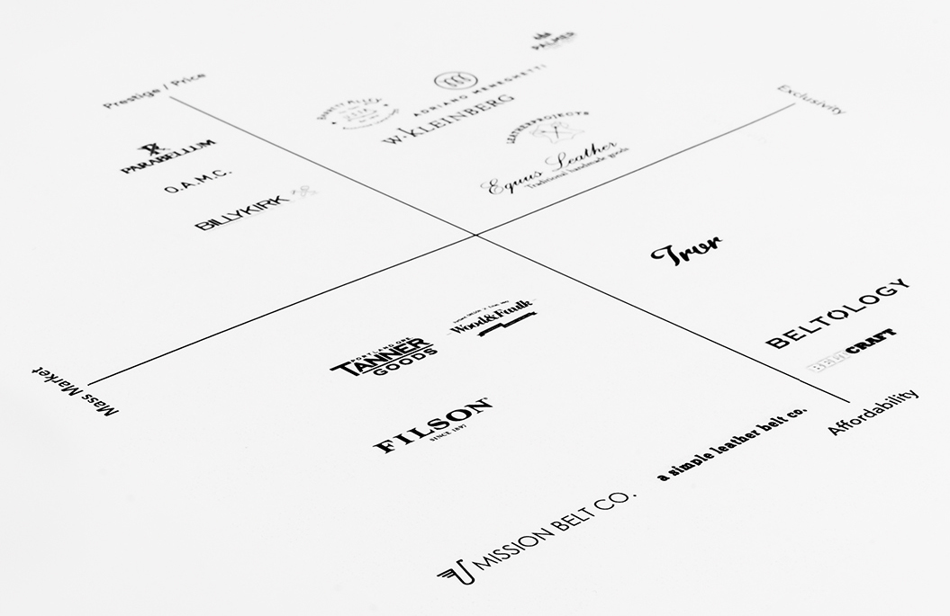
Based on research and discussion with the client, we selected 16 competitors to evaluate based on brand experience from a consumer’s viewpoint. This process guided an in-depth qualitative and quantitative study of each competitor. We then used perceptual mapping to visualize the competitive landscape, identify opportunities, and develop strategies for successful marketplace entry.
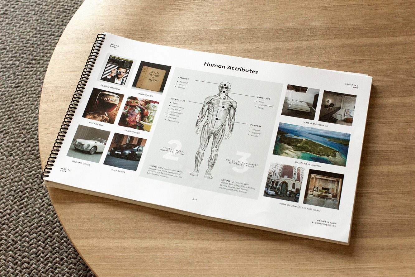
Once we had a thorough analysis of the market, we honed in on the core values, brand strategy, competitive advantages, and positioning of the brand. We worked with our client using our proprietary branding exercises to create a brand brief consisting of the brand’s essence, human attributes, and key objectives. This provided a solid foundation for long-term development.
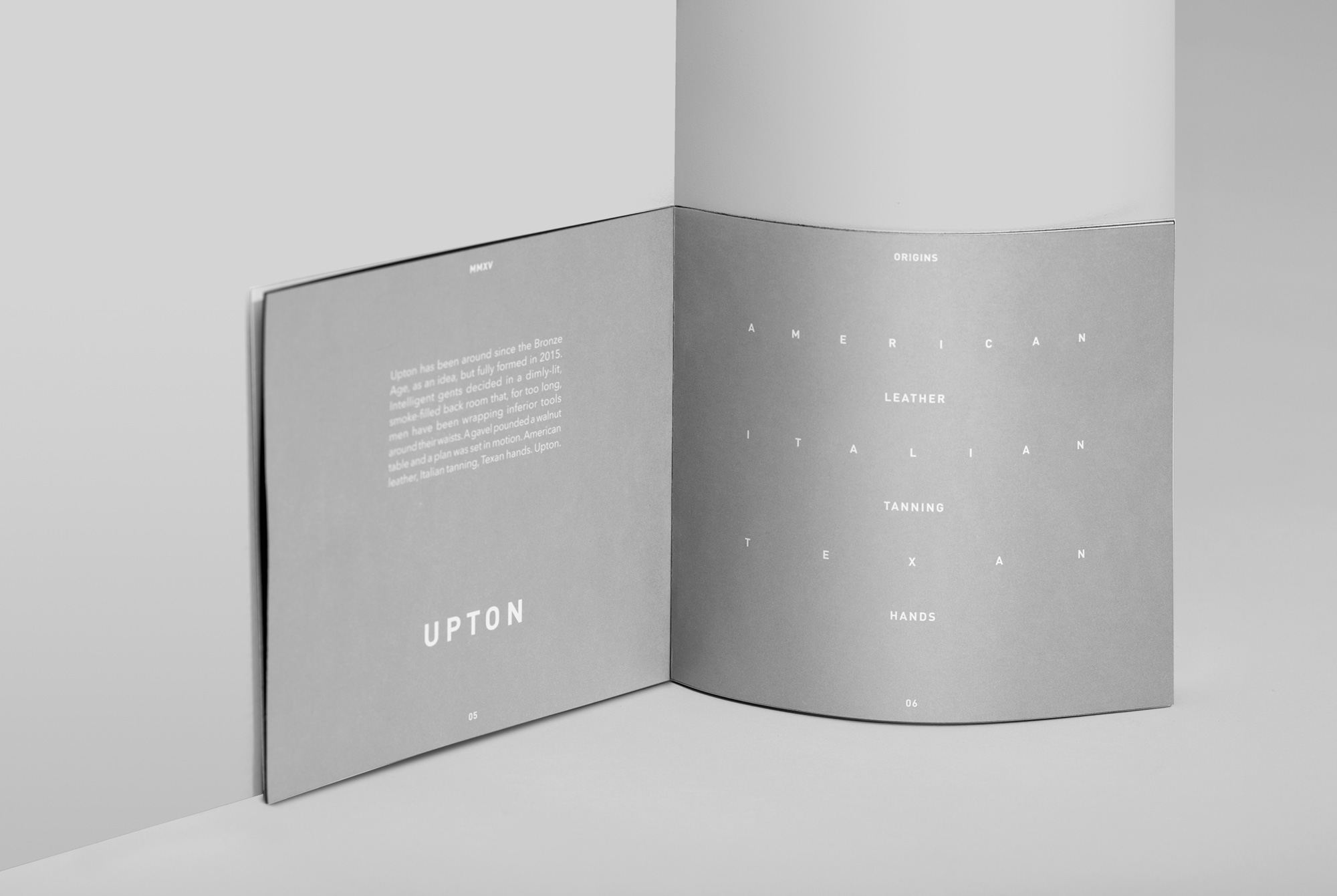
Guided by our naming criteria, we listed hundreds of potential names and evaluated each for origin, spelling and pronunciation ease, meaning, protectability, URL and social handle availability, distinctiveness, and visual structure. We wanted a surname with a historical significance that matched the brand’s attributes. A surname also pairs well with given names, which would assist in building a brand architecture for different lines and expansion beyond belts. The best candidates were submitted to our legal team for trademark pre-screening.
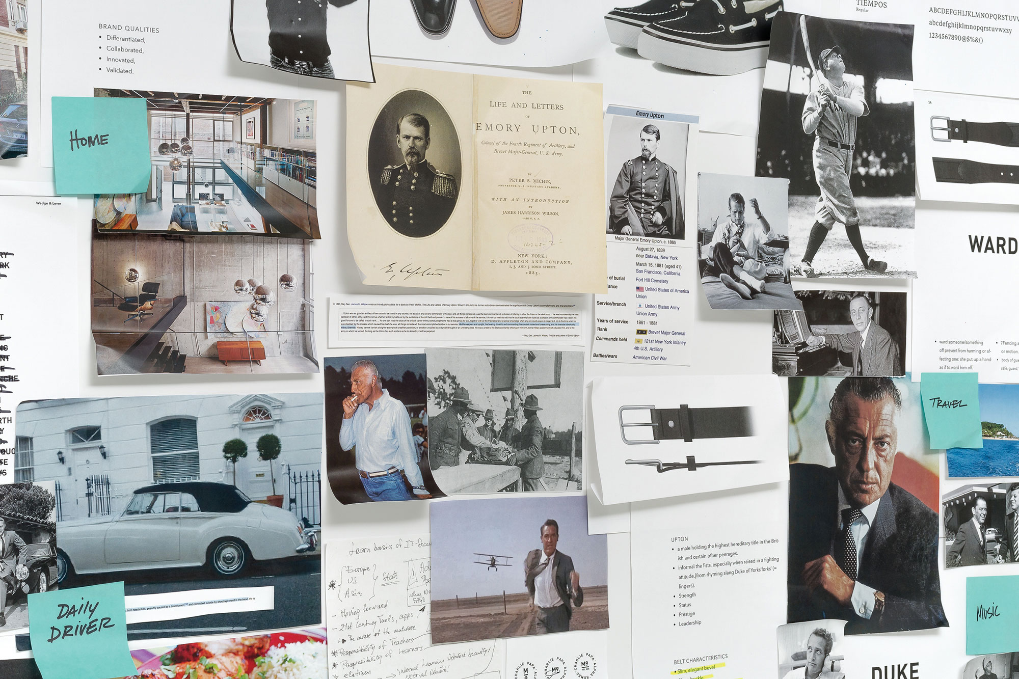
Our second round of naming examined the histories of surnames we favored. Upton, from the Old English words for “upper town” and a family name in use for centuries, immediately resonated for its familiarity and strength. We looked into Uptons from the past whose legacies mirrored the attributes established in the brand brief.
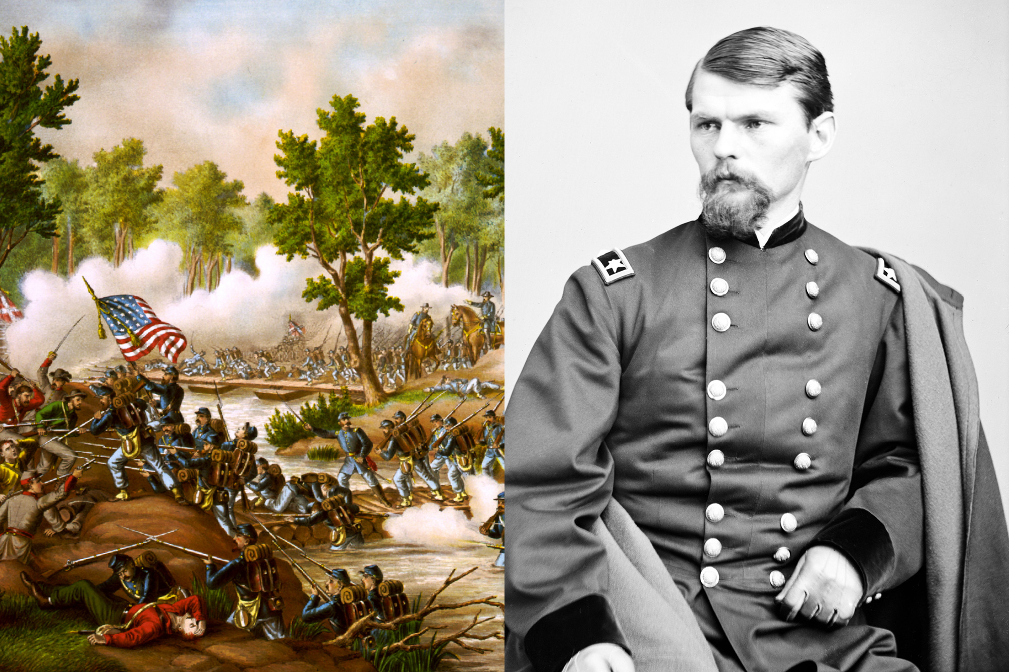
The most compelling was Emory Upton, a Civil War General who fought for the Union. Upton was wounded several times in battle, but continued to serve his country honorably. He was a model of resilience and strength, as well as a tireless defender of equality for all men.
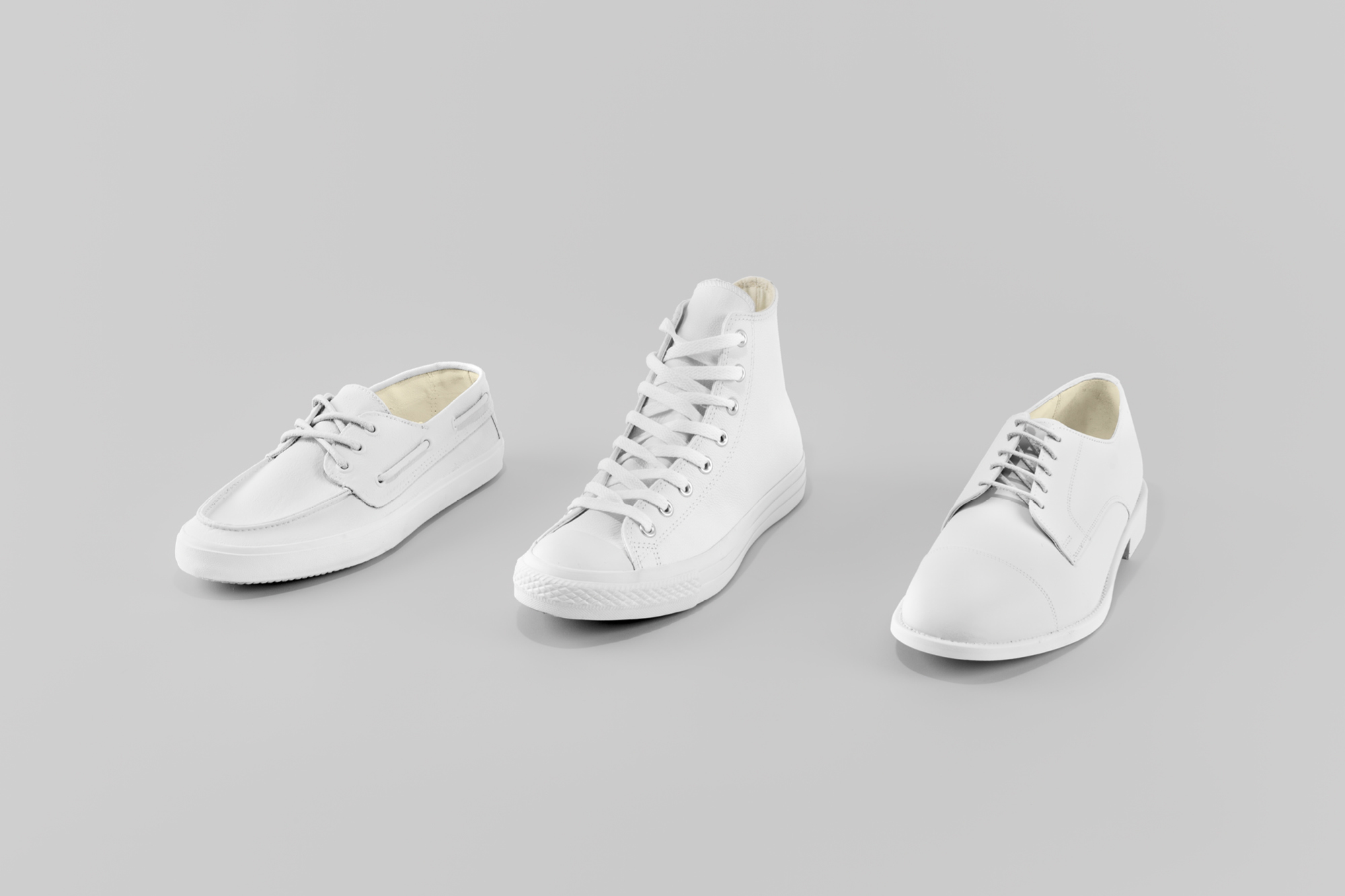
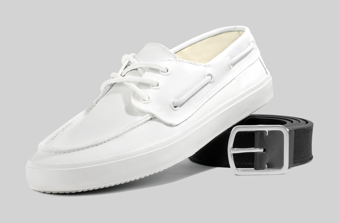
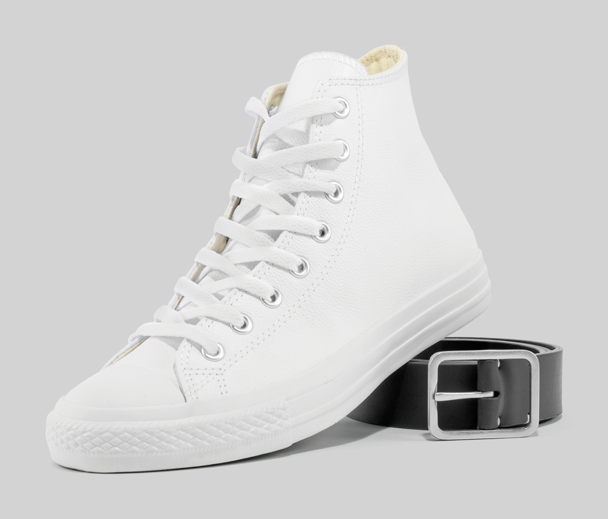
Belts are essential to any well-rounded outfit and are traditionally paired with shoes.
The color and materials of the belt, the width of the strap, and even the shape of the buckle are all taken into account when matching belt to shoe. Many occasions in a well-dressed man’s life call for different footwear styles. The same applies for his belt.
Early in the research stage we pegged the relationship between belt and footwear as a
perfect opportunity to build the brand’s product categories. For each of the three categories, we examined relevant historical archetypes to determine the key characteristics that defined these figures’ aspirations.
We then created a persona-driven narrative in which all three were brothers.
This established authenticity for each category within the brand architecture.
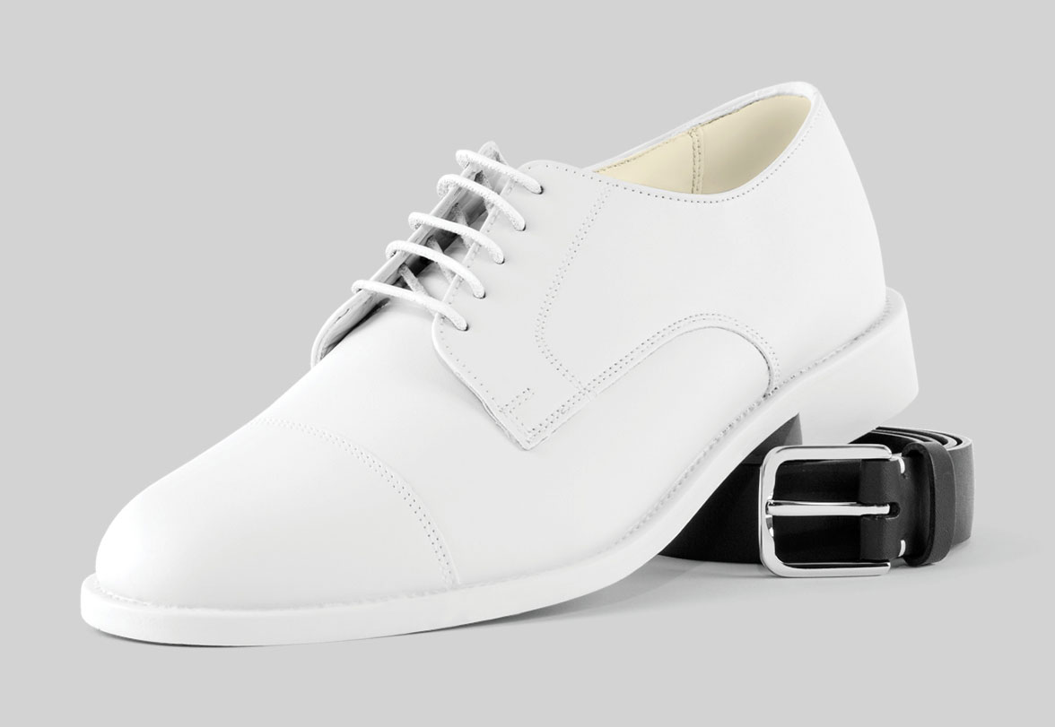
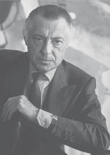
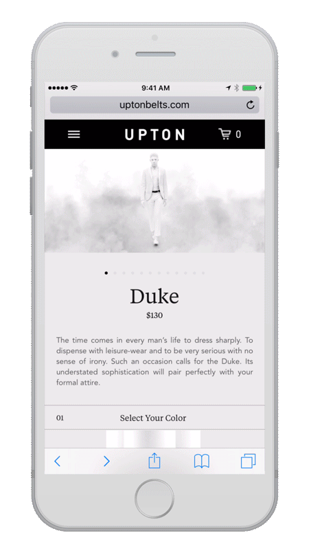
The time comes in every man’s life to dress sharply. To dispense with leisure-wear and to be very serious with no sense of irony. Such an occasion calls for the Duke. Its understated sophistication will pair perfectly with your formal attire.
He was born, quite literally, with a silver spoon in his mouth. His father had it forged on a business excursion to Bolivia shortly after its national revolution. Investors were fleeing due to the impending socialistic redistribution of wealth but his father was never one to fear any governmental system. “Money is meaningless,” he would often say between sips of Negroni. “It ceases to be the goal. The game is what counts.” He lost millions in Bolivia but gained it back in Argentina before tripling it in Zaire.
And love of the game transferred directly to his firstborn. He took to all things sterling with uncanny panache. His first investment, in a friend’s sow, earned him five dollars at the state fair when he was seven. From then on it was a series of financial wins, from plastics to an airline to a fleet of customized sailing yachts. His advisors would warn him from time to time, but he would send them off with a wave of a well-manicured hand: “Money doesn’t spend in hell!”
If he chose, he could retire to his country home in the Provence or his mid-century chalet in the Swiss Alps or his beach home in Kennebunport. But he chose not. He chose to play. And so he would show up to the office each morning wearing a Savile Row suit with a smile on his face. Yes, he bought his suits on Savile Row, his watches in Basel, his shoes in Milan, his signet rings in New York, his glasses in Denmark and his belt…well, his belt tied it all together.
The time comes in every man’s life to dress sharply. To dispense with leisure-wear and to be very serious with no sense of irony. Such an occasion calls for the Duke. Its understated sophistication will pair perfectly with your formal attire.

CHARACTER DEVELOPMENT
He was born, quite literally, with a silver spoon in his mouth. His father had it forged on a business excursion to Bolivia shortly after its national revolution. Investors were fleeing due to the impending socialistic redistribution of wealth but his father was never one to fear any governmental system. “Money is meaningless,” he would often say between sips of Negroni. “It ceases to be the goal. The game is what counts.” He lost millions in Bolivia but gained it back in Argentina before tripling it in Zaire.
And love of the game transferred directly to his firstborn. He took to all things sterling with uncanny panache. His first investment, in a friend’s sow, earned him five dollars at the state fair when he was seven. From then on it was a series of financial wins, from plastics to an airline to a fleet of customized sailing yachts. His advisors would warn him from time to time, but he would send them off with a wave of a well-manicured hand: “Money doesn’t spend in hell!”
If he chose, he could retire to his country home in the Provence or his mid-century chalet in the Swiss Alps or his beach home in Kennebunport. But he chose not. He chose to play. And so he would show up to the office each morning wearing a Savile Row suit with a smile on his face. Yes, he bought his suits on Savile Row, his watches in Basel, his shoes in Milan, his signet rings in New York, his glasses in Denmark and his belt…well, his belt tied it all together.

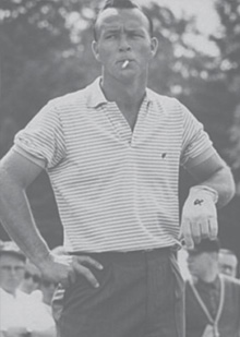
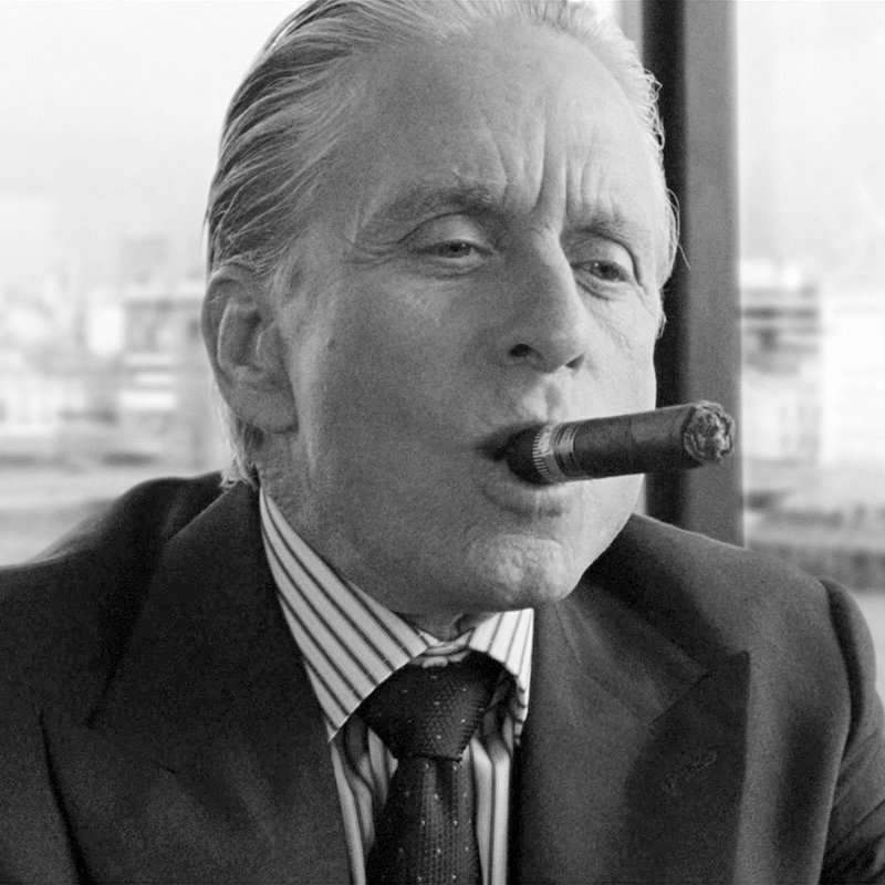
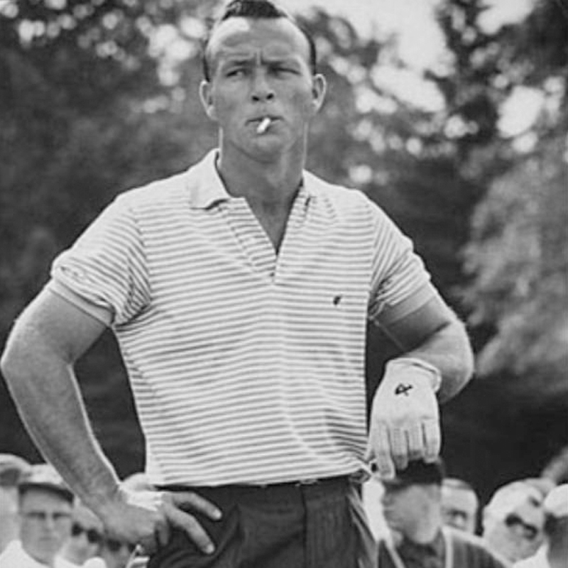
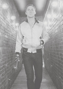
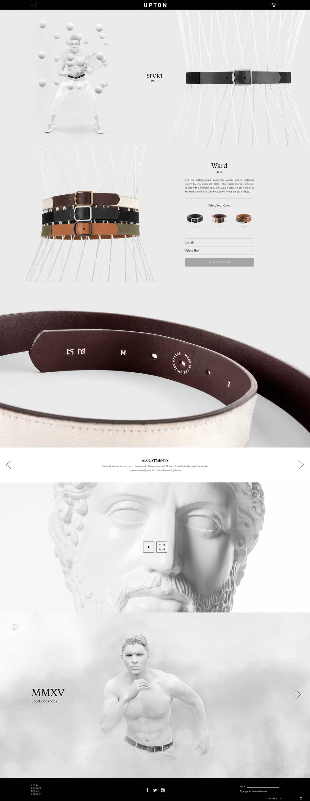
For the distinguished gentleman whose grit is matched solely by his exquisite taste. The Ward merges athletic ideals with a timeless look that would stop Arnold Palmer in his tracks. And, like The King, it will never go out of style.
“The sporting life is the only life,” he says with a laugh between matches or rounds or periods or whatever system is used to measure a particular game. He golfs, he fishes, he plays tennis, he sails, he climbs, he races, and he has gotten on a polo horse from time to time, but it’s always with the same attitude. His friends and competitors call it, “Devil may care,” and he finishes the idiom for them, always with a laugh: “The devil may care, but I certainly don’t.”
He had played amateur tennis, early on, but was permanently banned from the All England Lawn Tennis and Croquet Club for an alleged summer affair with Lady Helen Taylor, the Duke of Kent and the reigning president’s daughter. So he moved to amateur sailing and then to mountaineering. Even as an amateur he became one of only thirty-one to summit all of earth’s peaks above 8,000 meters, though his archrival Ralf Dujmovits of Germany disputed his route on Annapurna I.
Whenever he walks into a room, especially if that room has a well-stocked bar, people flock to his side. They want to hear his latest adventure, and he never disappoints them. “Devil may care…” they say while rubbing their chins in awe. “The devil may care, but I certainly don’t,” he laughs back while hitching his thumb through his belt.
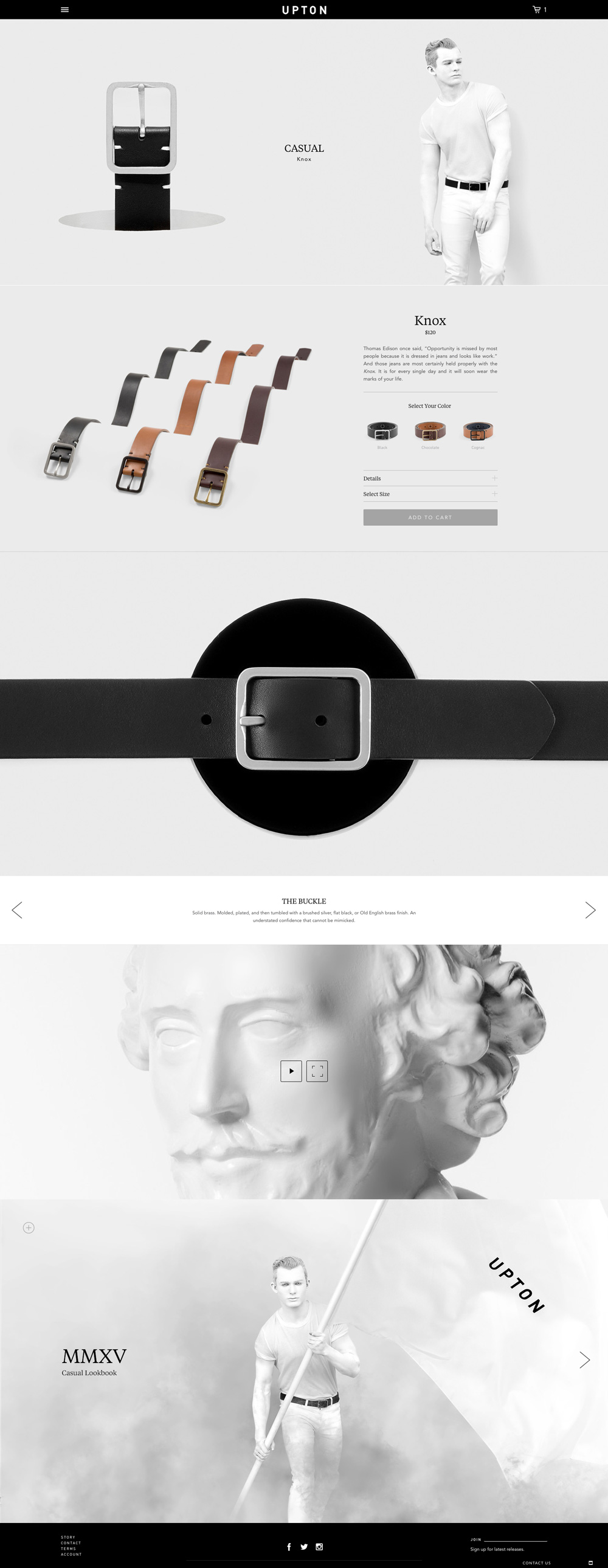
Thomas Edison once said, “Opportunity is missed by most people because it is dressed in jeans and looks like work.” And those jeans are most certainly held properly with the Knox. It is for every single day and it will soon wear the marks of your life.
He never speaks. Or rarely. There is simply no need. He does what he does, and that is all that needs to be said. Cliches like “actions speak louder than words” or “a man is known through his deeds” are just that. Cliches. They don’t sum him up. They don’t speak for him either.
Any time he is present, people listen. They listen to his hands, roughed by dirt or lined with grease. They listen to his eyes, piercing and solemn. They listen to his expression, intent but detached. They listen to his boots, his gloves, his jacket, and his belt. All perfectly worn leather. All telling stories far grander than any of them could imagine.
Thomas Edison once said, “Opportunity is missed by most people because it is dressed in jeans and looks like work.” And those jeans are most certainly held properly with the Knox. It is for every single day and it will soon wear the marks of your life.
CHARACTER DEVELOPMENT
He never speaks. Or rarely. There is simply no need. He does what he does, and that is all that needs to be said. Cliches like “actions speak louder than words” or “a man is known through his deeds” are just that. Cliches. They don’t sum him up. They don’t speak for him either.
Any time he is present, people listen. They listen to his hands, roughed by dirt or lined with grease. They listen to his eyes, piercing and solemn. They listen to his expression, intent but detached. They listen to his boots, his gloves, his jacket, and his belt. All perfectly worn leather. All telling stories far grander than any of them could imagine.
01
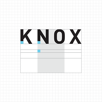
In a world inundated with noisy brand messages, the primary challenge lies in reducing a complex idea to its core visual essence. Our goal was to create a refined identity based on a contemporary minimalist aesthetic. This cultivates an effective brand experience by stripping away superfluities.
We created a balanced wordmark for the primary design identity and coupled this with a typographical system for each category. This provides design flexibility for the brand’s future expansion.
01
In a world inundated with noisy brand messages, the primary challenge lies in reducing a complex idea to its core visual essence. Our goal was to create a refined identity based on a contemporary minimalist aesthetic. This cultivates an effective brand experience by stripping away superfluities.
We created a balanced wordmark for the primary design identity and coupled this with a typographical system for each category. This provides design flexibility for the brand’s future expansion.
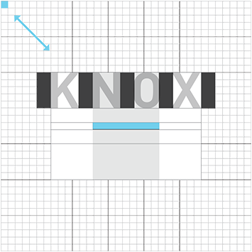
The wordmark was created using the primary typeface, DIN Bold, which was created in the early 20th century for use by the Royal Prussian Railway. It was subsequently used for road signage in Germany. Balanced off the symmetrical “T” at its center, the wordmark conveys feelings of strength, sophistication, and minimalism.
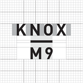
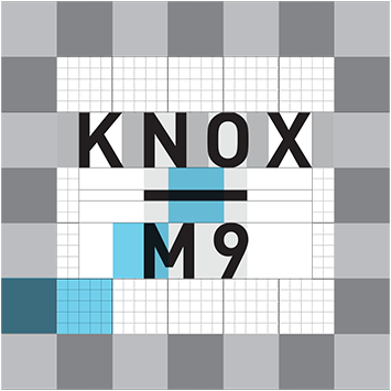
The identity system easily expands into sub-categories and products beyond belts. For example, KNOX M9 represents the casual portion of the launch collection of nine men’s belts. F9 will be used for the women’s line, and so on.
02
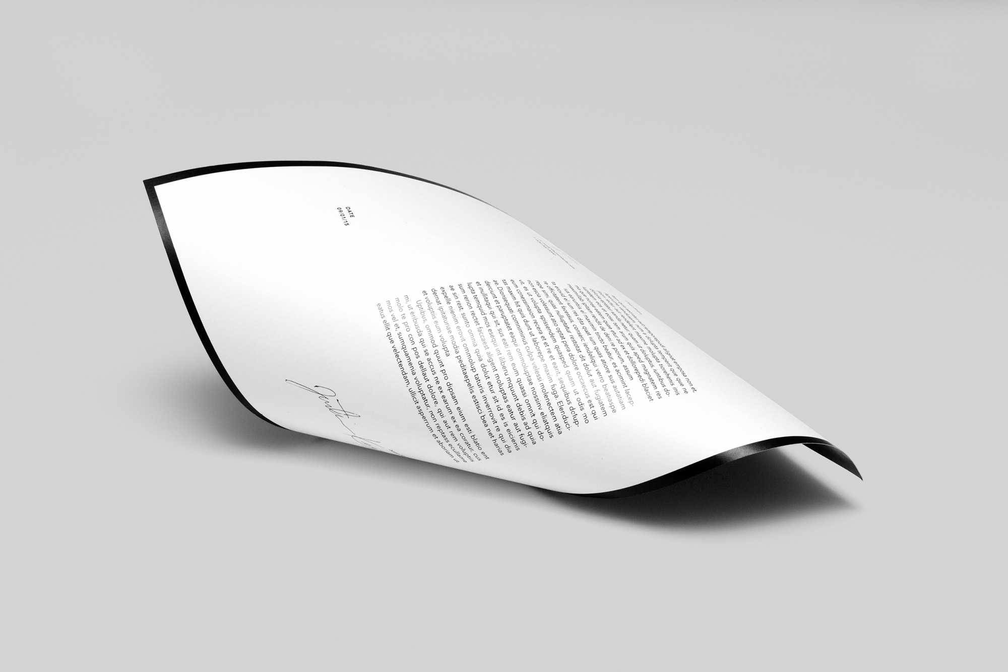
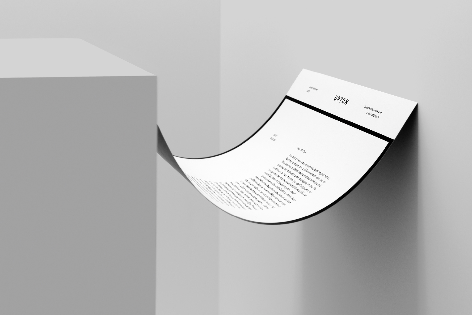
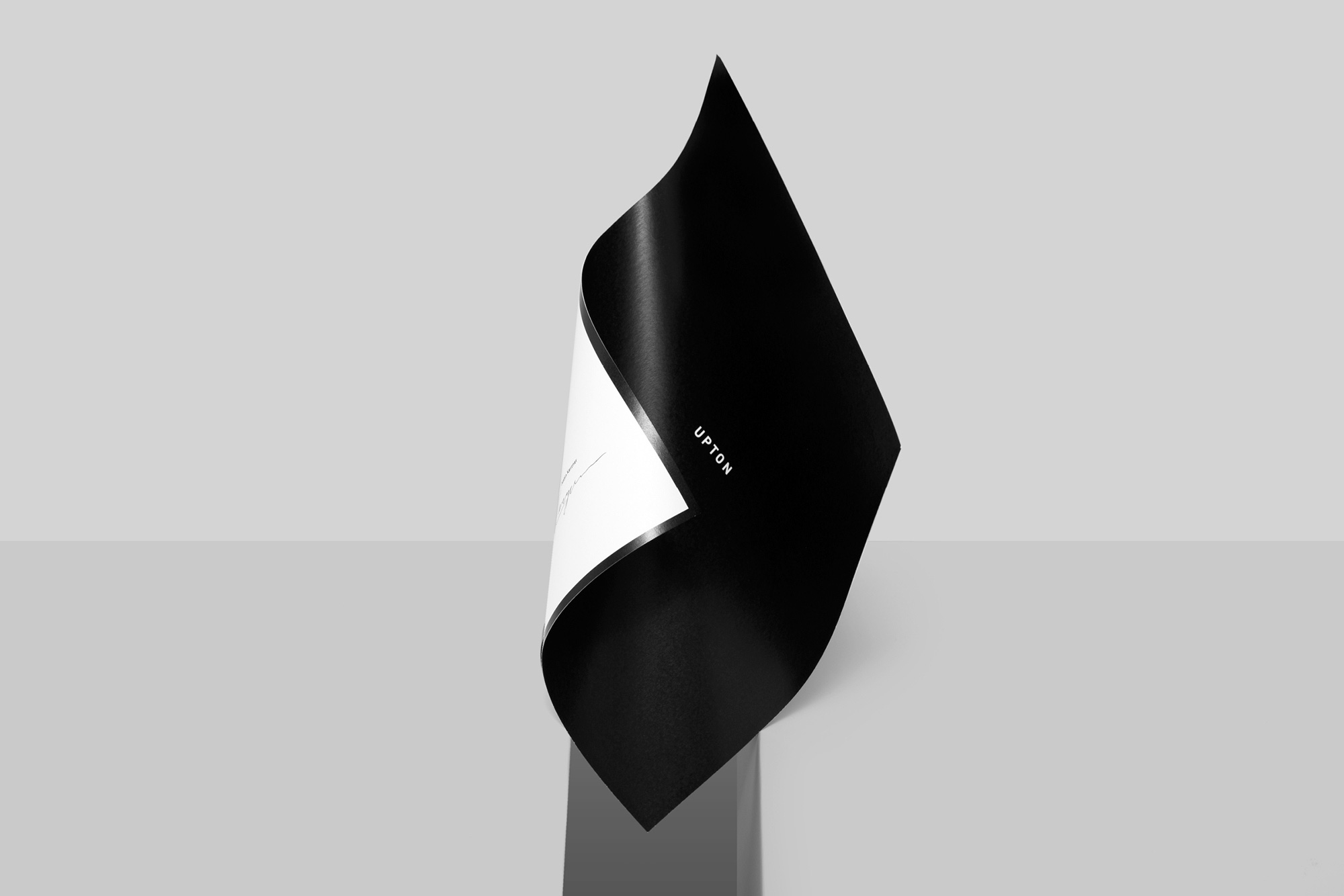
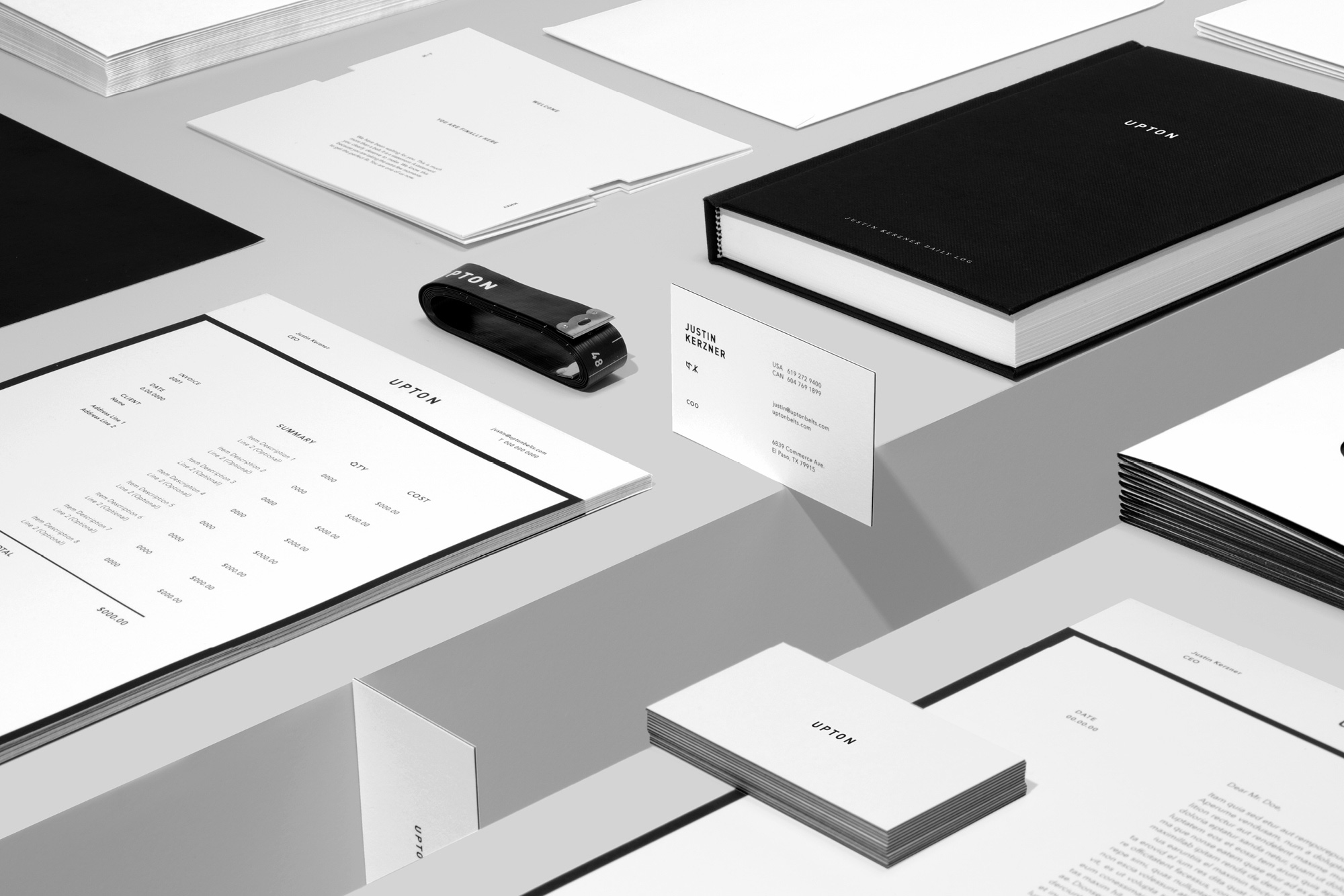
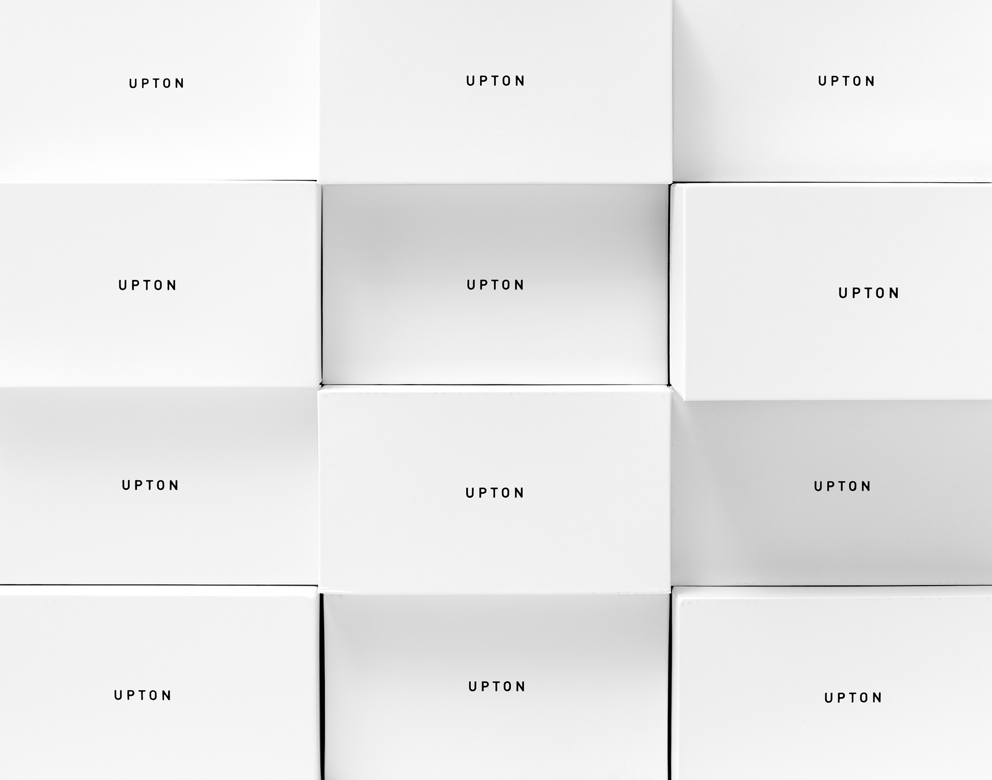
Upton’s print collateral is the primary physical manifestation of the brand, so it required close attention to detail. We emphasized quality of materials and unique production techniques to reinforce the brand’s aesthetic. Black was used across all pieces as a design element to either frame content or as a graphic representation of a belt, which creates a strong visual harmony binding all print collateral. Two unique letterhead designs were created, each targeted toward different segments within the corporate structure.
02
Upton’s print collateral is the primary physical manifestation of the brand, so it required close attention to detail. We emphasized quality of materials and unique production techniques to reinforce the brand’s aesthetic. Black was used across all pieces as a design element to either frame content or as a graphic representation of a belt, which creates a strong visual harmony binding all print collateral. Two unique letterhead designs were created, each targeted toward different segments within the corporate structure.
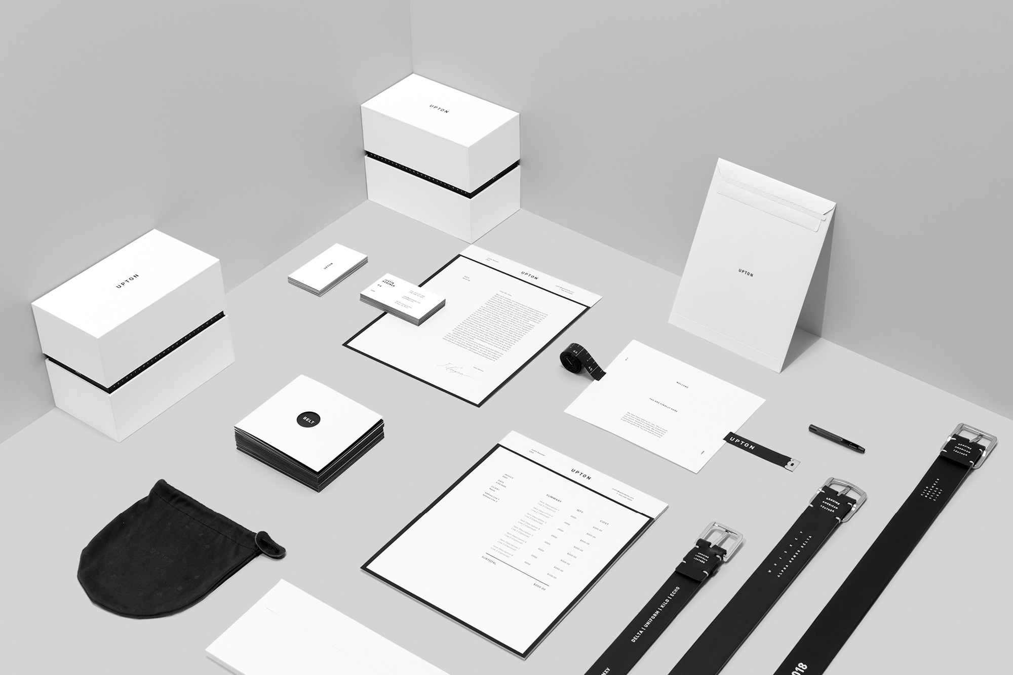
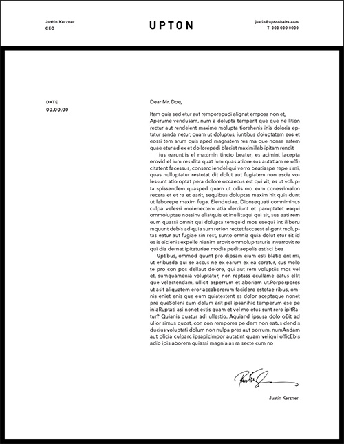
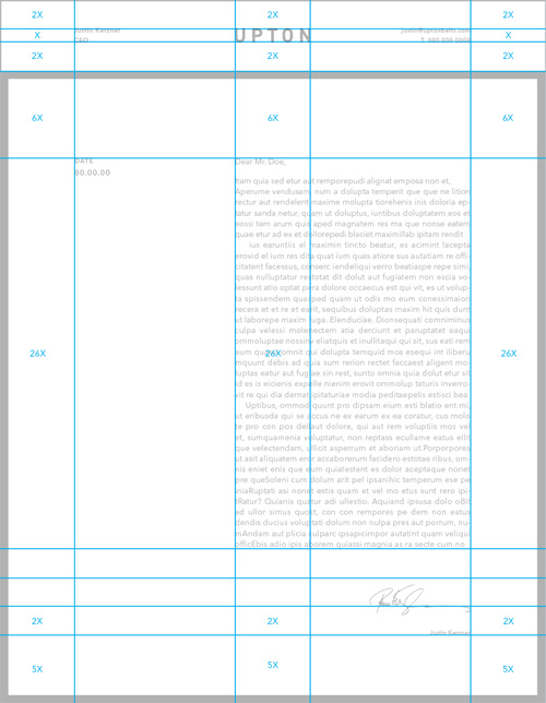
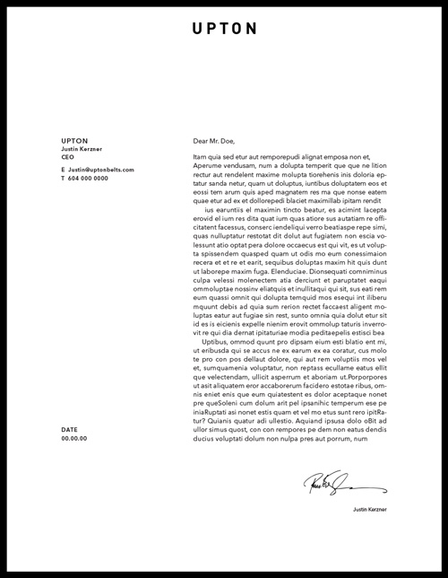
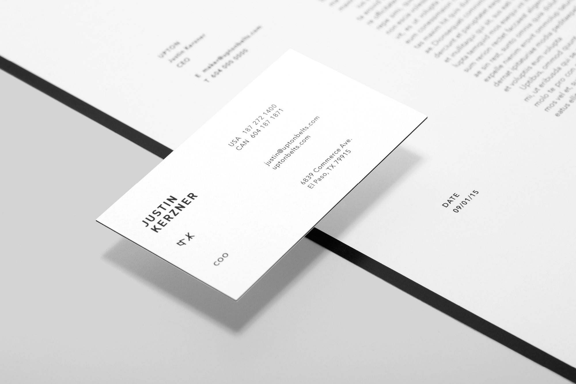
Corporate Letterhead is reserved for formal communications. It emphasizes details crucial for legal documents. Since this type of letterhead is often mailed, the bottom portion is designed to fold to meet the black line near the top, which allows the reader to clearly see the sender and contact information right from the envelope.
Used for daily communication within divisions and for invoices, the internal letterhead uses a concise system that clearly communicates the sender and the message to the recipient. It should never be folded or mailed. The grid reflects the visual aesthetic of the brand and allows for content flexibility.

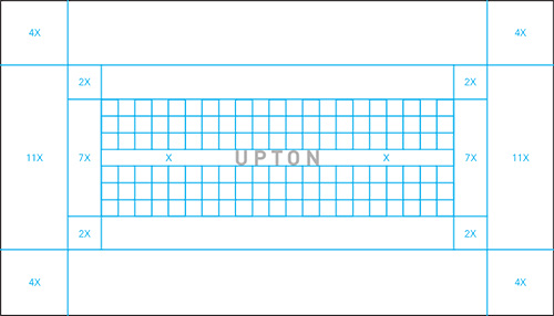
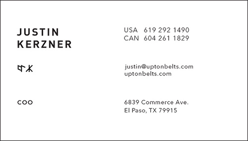
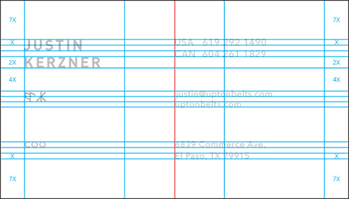
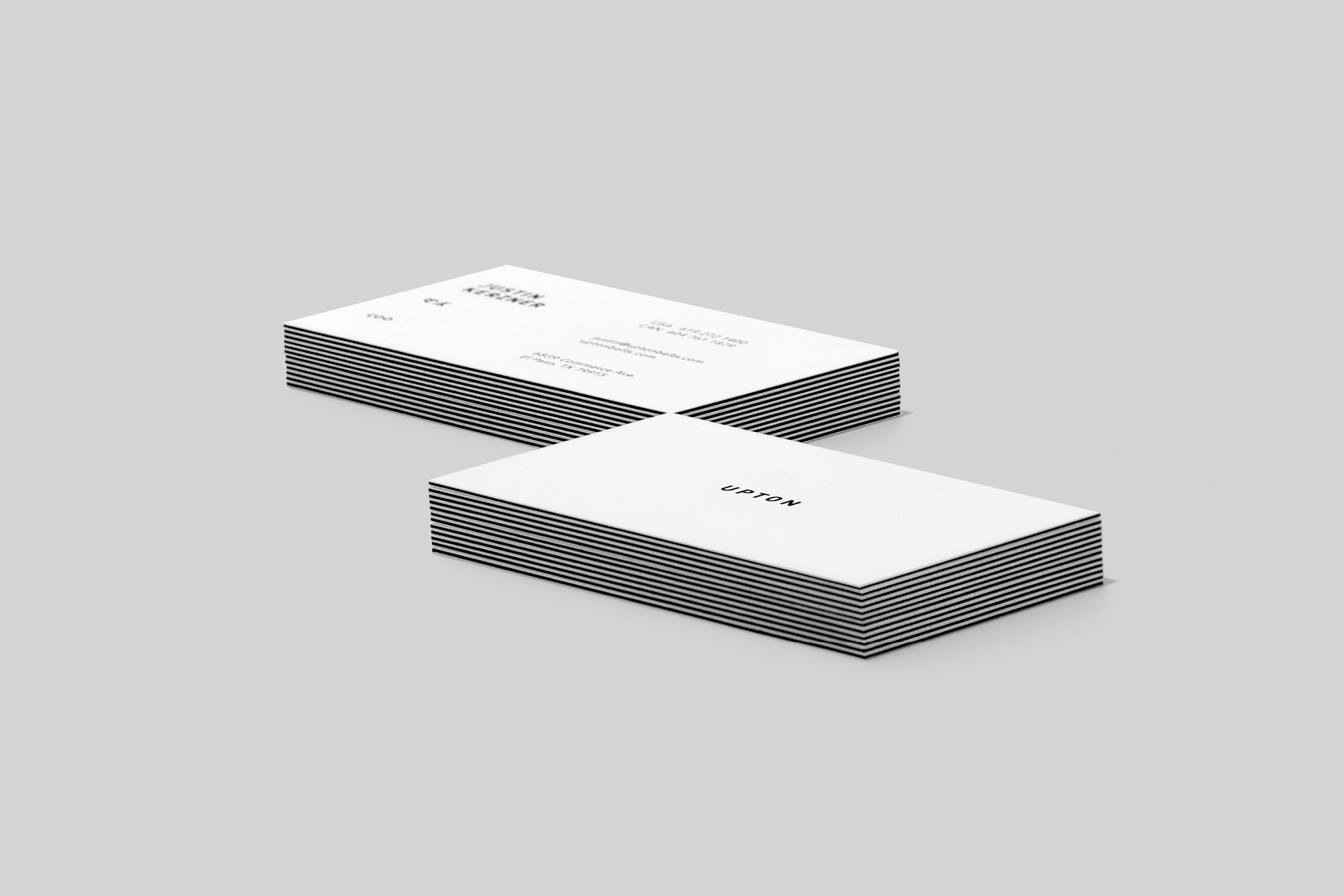
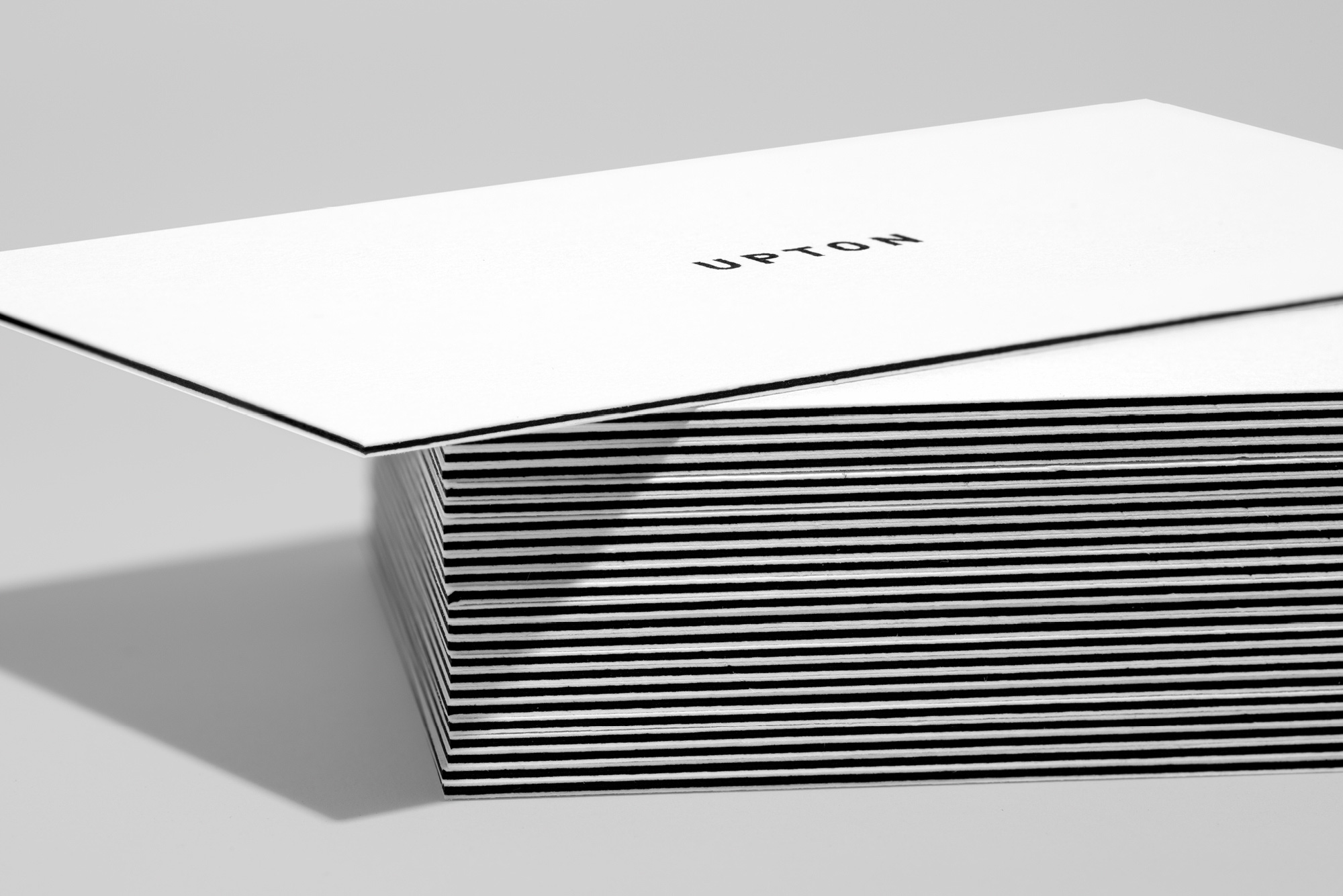
Two ultra-fine layers of midnight black Mohawk paper were compressed between two outer layers of matte white stock for the business card. This creates a visual representation of the belt framing a person’s mid-section. All spacing on the face of the card is based on the height of the wordmark, which is proportional to its size on the top of the packaging. The spacing on the back uses the cap height of the contact information on the right side of the card.

01
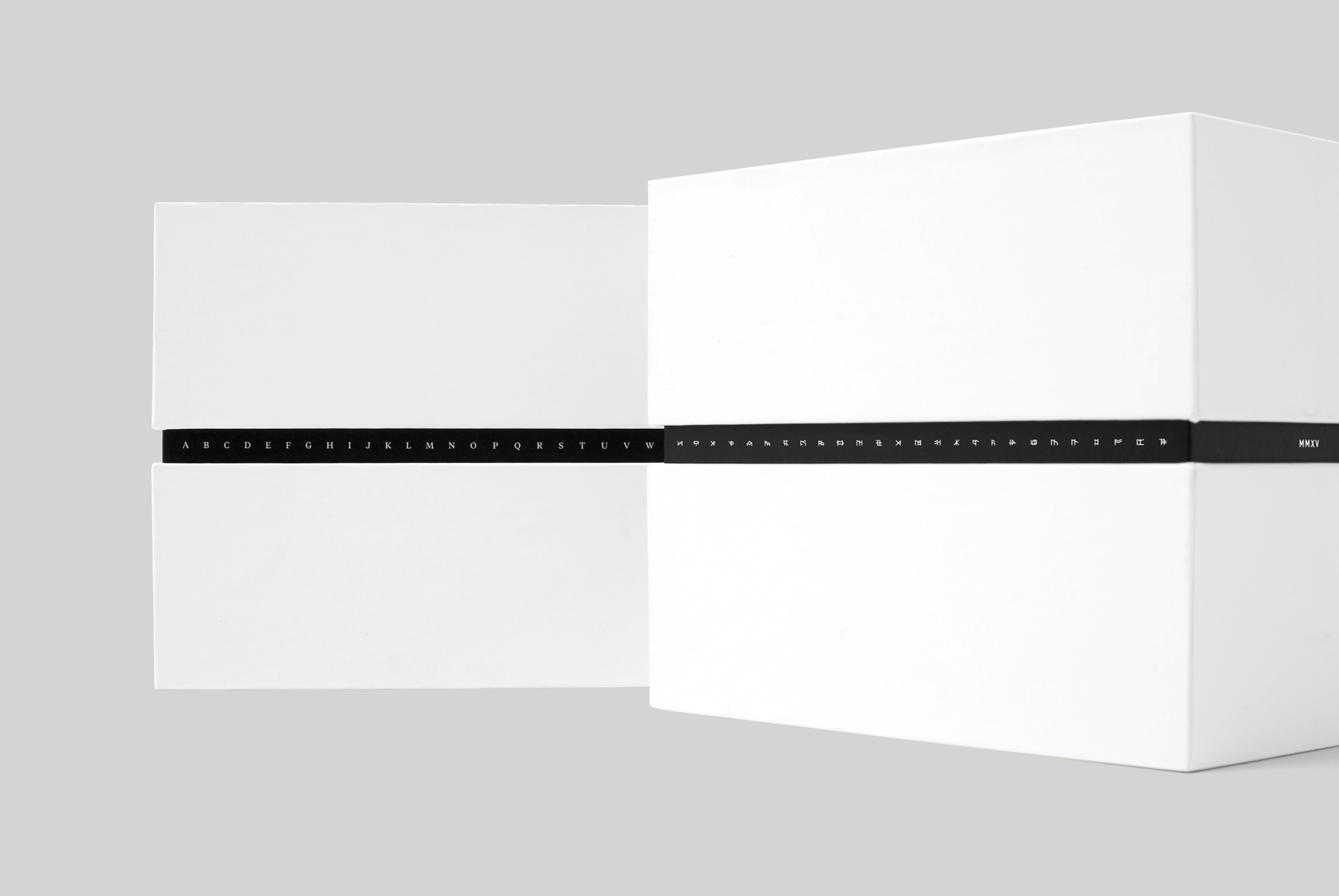
We knew a unique means of communication would help foster a sense of familiarity and loyalty with our customers. Inspired by the 1930s radio show “Little Orphan Annie,” we created a secret alphabet and integrated a decoder system into the packaging. Messages and puzzles—which offer rewards— are decipherable only by those who purchase a belt. This builds curiosity, rewards repeat customers, and turns the unboxing experience into a moment of discovery. The customer’s initials are hand stamped in our secret alphabet on the back of each belt.
03
We knew a unique means of communication would help foster a sense of familiarity and loyalty with our customers. Inspired by the 1930s radio show “Little Orphan Annie,” we created a secret alphabet and integrated a decoder system into the packaging. Messages and puzzles—which offer rewards— are decipherable only by those who purchase a belt. This builds curiosity, rewards repeat customers, and turns the unboxing experience into a moment of discovery. The customer’s initials are hand stamped in our secret alphabet on the back of each belt.
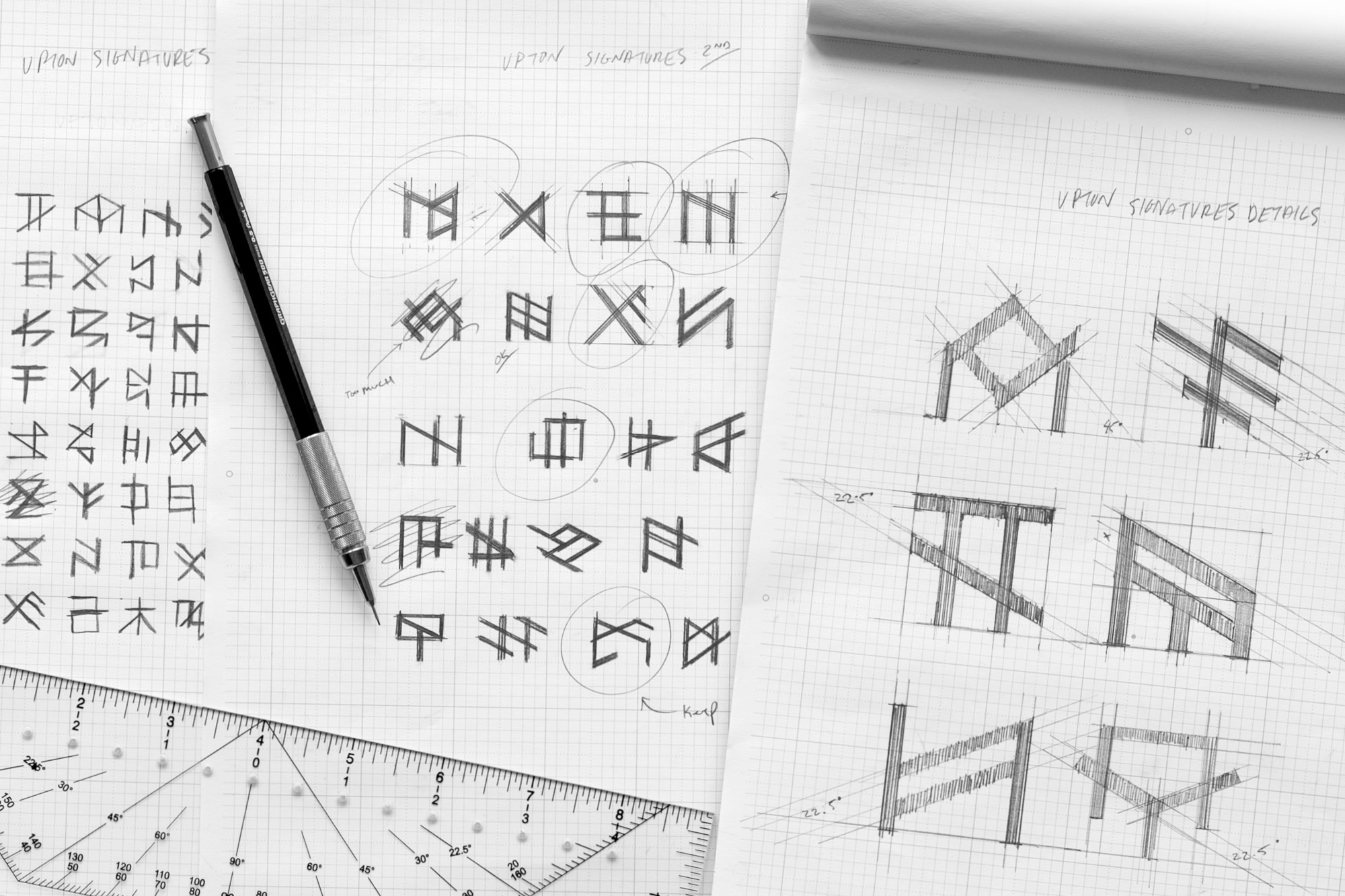
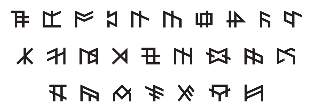
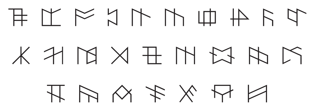
With the rare opportunity to create an entirely new alphabet, we felt that each character should connect with the history of hand-tooled leatherworking. Leatherworkers have long used markers to visually communicate ideas and ownership. In our alphabet, we mirrored the traditional grid system of markings leatherworkers used as a nod to their craft and culture.
With the rare opportunity to create an entirely new alphabet, we felt that each character should connect with the history of hand-tooled leatherworking. Leatherworkers have long used markers to visually communicate ideas and ownership. In our alphabet, we mirrored the traditional grid system of markings leatherworkers used as a nod to their craft and culture.
With the rare opportunity to create an entirely new alphabet, we felt that each character should connect with the history of hand-tooled leatherworking. Leatherworkers have long used markers to visually communicate ideas and ownership. In our alphabet, we mirrored the traditional grid system of markings leatherworkers used as a nod to their craft and culture.
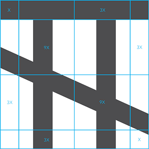
The Upton alphabet is based on the Roman alphabet. To create our characters, we dissected the defining characteristics of every letter in the Roman alphabet. We wanted to maintain an abstract visual resemblance between the new character and its Roman counterpart. Two typeface weights were cut to accommodate for scale.
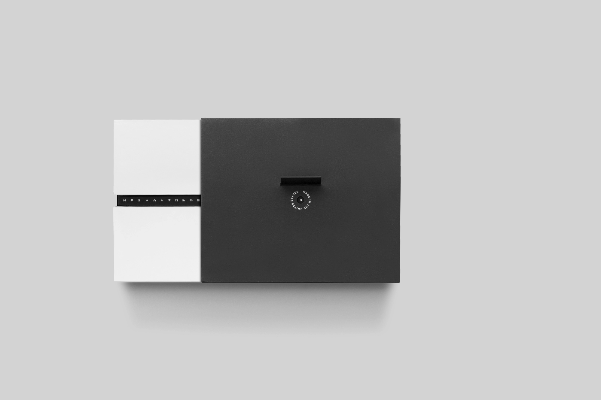
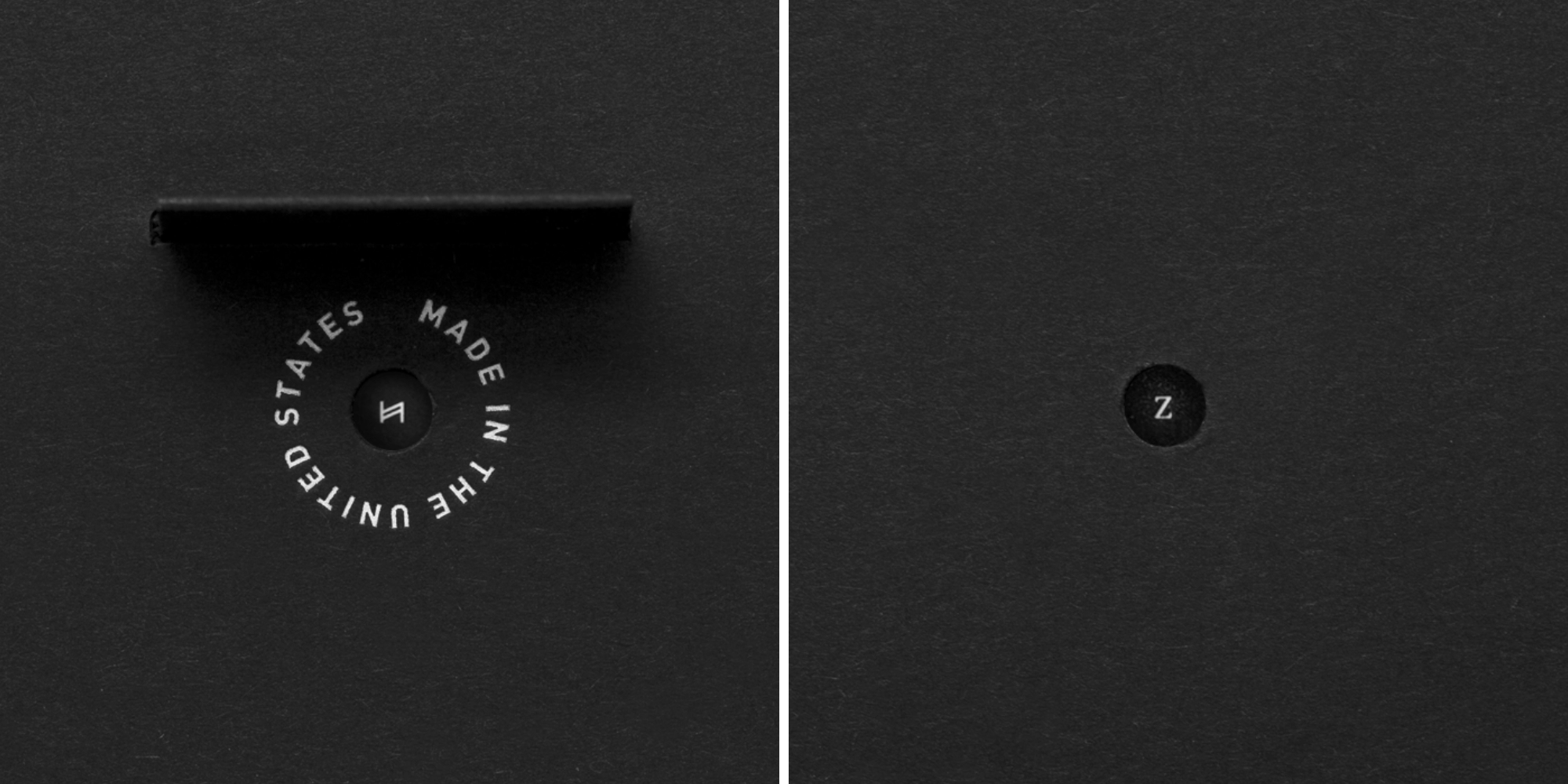
Our next step was to create a decoder that matched the brand’s clean visual aesthetic. We created a sleeve for the packaging that aligned our characters with their Roman counterparts using two die-cuts on opposite sides of the packaging. The decoder is easy to use and protects the packaging.
We felt that the product line had to maintain a clean and timeless aesthetic to cement the brand identity. We also didn’t want the belts to distract from the owner’s outfit, but instead support the clothes in a complementary role. The inner strap, seen only by the owner, is the canvas for the belt’s unique markings. Every design facet of the belt reflects the key attributes of the character archetypes we created for each category.
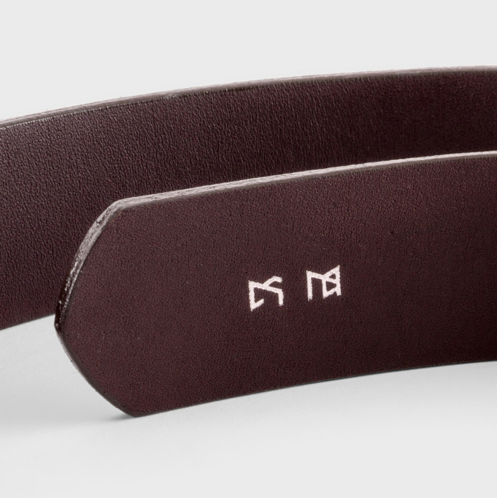
We add a unique form of personalization by stamping the owner’s initials—unbeknownst to them—using the Upton alphabet on the back of each belt. The owner discovers this after noticing the markings and using the decoder to reveal the initials.
We add a unique form of personalization by stamping the owner’s initials—unbeknownst to them—using the Upton alphabet on the back of each belt. The owner discovers this after noticing the markings and using the decoder to reveal the initials.
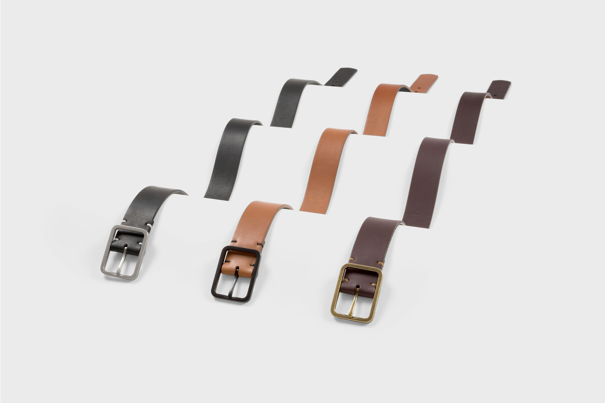
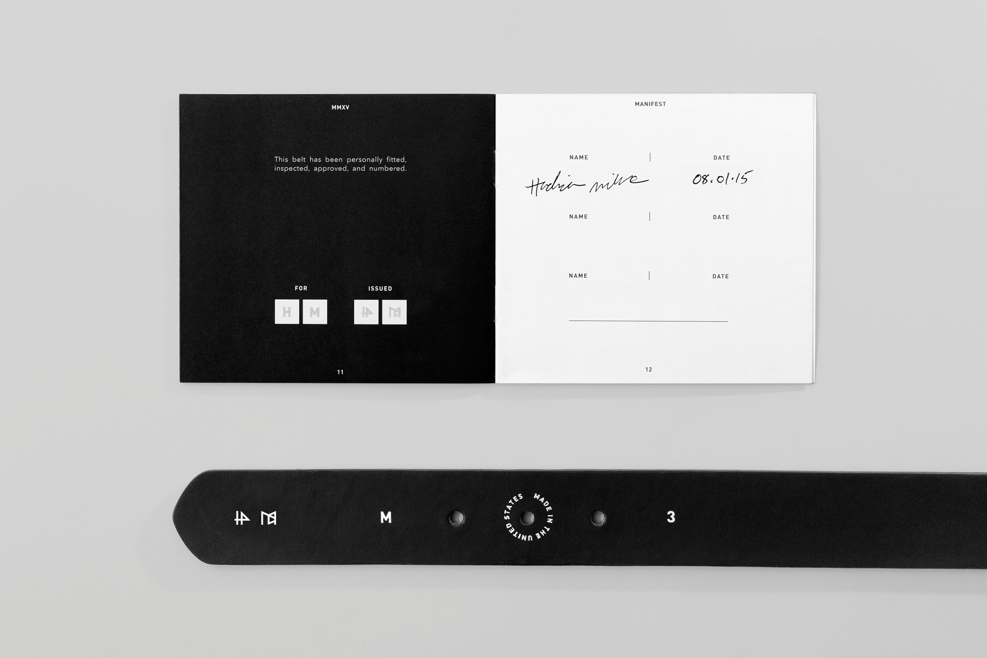
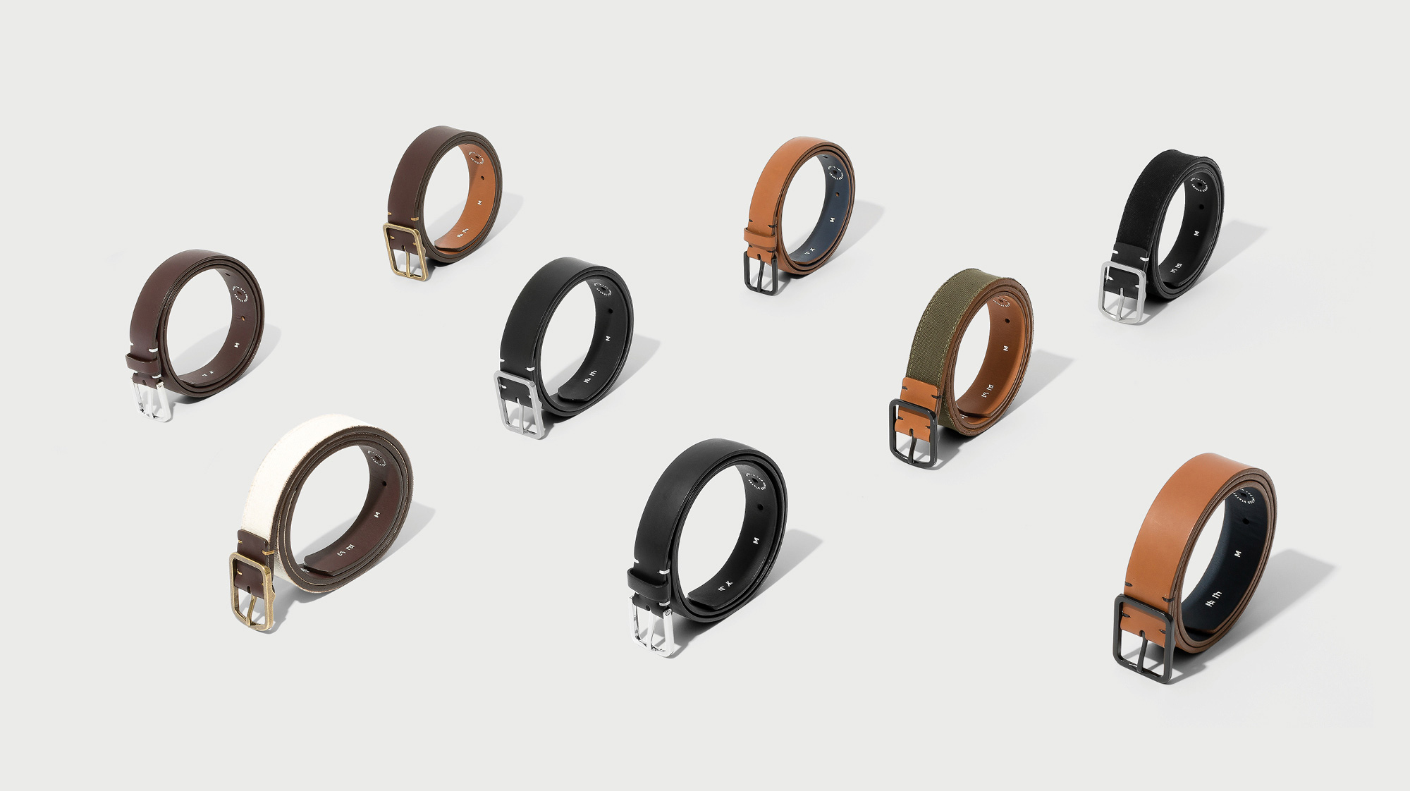
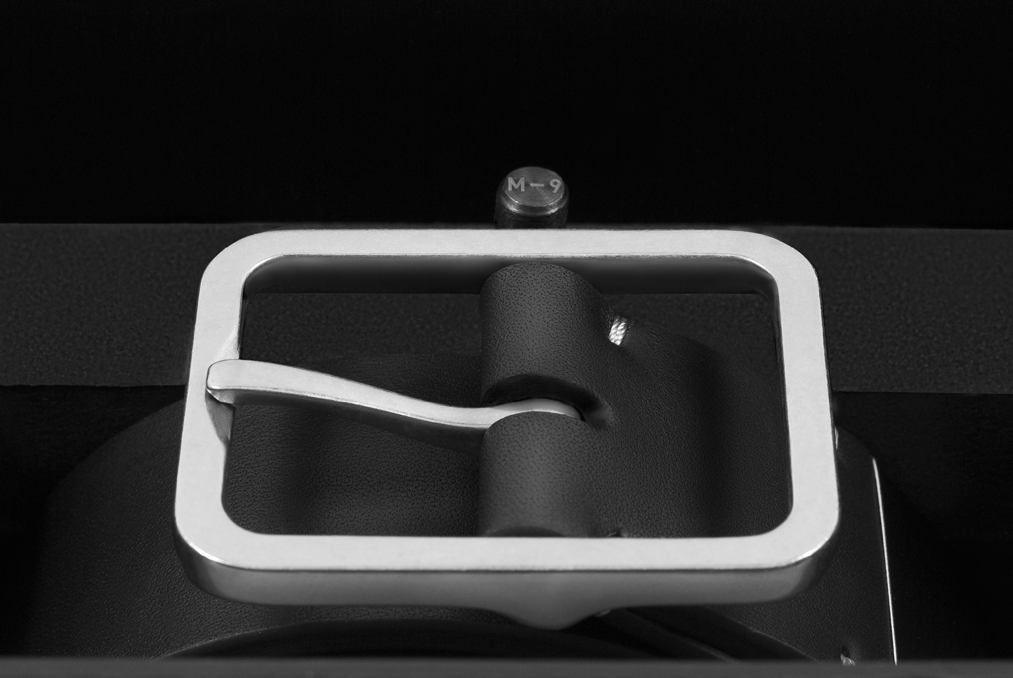
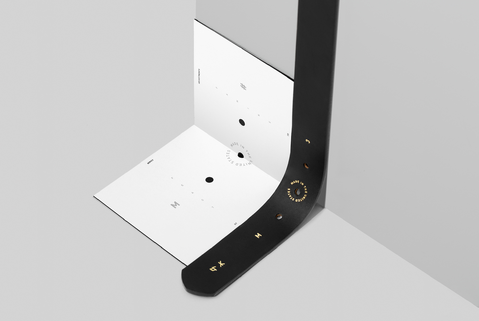
Belts traditionally come in three to four strap lengths with five to twelve holes to accommodate a range of waist sizes. Many of the holes are unnecessary and, combined with excess strap length, create a sloppy, distracting look. We decided to instead feature only three perfectly placed holes. The middle hole is placed at the customer’s precise waist measurement, ensuring the perfect fit. Since waistlines can fluctuate, two pre-marked holes are stamped into the inner side of the belt.
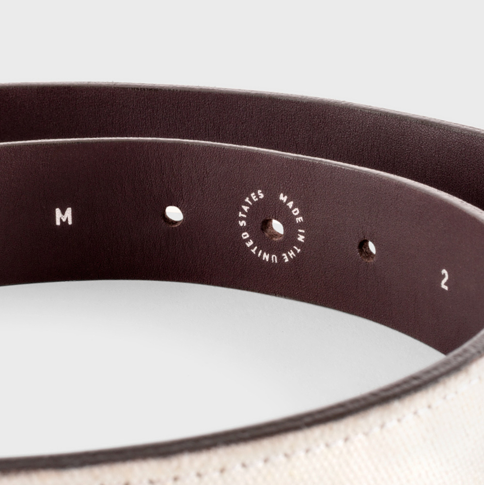
Belts traditionally come in three to four strap lengths with five to twelve holes to accommodate a range of waist sizes. Many of the holes are unnecessary and, combined with excess strap length, create a sloppy, distracting look. We decided to instead feature only three perfectly placed holes. The middle hole is placed at the customer’s precise waist measurement, ensuring the perfect fit. Since waistlines can fluctuate, two pre-marked holes are stamped into the inner side of the belt.
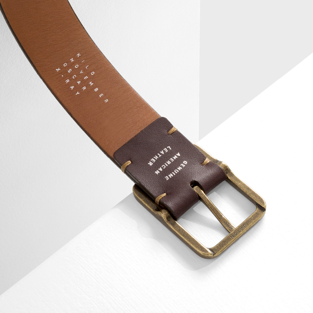
Each belt’s four-letter name is stamped on the back using the NATO phonetic alphabet. Each name has its own unique lock-up.
Each belt’s four-letter name is stamped on the back using the NATO phonetic alphabet. Each name has its own unique lock-up.
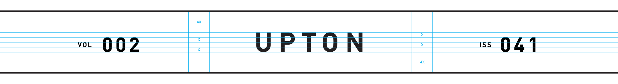
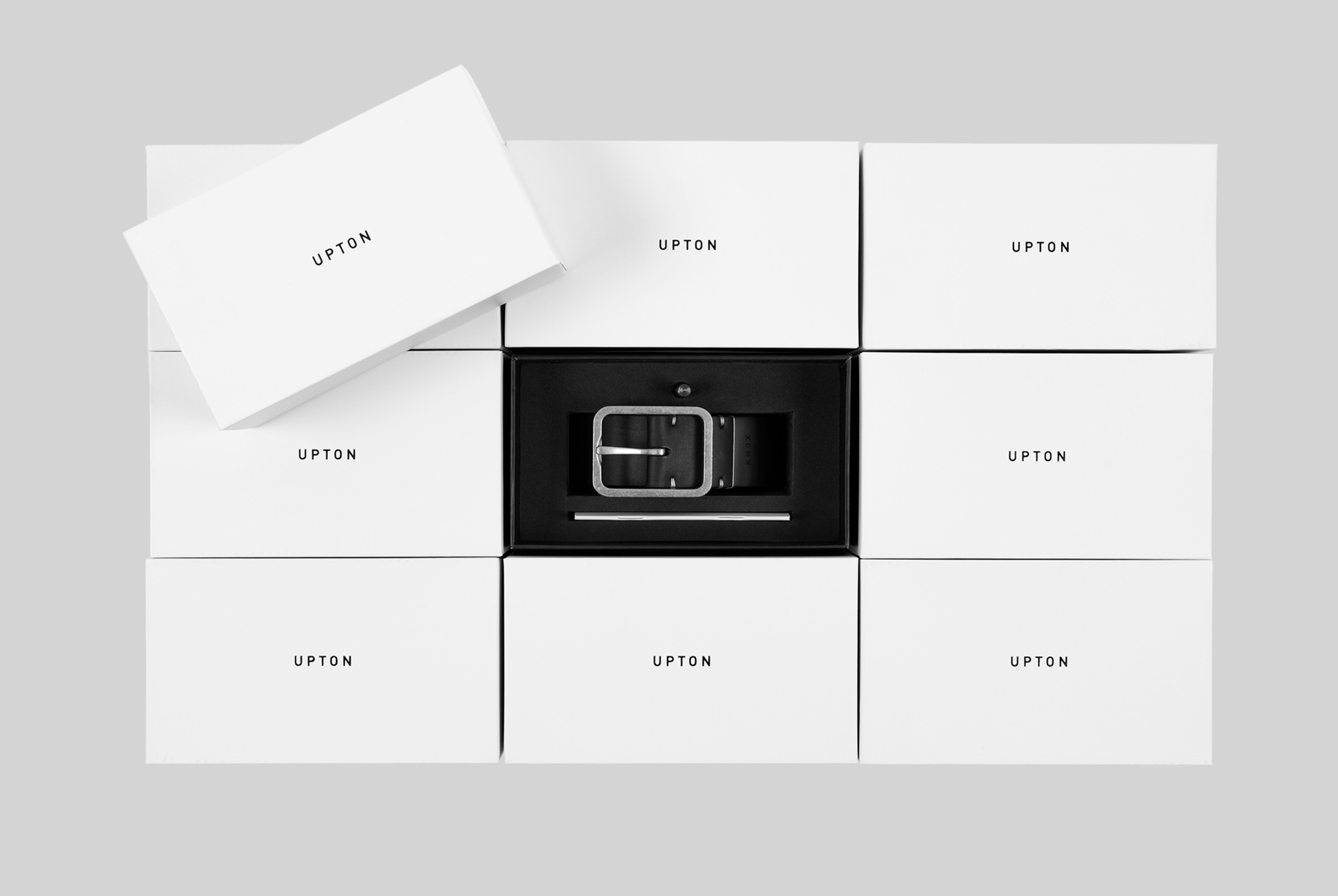
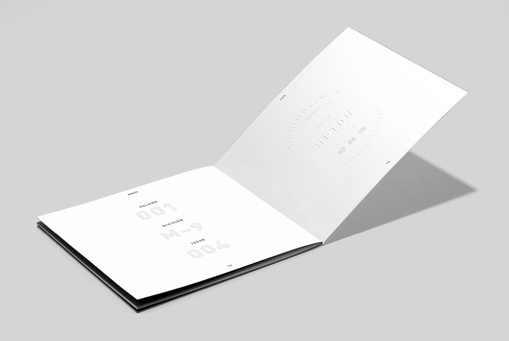
To emphasize collectability, all belts are stamped with the volume and issue number of their manufacture, with each volume consisting of 100 belts.
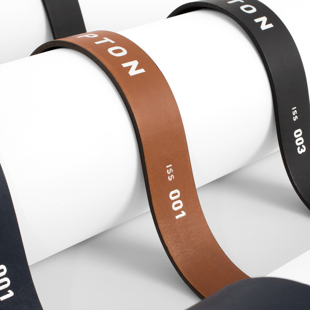
To emphasize collectability, all belts are stamped with the volume and issue number of their manufacture, with each volume consisting of 100 belts.
04
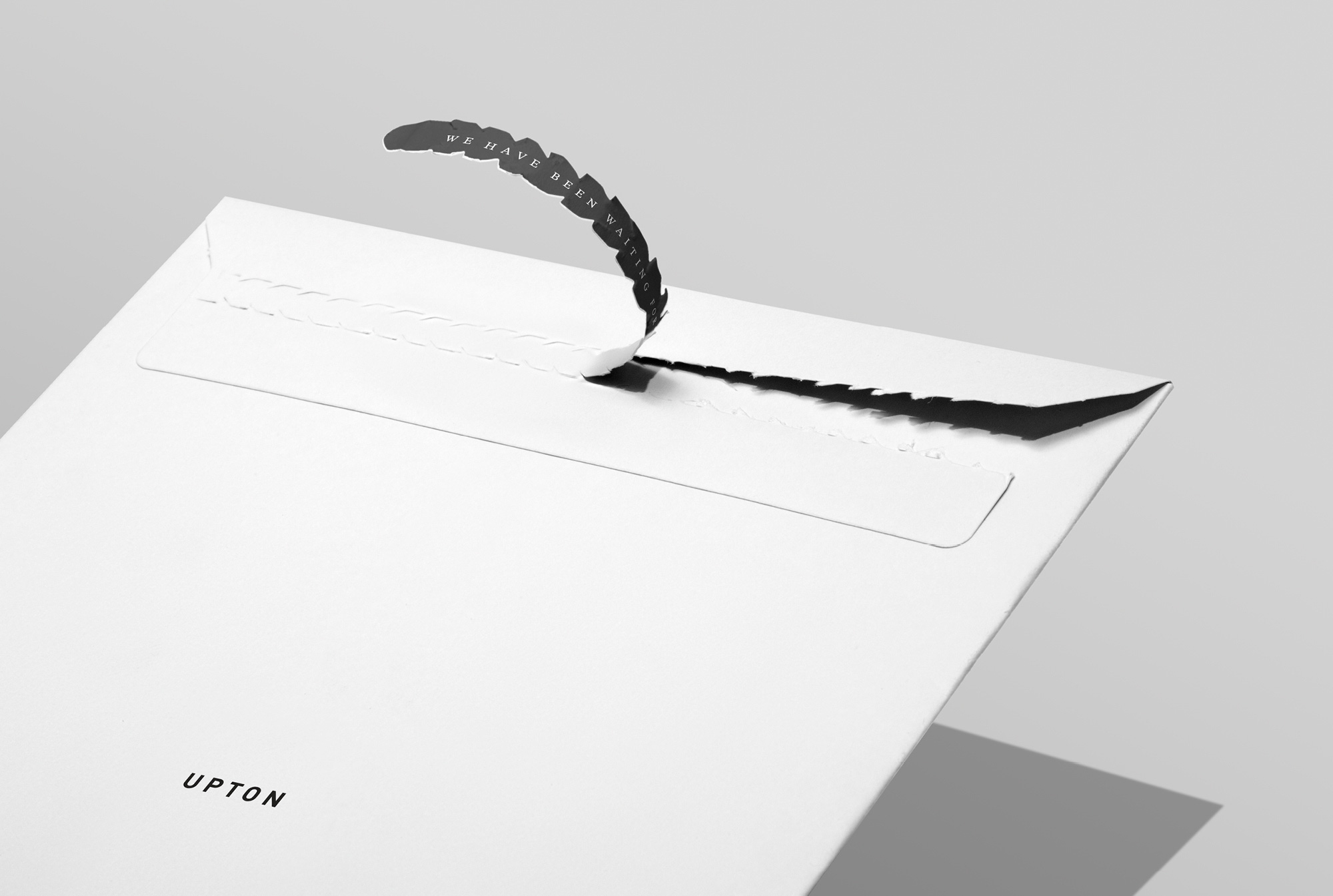
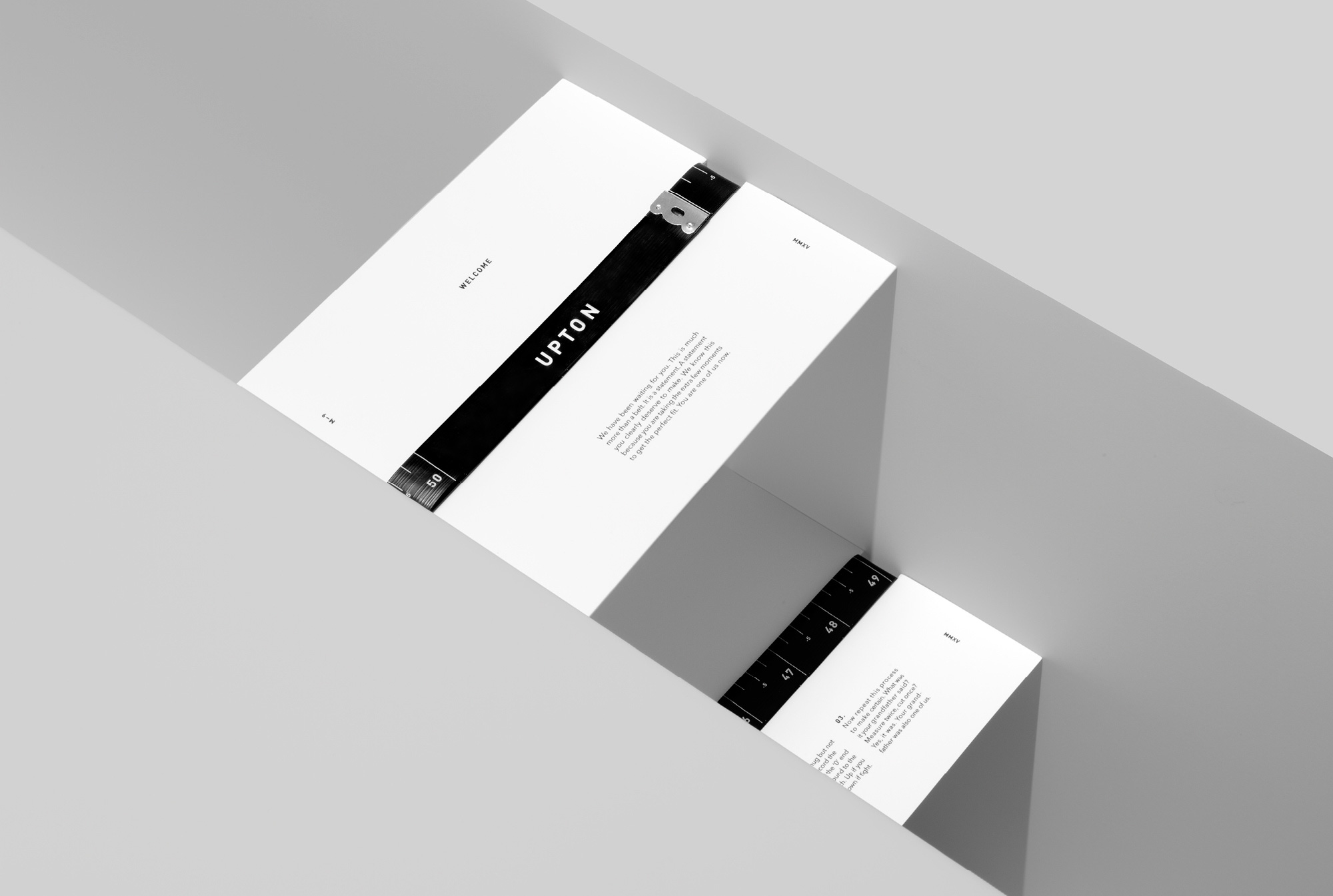
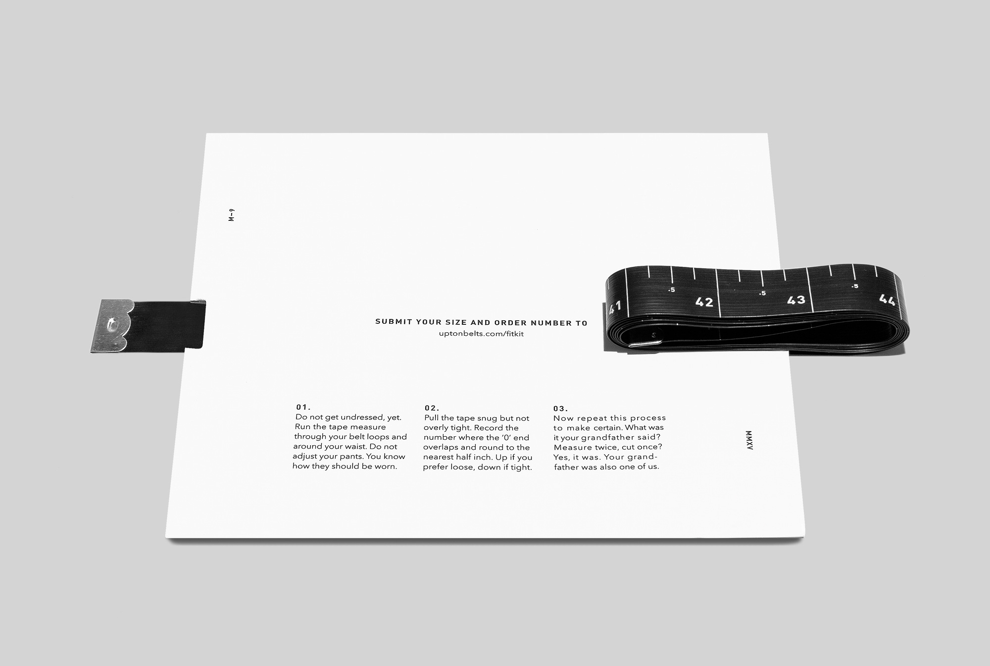
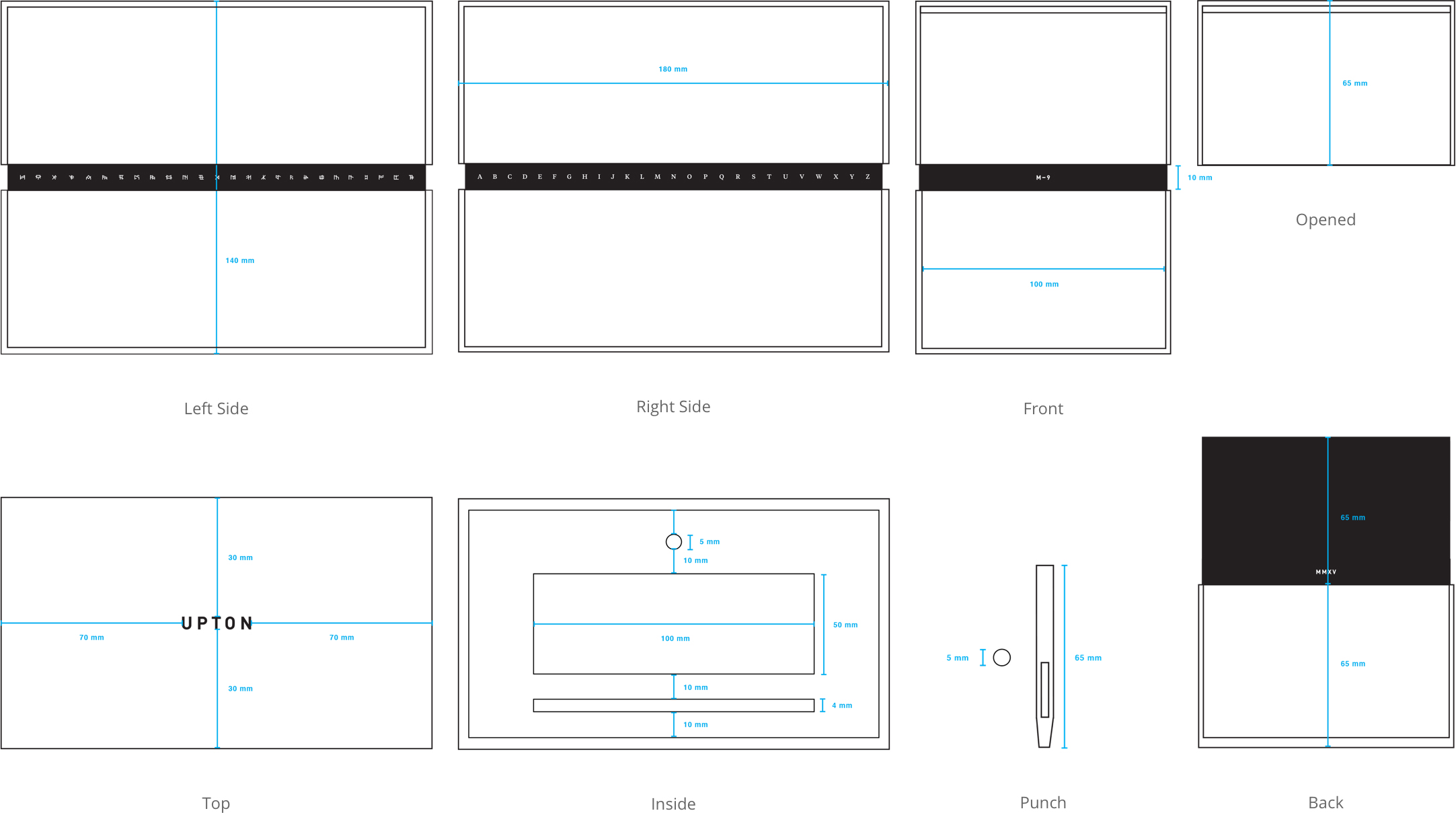
Because Upton manufactures custom-tailored belts but does not have a physical location for fittings, we had to find a way to get our customer’s measurements. We developed the Fit Kit to meet this need. The Fit Kit comes packaged in a branded tear tab envelope with a cryptic brand message. It includes a tape measure that wraps around the center, visually reminiscent of a belt and the packaging. Measurement instructions are printed on it, and a hidden welcome message is revealed once the tape measure is unfurled.
04
Because Upton manufactures custom-tailored belts but does not have a physical location for fittings, we had to find a way to get our customer’s measurements. We developed the Fit Kit to meet this need. The Fit Kit comes packaged in a branded tear tab envelope with a cryptic brand message. It includes a tape measure that wraps around the center, visually reminiscent of a belt and the packaging. Measurement instructions are printed on it, and a hidden welcome message is revealed once the tape measure is unfurled.
FIT KIT DIELINE
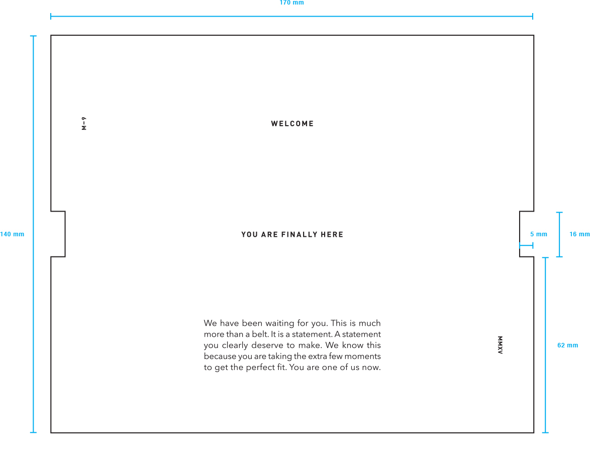
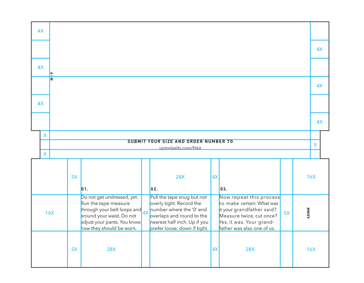
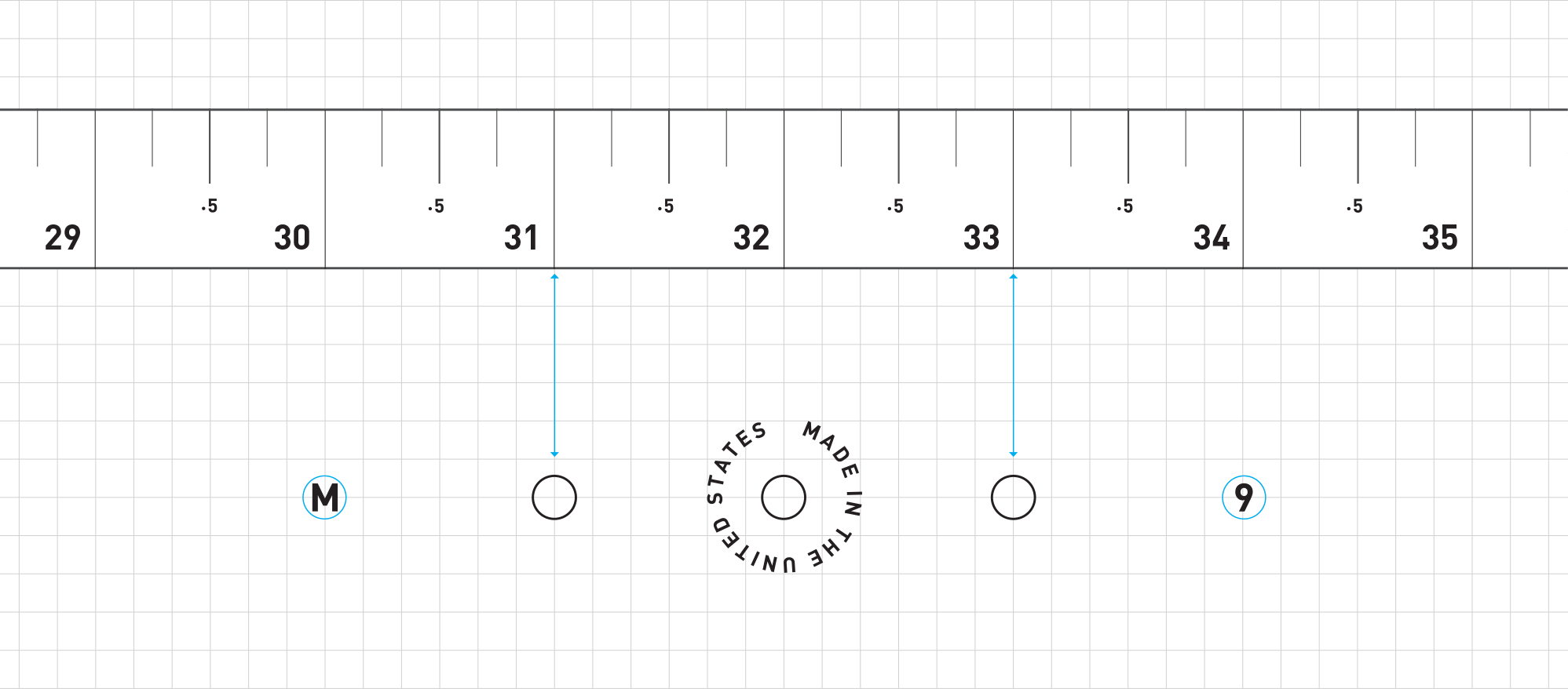
The tape measure, which is designed to be a keepsake, is marked in ½-inch increments to match the belt size offering.
The tape measure, which is designed to be a keepsake, is marked in ½-inch increments to match the belt size offering.

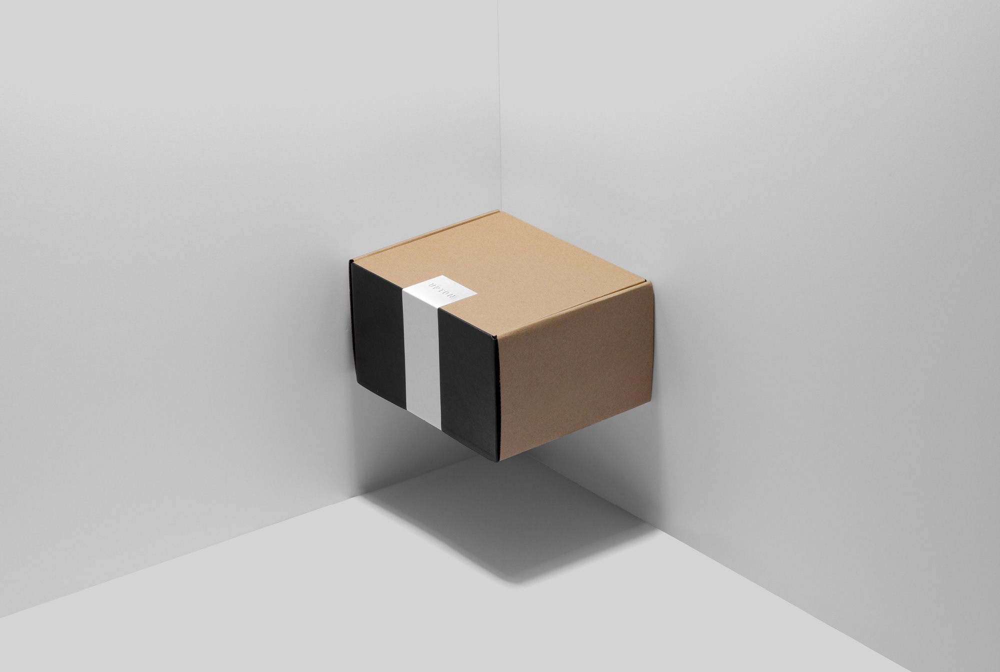
05
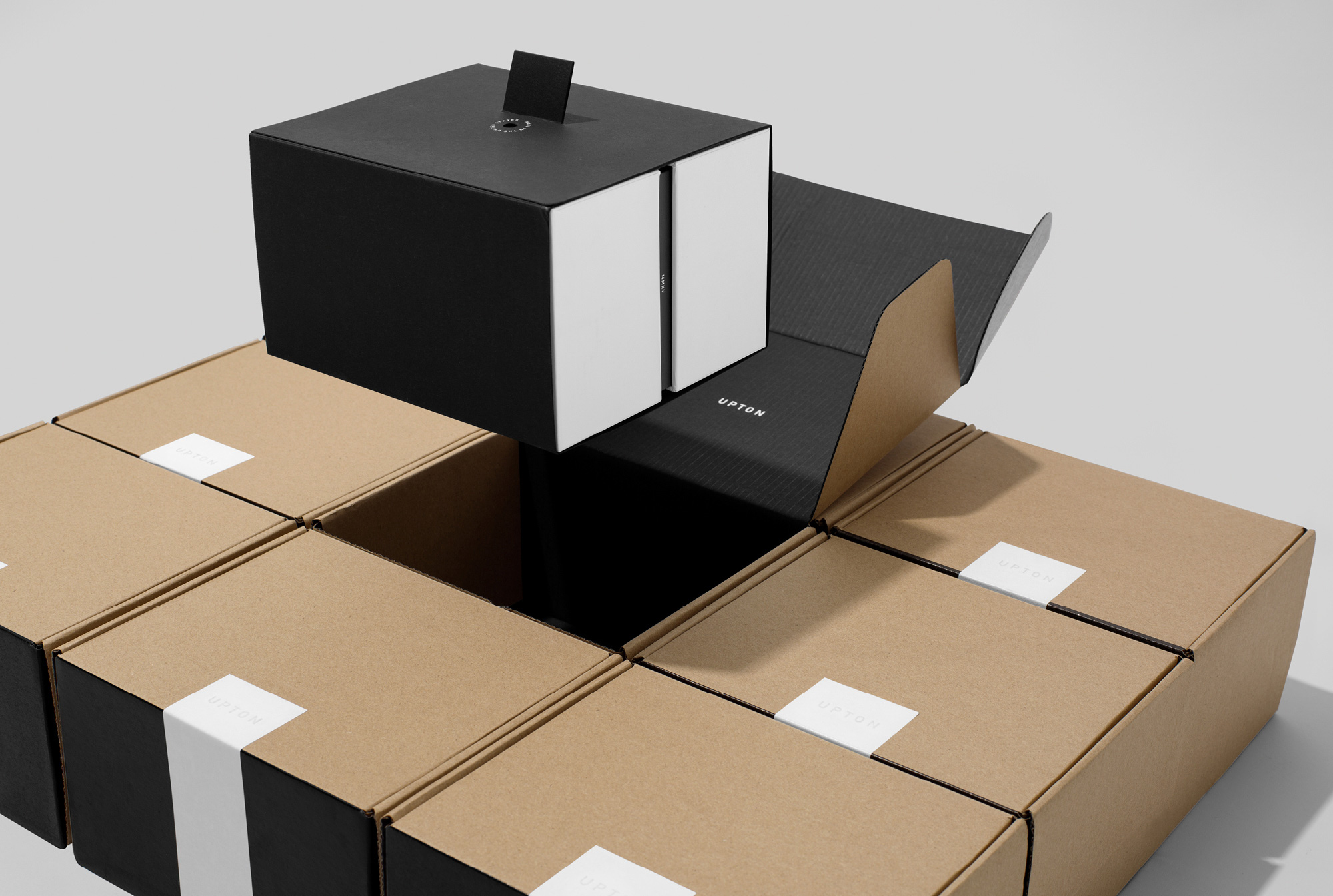
We had two main objectives for the shipping parcel design. First, we wanted a single point of entry to be sure the proper consumer experience was followed. Second, we wanted to build an element of surprise as though a door into the Upton Belts world was opened along with the packaging.
05
We had two main objectives for the shipping parcel design. First, we wanted a single point of entry to be sure the proper consumer experience was followed. Second, we wanted to build an element of surprise as though a door into the Upton Belts world was opened along with the packaging.
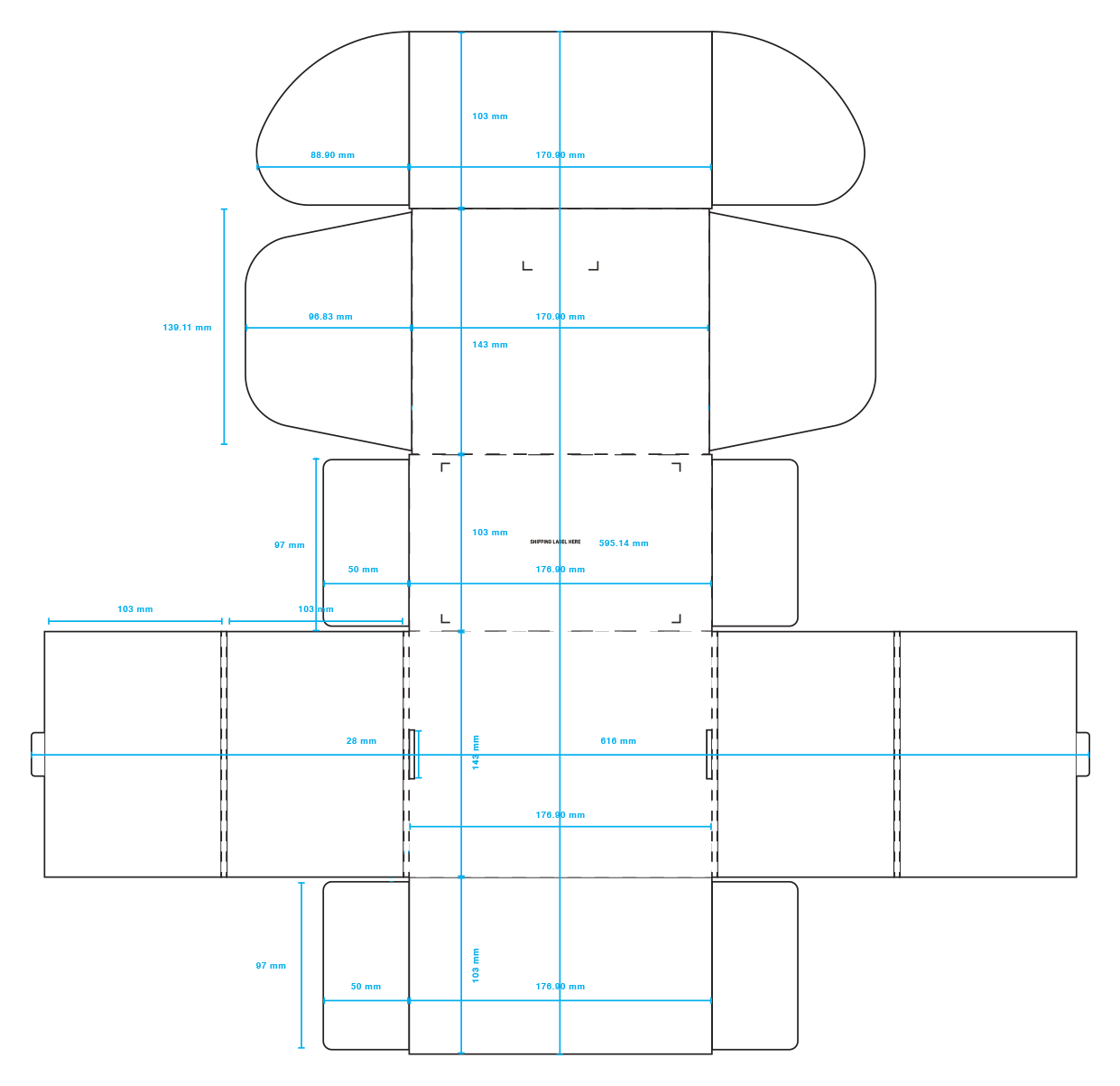
We designed a custom dieline using a cherry-lock enclosure—secure and easy to open. To condense the silhouette, we chose a 1.5mm E-Flute cardboard for the box.
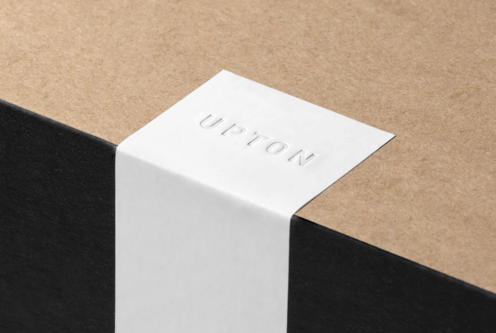
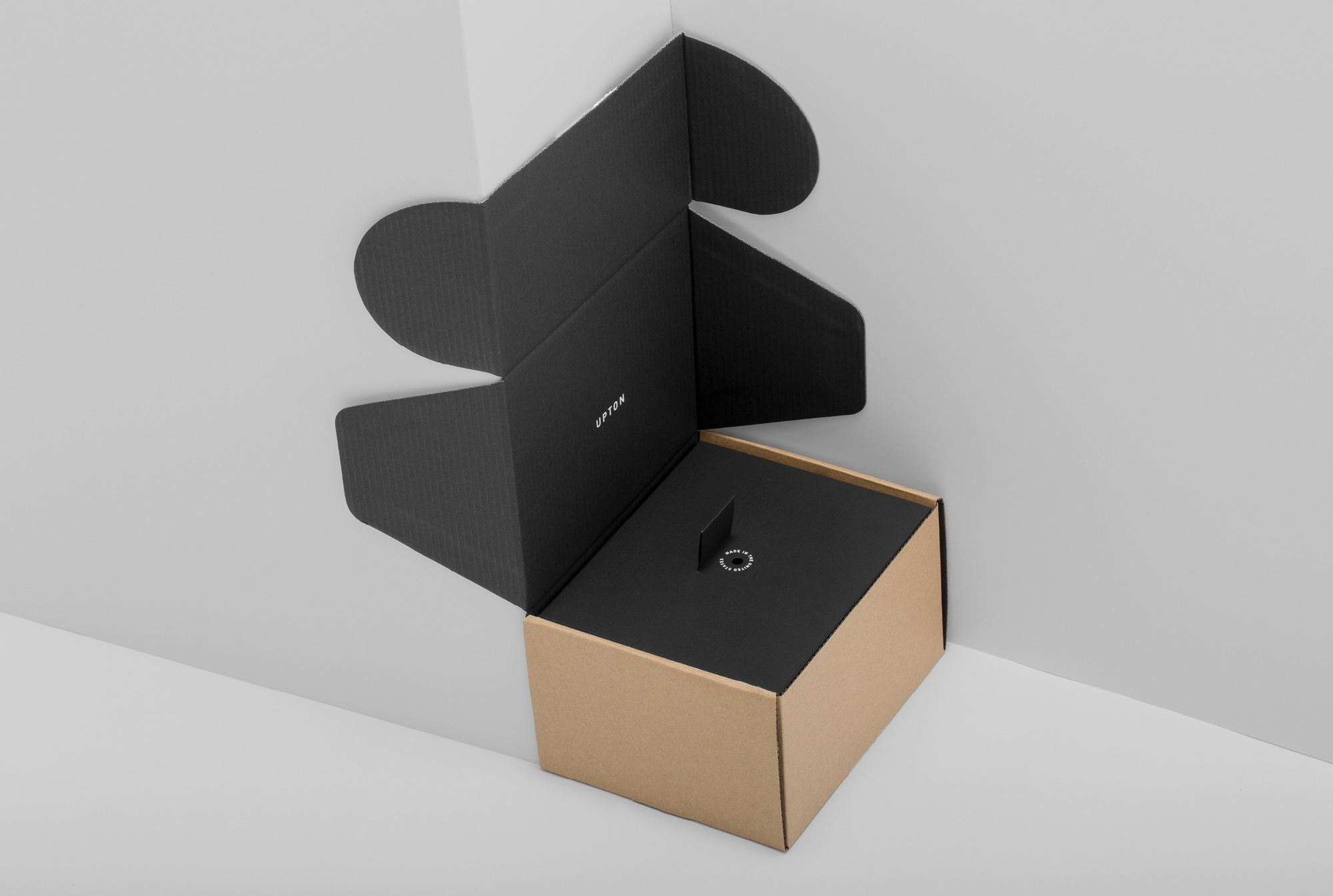
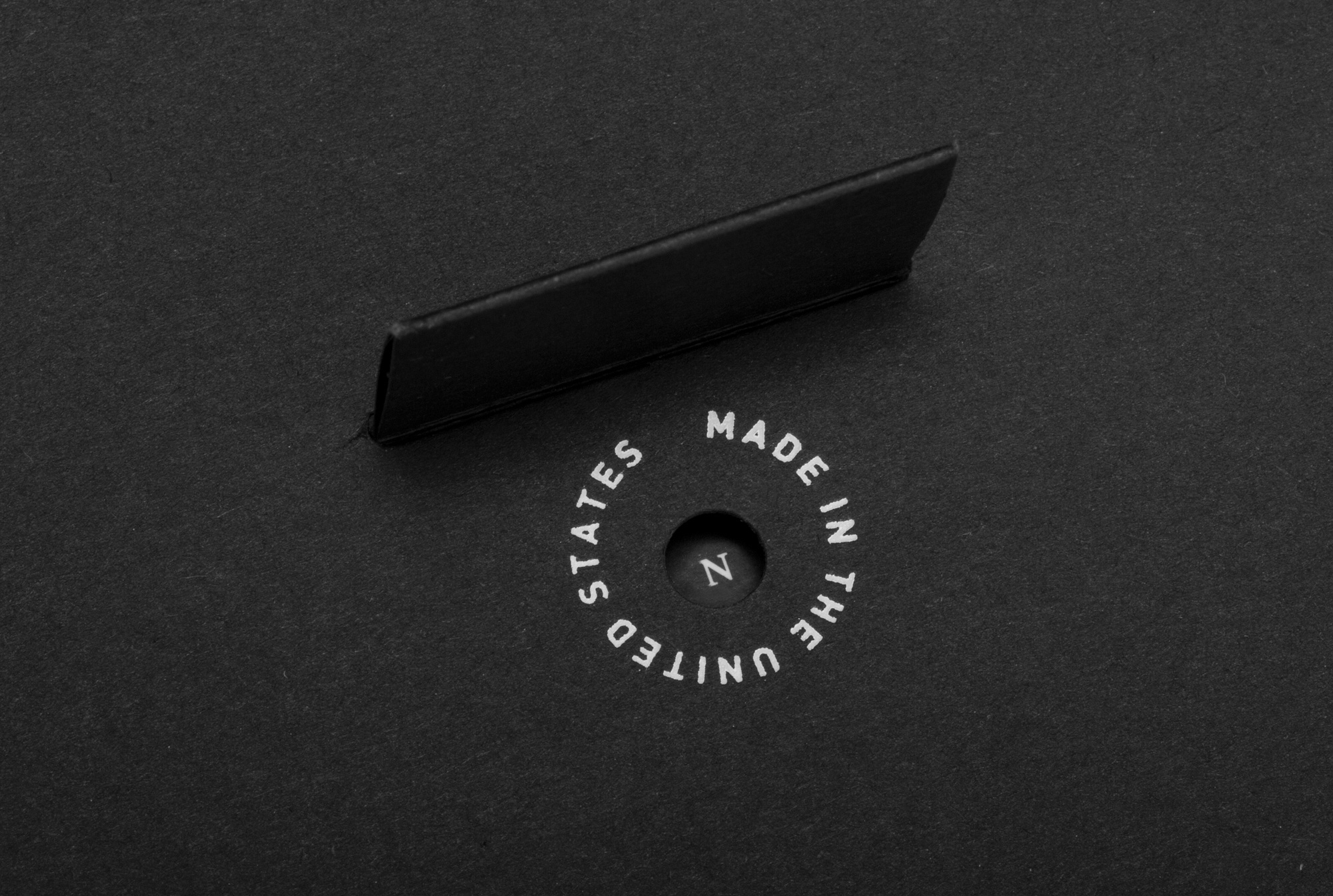
The soft-touch seal features a blind deboss of the wordmark. Upon breaking the seal, the packaging sleeve is revealed. Highlighted inside is the wordmark and the sleeve’s center tab. When the tab is lifted, it exposes the decoder and a “Made in the United States” print, which is also on the back of each belt.
06
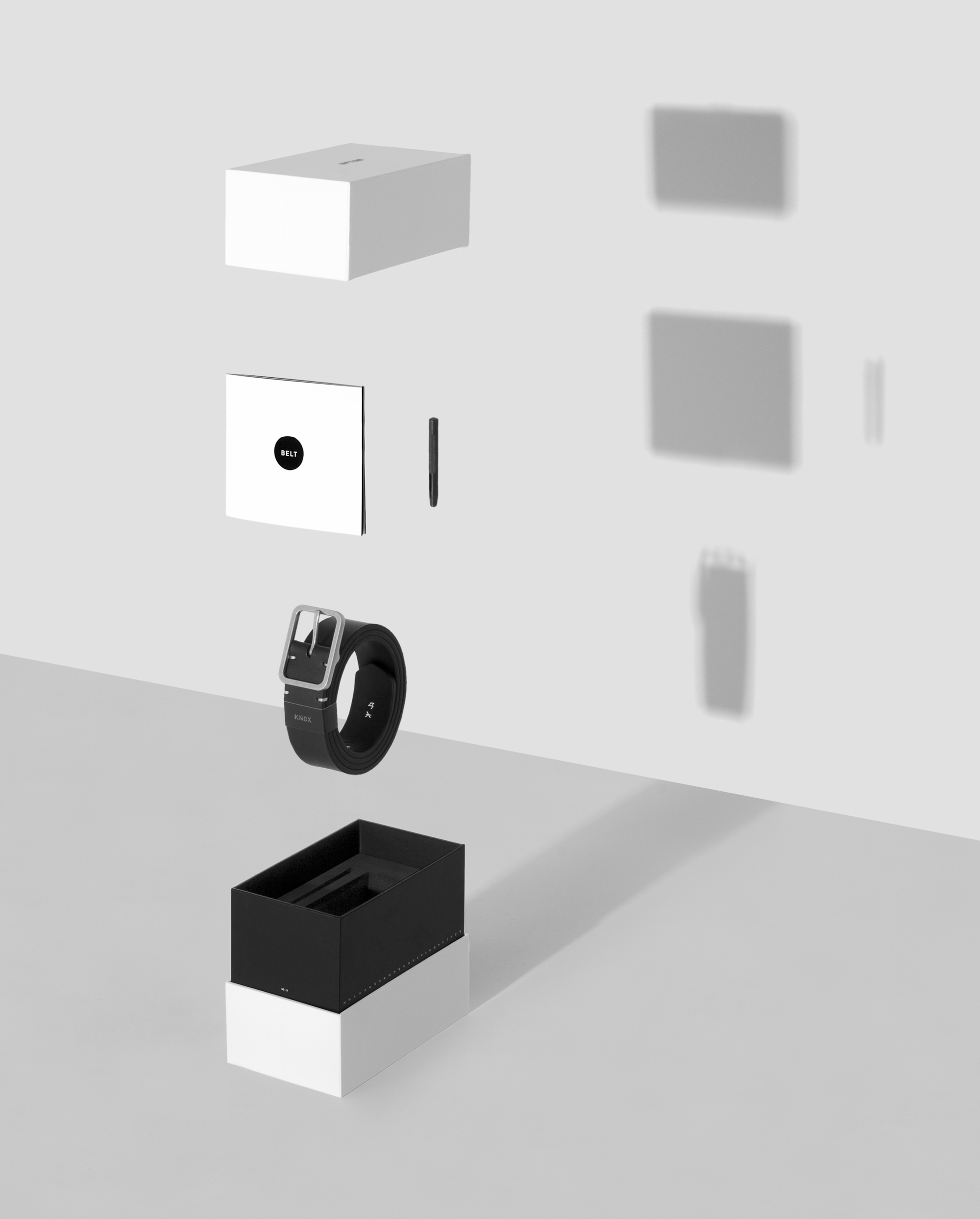
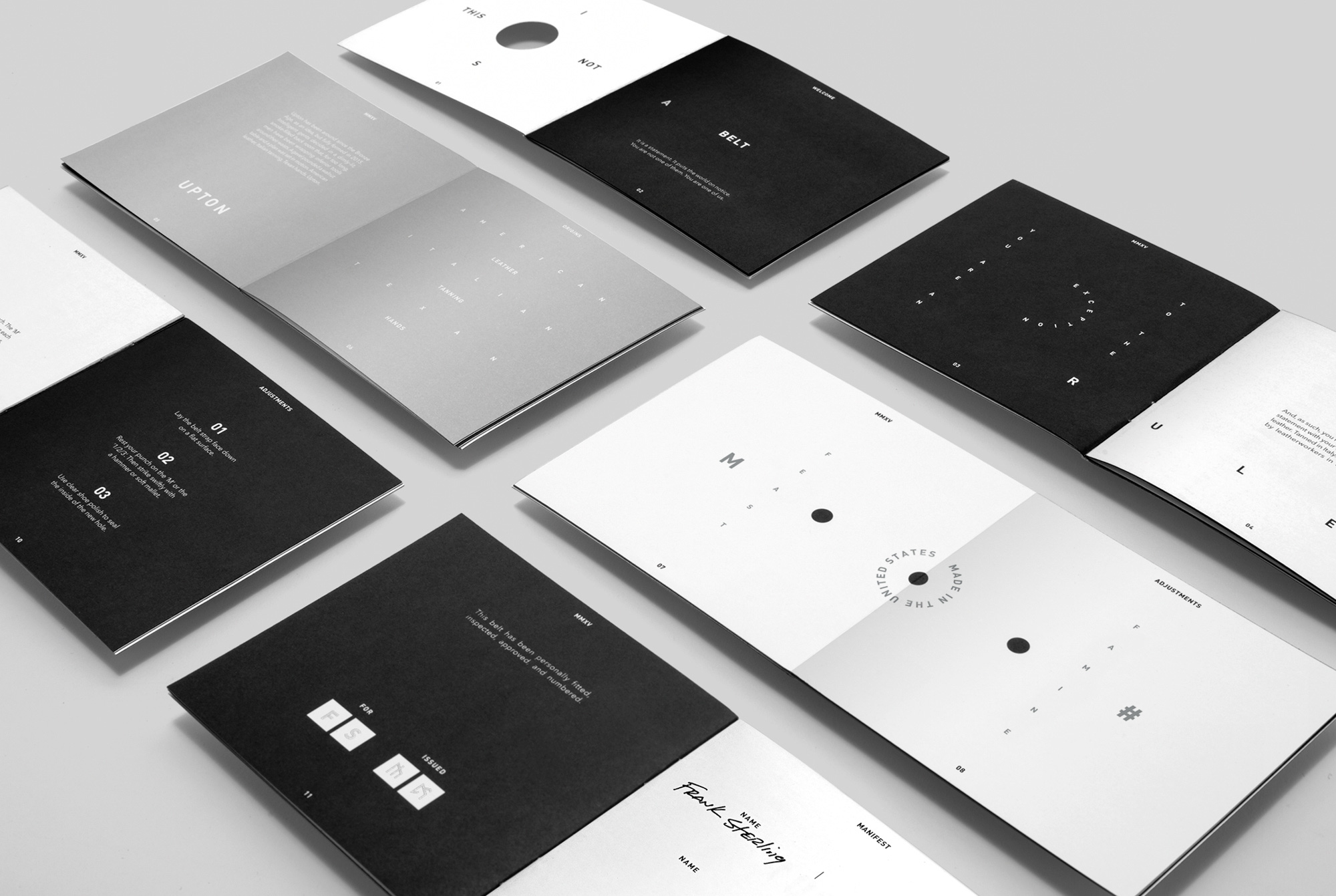
This is the heart of Upton’s brand experience. Elegant and inviting, it leaves a lasting impression of aesthetic value. Its soft-touch finish contrasts its matte black protective sleeve. The wordmark is proudly debosed on its crown. A thin black bar wraps around it to visually represent the belt and features the Upton alphabet, the Roman alphabet, the year of the belt’s production, and the belt’s product division. Once opened, the belt is revealed within a black environment that frames it and its accouterments: a punch for sizing adjustments, a bag for storage, and a 14-page manuscript.
06
This is the heart of Upton’s brand experience. Elegant and inviting, it leaves a lasting impression of aesthetic value. Its soft-touch finish contrasts its matte black protective sleeve. The wordmark is proudly debosed on its crown. A thin black bar wraps around it to visually represent the belt and features the Upton alphabet, the Roman alphabet, the year of the belt’s production, and the belt’s product division. Once opened, the belt is revealed within a black environment that frames it and its accouterments: a punch for sizing adjustments, a bag for storage, and a 14-page manuscript.

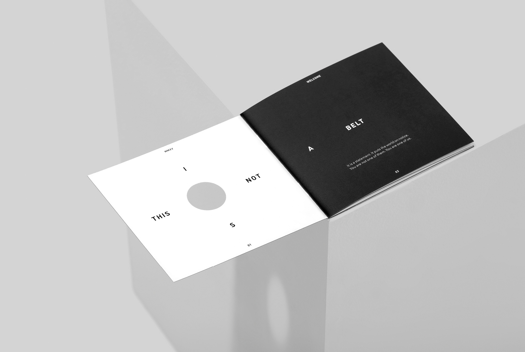
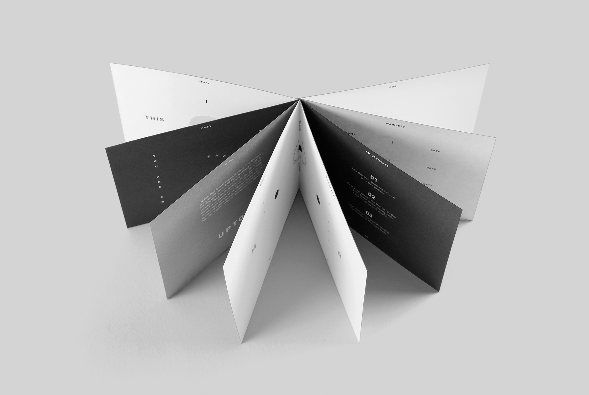
07
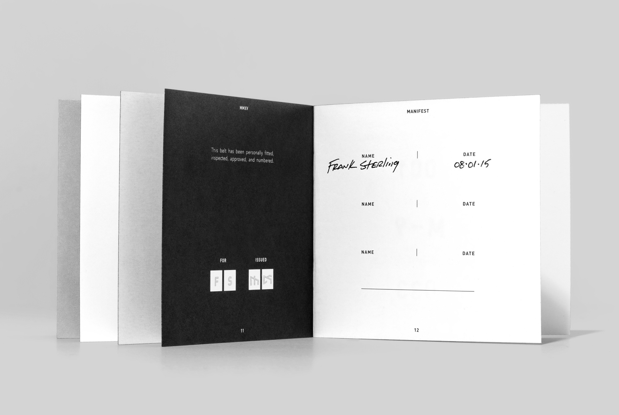
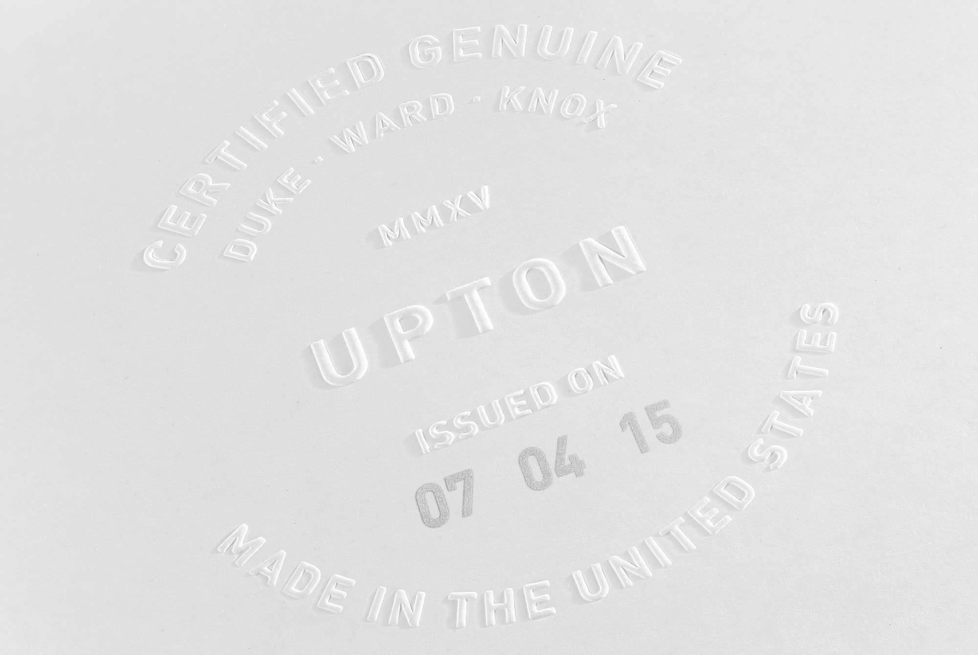
The belt manuscript is a more personal and collectable response to the typically forgettable owner’s manual accompanying most products. Each one is stamped with the owner’s initials and belt number, which are also stamped on the belt. A manifest page is included to maintain a record of the belt’s ownership journey if it’s passed down over the years. The back page features a blind embossed seal of authenticity and the date of issue.
07
The belt manuscript is a more personal and collectable response to the typically forgettable owner’s manual accompanying most products. Each one is stamped with the owner’s initials and belt number, which are also stamped on the belt. A manifest page is included to maintain a record of the belt’s ownership journey if it’s passed down over the years. The back page features a blind embossed seal of authenticity and the date of issue.


MMXV Launch Website
Upton Belts
Creative Direction
Design
Development
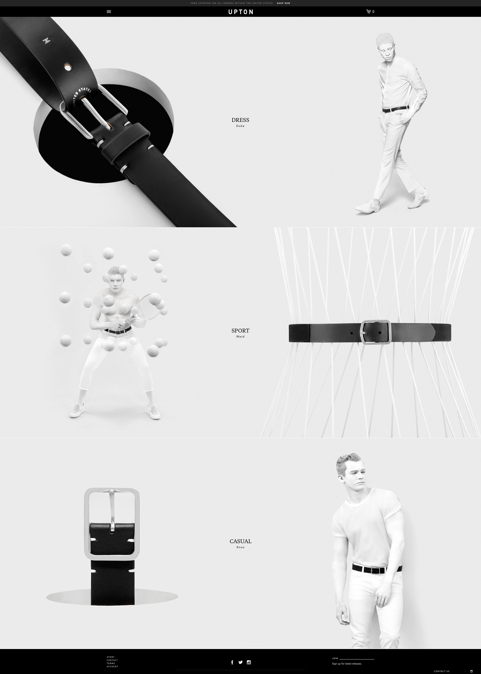
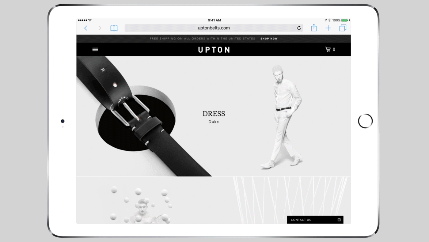
As an online-exclusive brand it was critical that Upton’s MMXV Launch Website immediately connected with the user—it would be their first interaction with the brand. With that in mind, we built a site centered on a minimalist aesthetic that communicated the uniqueness and high-quality of the brand. We focused on striking visuals, all built on the bones of an adaptable, modular design.
08
As an online-exclusive brand it was critical that Upton’s MMXV Launch Website immediately connected with the user—it would be their first interaction with the brand. With that in mind, we built a site centered on a minimalist aesthetic that communicated the uniqueness and high-quality of the brand. We focused on striking visuals, all built on the bones of an adaptable, modular design.

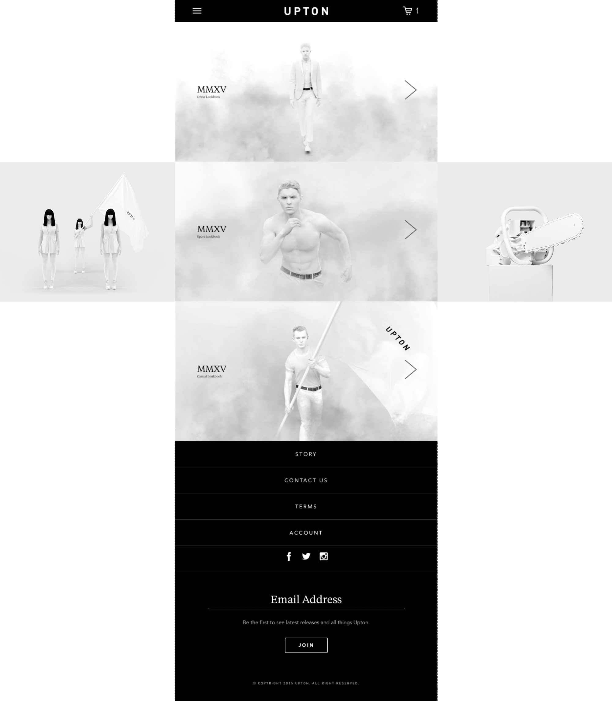
DISCOVERY & PAGE FLOW
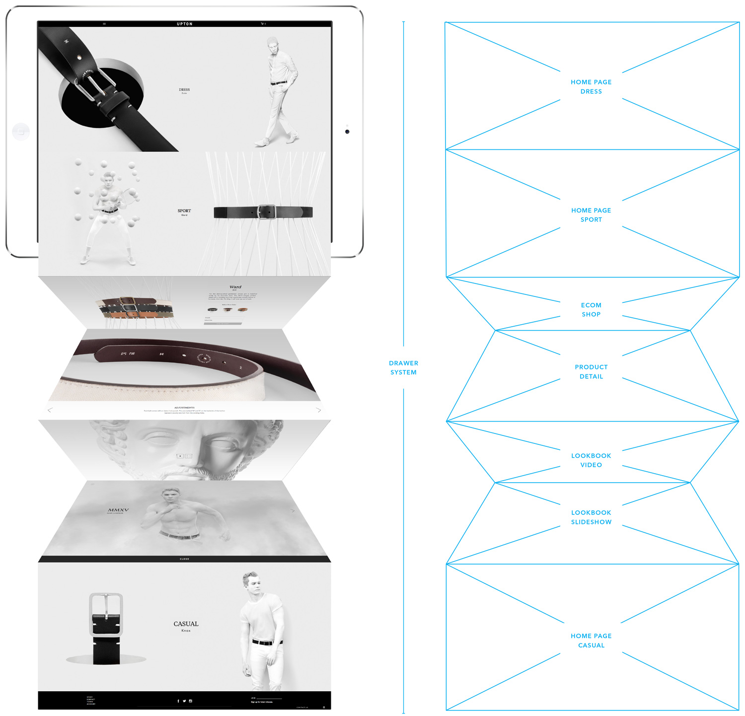
We began by sketching a drawer system that highlighted the three product categories: Dress, Sport, and Casual. This would allow us to improve the user experience by easily organizing a large amount of content in a digestible manner. The page flow is built on smooth movement. One click on the homepage pushes the page down to reveal product detail pages. Sliders slip in under product photos to reveal key details. The site is tailored to a variety of users, from those obsessed with product detail to those moved more through narratives.
DISCOVERY & PAGE FLOW
We began by sketching a drawer system that highlighted the three product categories: Dress, Sport, and Casual. This would allow us to improve the user experience by easily organizing a large amount of content in a digestible manner. The page flow is built on smooth movement. One click on the homepage pushes the page down to reveal product detail pages. Sliders slip in under product photos to reveal key details. The site is tailored to a variety of users, from those obsessed with product detail to those moved more through narratives.
TYPOGRAPHY

Tiempos Text Headline

Avenir Next LT Pro Book / Primary
TYPOGRAPHY
Tiempos Text
Headline
Avenir Next LT Pro
Book / Primary
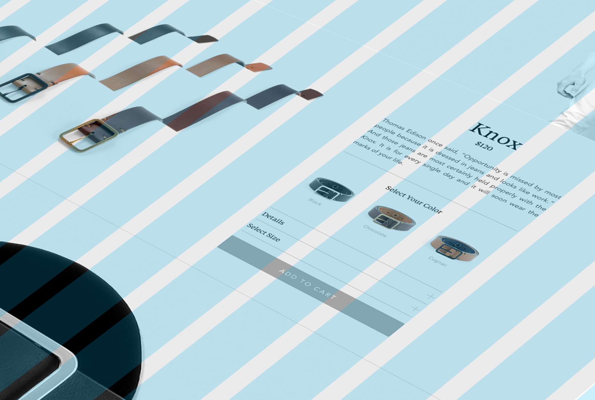
SHOPPING EXPERIENCE
Shopping with Upton is a guided affair. Animation ushers the customer through each step in the experience, with product education, multiple angles of each belt in the collection, and a preview of a purchased belt packaged and ready to be mailed. Everything is designed to mimic a real-life retail experience as close as possible.
SPORT AND CASUAL

RESPONSIVE DESIGN
The site was designed to be simple to use on any digital platform. Information is concise, quickly palatable, and presented with smooth scrolling pages. The focus is kept on the product, where it belongs.
RESPONSIVE DESIGN
The site was designed to be simple to use on any digital platform. Information is concise, quickly palatable, and presented with smooth scrolling pages. The focus is kept on the product, where it belongs.
MOBILE GRID
MOBILE GRID
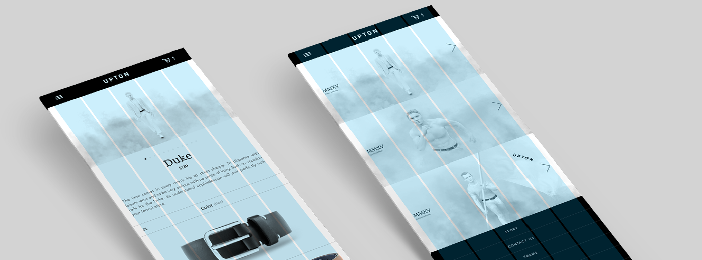

MMXV COLLECTION LOOKBOOK
MMXV COLLECTION LOOKBOOK
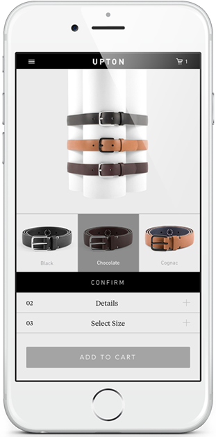
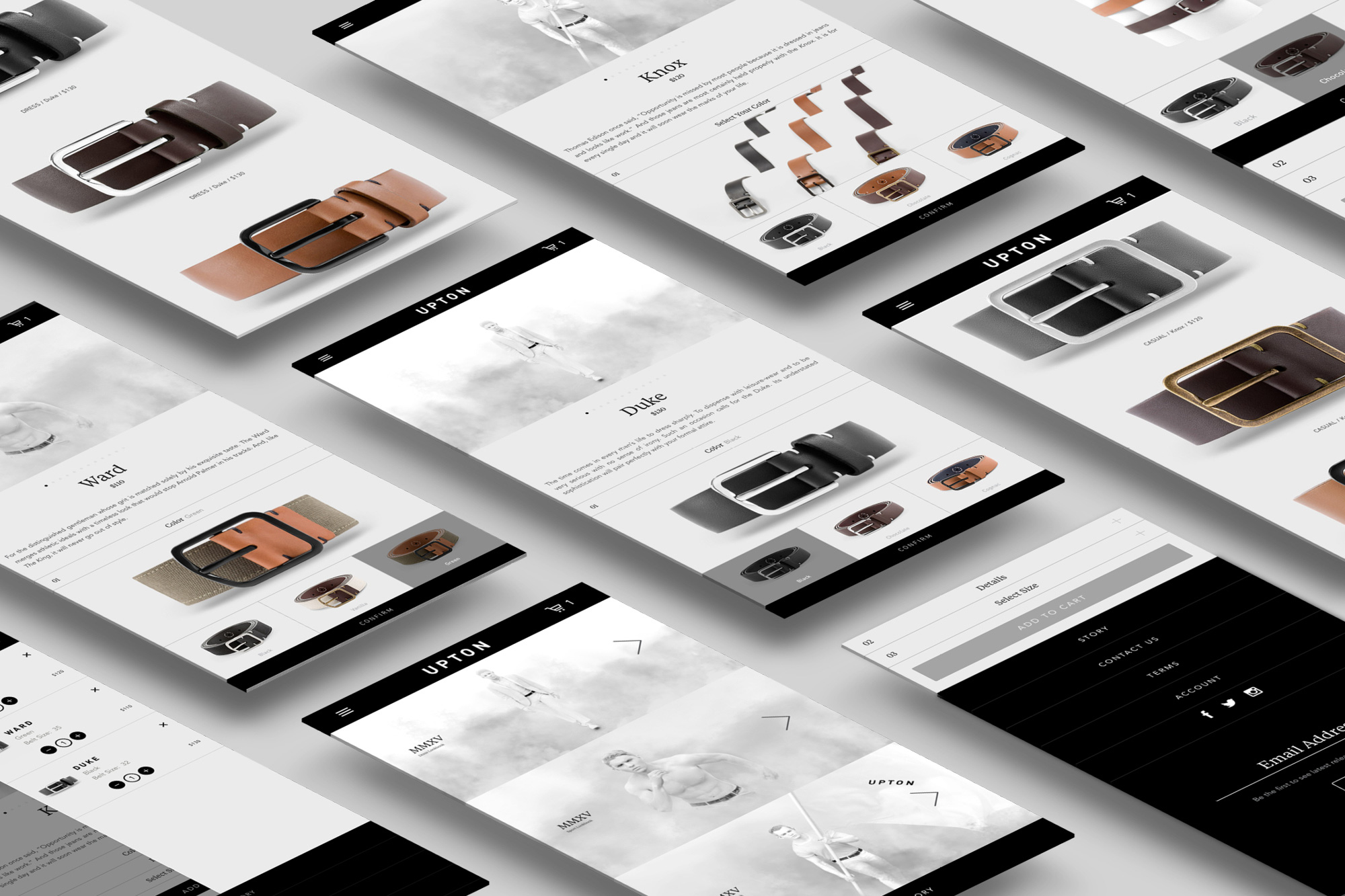
MOBILE SHOPPING
Controls are placed lower on the screen to ease navigation on mobile devices. Each step in the shopping process features a confirmation button to prevent mistakes. The entire mobile site is focused on a seamless user experience.
MOBILE SHOPPING
Controls are placed lower on the screen to ease navigation on mobile devices. Each step in the shopping process features a confirmation button to prevent mistakes. The entire mobile site is focused on a seamless user experience.
MOBILE SHOPPING
Controls are placed lower on the screen to ease navigation on mobile devices. Each step in the shopping process features a confirmation button to prevent mistakes. The entire mobile site is focused on a seamless user experience.
VISUAL CHECKOUT
The cart slides out from the right, and smoothly expands and contracts. The product selected and the quantities are easily adjustable.

VISUAL CHECKOUT
The cart slides out from the right, and smoothly expands and contracts. The product selected and the quantities are easily adjustable.
VISUAL CHECKOUT
The cart slides out from the right, and smoothly expands and contracts. The product selected and the quantities are easily adjustable.